⚡ TL;DR: best blush for deep skin tones
The strongest choices are shades with enough depth or saturation to remain visible once blended: rich berry, raisin, plum, brick, vivid pink, and true red. “Best” here means clear color on deeper complexions without a pale, powdery cast, plus a texture you can control.
Top Picks
- 🏆 Best Overall — Juvia’s Place Duo Blush — rich, deep, earthy shade flexibility
- 🥈 1st Runner-up — Fenty Cheeks Out — blendable warm raisin cream
- 🥉 2nd Runner-up — Patrick Ta Double-Take Duo — two-texture berry dimension
Finding the best blush for deep skin tones can feel strangely difficult: a shade looks vivid in the pan, then vanishes on the cheek or leaves a grey veil. The fix is not simply piling on more product. Choose color depth and undertone deliberately, then use the formula’s texture to control the finish.
✨ Inside This Blush Guide
🌸 Psst…
Some links in this post are affiliate links. If you shop through them, we may earn a small commission at no extra cost to you — like a little coffee while we keep testing beauty favorites. ☕💄
Quick Comparison: Best Blush for Deep Skin Tones
The eight blushes here do different jobs. Start with the shade and how it blends, not just how lovely the compact looks.
| Product | Exact shade | Formula / finish | Best deep-skin fit | Intensity control |
|---|---|---|---|---|
| Juvia's Place Duo Blush | Volume 1 | Two powder colors | Deep earthy warmth | Mix pans lightly |
| Fenty Cheeks Out | Raisin Standardz | Cream | Warm raisin definition | Tap and diffuse |
| Patrick Ta Double-Take Duo | She's Wanted | Crème + powder | Rich berry dimension | One texture or layer |
| NARS Blush | Infatuated | Matte powder | Deep plum flush | Gentle brush pickup |
| Rare Beauty Soft Pinch | Grateful | Dewy liquid | True-red accent | One tiny dot |
| HAUS LABS Color Fuse | Dragon Fruit Daze | Cool-pink powder | Bright contrast | Build thin layers |
| NYX Buttermelt | 11 Butta Than Before | Raspberry powder | Budget vivid color | Tap excess off |
| Black Radiance Artisan Color | Toasted Almond | Baked powder | Soft warm cheek | Dry then build |
How to Choose Blush That Shows Up on Deep Skin
Pigment after blending is the useful test, not how bright a compact looks under store lighting. On deep complexions, a weak, pastel-based wash can blend almost to nothing, while a saturated berry or terracotta can look natural once its borders are softened.
Depth and undertone are different decisions. A richly pigmented plum can complement a cool undertone; a brick or raisin shade often contributes warmer definition; and a cool fuchsia can be an intentional contrast rather than a mistake. None of these are rules you must follow without looking at the color on your own cheek.
A pale pink isn’t automatically off-limits. A sheer layer or a deeper blush placed underneath may keep a lighter shade from turning chalky, although a heavily white-based formula is harder to make seamless. For a broader guide to matching other complexions and undertones, the next resource can help.
Matching cheek color gets easier when we separate the shade family from its strength. The broader guide covers other skin depths; this list stays with deep skin.
The 8 Best Blushes for Deep Skin Tones
We do not need eight near-identical berry powders. Each pick has its own shade, finish, or blending advantage, making it easier to choose a flush we actually enjoy.
Juvia’s Place Duo Blush
Deep earthy color with mixing flexibility.
Want a flush that reads as color rather than a hint of powder? Volume 1 puts two deep earthy shades in one compact, making this an especially direct answer to blush that disappears on a rich complexion. You can use either pan alone or combine them to adjust warmth without reaching for a separate product.
A pressed-powder texture also makes the color easy to place intentionally with a brush. Start with a small amount before deciding how much pigment your cheeks need; the deepest-looking pan is not always the easiest starting point.
Bottom line: Choose this if your priority is unmistakable color depth with the freedom to mix two earthy shades; blend cautiously.
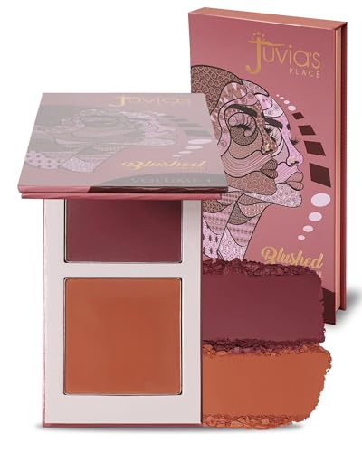
- ✅ Deep earthy shades suit a depth-first selection approach
- ✅ Two pans let you vary the tonal balance
- ✅ Pressed texture suits intentional brush placement
- ❌ A heavy sweep can make both shades look stronger than expected
- ❌ If you only want one simple shade, a duo may feel unnecessary
🧪 Lash Lab Notes — Mahmuda (Homemaker & Beauty Enthusiast)
Start with the deeper pan using a barely loaded brush, then mix only if the resulting flush needs more warmth. That preserves the two-shade advantage without overworking the cheeks.
- 💡 Editor’s Note: We like how a two-pan earthy arrangement solves a real choice: some days the cheek needs more red, and some days more warmth. Use the mixing option as a finishing adjustment rather than your first move. That keeps both shades useful on deep skin.
For the two-pan shade options, browse buyer impressions of Juvia’s Place Duo Blush.
Best for deep complexions seeking a customizable earthy powder flush.
After that earthy powder duo, a warmer cream gives us a different option.
Fenty Beauty Cheeks Out Freestyle Cream Blush
A warm raisin shade in a flexible cream.
Raisin Standardz is the route to take when you want richness with the softer edges of cream. The shade sits in the deep raisin family, so it can make a flushed cheek visible without relying on a pale, light-reflecting base.
A cream can be tapped over a complexion base and blended at its perimeter rather than brushed widely from the start. The small compact format suits a makeup bag, while the warm raisin color can be the main cheek statement.
Bottom line: Choose this for a rich warm cream flush with soft edges; powder enthusiasts may prefer a drier finish.
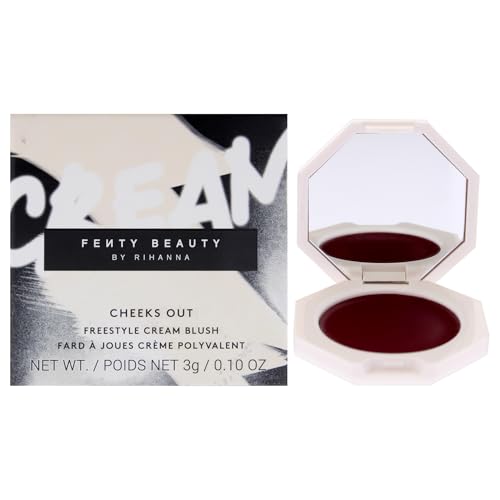
- ✅ Rich raisin color avoids a pale-pink starting point
- ✅ Cream texture lends itself to soft, tapped edges
- ✅ One compact shade for a warm cheek look
- ❌ Cream edges need patient tapping on a dry or powdered base
- ❌ Anyone seeking a fully matte powder finish should look elsewhere
🧪 Lash Lab Notes — Zayba (A-Level Student & Beauty Enthusiast)
Tap the cream with a finger in two small passes rather than one thick smear. Soft edges are the useful part of this formula’s format, not a promise of effortless wear.
- 💡 Editor’s Note: We would pick this when a soft cream finish is part of the look, not because every cream is automatically less ashy. Depth in the raisin color does much of the visual work. Test the blended result over your usual base.
Curious how the raisin cream suits other routines? Explore shopper comments for Fenty Cheeks Out.
Best for anyone who prefers warm cream color with feathered edges.
Want more depth from a berry shade? The next duo brings two textures to the same compact.
Patrick Ta Major Headlines Double-Take Blush Duo
Cream-plus-powder dimension in rich berry.
This duo earns a luxury place because it gives you two ways to show the same rich-berry family. She’s Wanted pairs a crème with a pressed powder, letting you choose one texture or use both for a more dimensional look.
The difference is practical: a dab of cream can shape a luminous stain-like flush, while powder changes the finish and intensity. When deeper skin turns an ordinary pink into a disappearing act, this berry has the visual depth to make a stronger statement.
Bottom line: Choose this when layered berry dimension matters more than a simple one-pan routine.

- ✅ Rich berry shade is built for visible color
- ✅ Crème and powder offer different finish options
- ✅ One compact supports optional layering
- ❌ A two-texture routine can feel excessive for a five-minute makeup look
- ❌ Rich berry may read dramatic when loaded heavily
🧪 Lash Lab Notes — Engr. Nusrat (Engineer & Beauty Enthusiast)
The cream-and-powder construction provides two separate textures in one case, which changes how the shade can be layered. That does not automatically mean one fixed look lasts longer.
- 💡 Editor’s Note: Two textures are worth paying attention to only if you will use both of them. We would start with the cream alone to understand the berry on your complexion. Add the powder when you specifically want another layer of color or finish.
To compare the two textures before deciding, view buyer feedback for Patrick Ta Double-Take Duo.
Best for berry lovers who will use both cream and powder textures.
The separate cream and powder formula may leave you wondering how the broader Patrick Ta lineup compares. A dedicated review gives that brand-specific context without stretching this deep-skin roundup into a full range breakdown.
Not in the mood for shine? A matte plum gives the cheeks another kind of finish.
NARS Blush
Matte deep plum with defined saturation.
For a moody plum cheek rather than a bright candy pink, Infatuated is an appealing direction. Its matte deep-plumberry identity makes the desired result clear before you even choose a brush.
The pressed format is useful when you prefer a controlled, defined placement and do not want extra sheen. Try a very light first pass on the cheek; a strong wine color can be flattering without becoming a visible stripe.
Bottom line: Choose this for a deep, matte plum that does not need shimmer to announce itself.

- ✅ Deep plumberry shade offers a specific cool direction
- ✅ Matte finish suits a non-shimmery cheek
- ✅ Powder makes targeted brush placement practical
- ❌ The matte deep plum is not a peachy-warm blush substitute
- ❌ A dense brush may leave a concentrated first patch
🧪 Lash Lab Notes — Dr. Rabeya (Dentist & Beauty Enthusiast)
Control brush pickup before placement, since Infatuated already supplies a dark matte color. A light first pass preserves the intended plum effect without a hard edge.
- 💡 Editor’s Note: Matte does not have to mean flat or chalky. With a deep-plum powder, placement and amount are the controls that matter most. Look at the cheek straight on, not only at a close-up swatch.
For another perspective on its matte plum effect, read customer comments about NARS Blush.
Best for a matte wine-toned cheek without obvious shimmer.
If plum is the shade family that has finally solved your disappearing-blush problem, the narrower berry guide compares that color direction in more depth. This list keeps its comparison to a single deep-plum pick.
A true red moves the color story from wine-toned to statement-bright.
Rare Beauty Soft Pinch Liquid Blush
Dewy true red with vivid payoff.
Grateful is for the moment when you want red cheeks to look deliberate, not apologetic. A true-red liquid offers a bold direction that can stay visible on a very deep complexion instead of fading into a pale wash.
Its dewy identity adds another dimension to the color, especially when you keep your base looking like skin. Use a tiny dot, diffuse it, and assess the result before adding a second dot; there is no prize for applying an entire doe-foot swipe.
Bottom line: Choose this for a vivid, dewy red statement, not a barely-there office flush.

- ✅ True-red hue creates a vivid contrast
- ✅ Dewy liquid offers a different finish from powder
- ✅ Small-dot application provides intensity control
- ❌ One large application can overwhelm a subtle makeup look
- ❌ A dewy finish may not suit people who prefer dry powders
🧪 Lash Lab Notes — Fauzia (University Student & Beauty Enthusiast)
Apply Grateful in tiny dots, because spreading a true red over a wide area can exceed the look you wanted. Build the color only after the initial dot is blended.
- 💡 Editor’s Note: Red can look surprisingly coherent on deep skin once its edges disappear into the base. We would rather see one diffused dot than three heavy ones. If dewy cheeks are not your style, choose a different finish before choosing another red shade.
To assess how dramatic this red can look, see shopper experiences with Rare Beauty Soft Pinch.
Best for a vibrant red cheek with a dewy effect.
Grateful is only one route through this liquid range, and deciding between the line’s finishes deserves more than a passing aside. The dedicated review covers the wider Rare Beauty decision.
Pink can be just as expressive as red when the saturation is there.
HAUS LABS Color Fuse Powder Blush
Bright cool pink for statement cheeks.
Cool pink deserves a chance on deep skin, and Dragon Fruit Daze is a compelling high-contrast option. The vivid color provides a different visual mood from brick or berry without asking you to wear a pale, chalky-looking pastel.
This is a powder pick for someone who enjoys a more obvious flush and wants defined color placement. Keep your brush light at first and assess how much cool pink you want next to your skin’s undertone.
Bottom line: Choose this for a confident cool-pink statement on deep skin, not for muted neutral warmth.
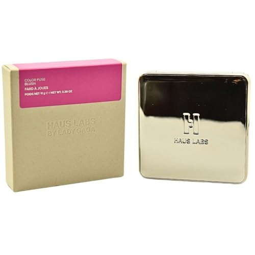
- ✅ Bright cool pink expands the shade choices
- ✅ Powder format offers precise placement
- ✅ Color stands apart from warm terracottas
- ❌ Cool fuchsia contrasts strongly with warm earthy makeup
- ❌ This is not the most natural-looking shade for someone avoiding bright pink
🧪 Lash Lab Notes — Dr. Sazia (Medicine Specialist & Beauty Enthusiast)
Judge a vivid cool pink against the individual complexion in daylight. Skin sensitivity is a separate issue from shade suitability, so a new cosmetic still merits cautious introduction.
- 💡 Editor’s Note: A vivid pink is a style choice, not a test of how warm or cool your complexion is allowed to be. We would judge this against your favorite lip and eye look. A light hand leaves room to decide whether you want contrast or just a brightened cheek.
Want a closer look at the bright pink shade? Explore customer observations of HAUS LABS Color Fuse.
Best for cool-pink contrast on a deep complexion.
Let’s move from bold cool pink to a more budget-conscious raspberry.
NYX Buttermelt Powder Blush
Raspberry powder without prestige pricing.
A true budget-minded option should still look like blush once it has been blended. Butta Than Before is a deep-raspberry powder, an accessible color family for someone who wants noticeable pigment without moving into prestige pricing.
The finely blended impression comes from handling the color in layers rather than packing a loaded brush on the center of the cheek. Rich raspberry also bridges the gap between a warm rose and a deeper berry, depending on your own undertone.
Bottom line: Choose this for a lively raspberry powder in the drugstore category; use a gentle brush.

- ✅ Deep raspberry is a distinctive rich shade
- ✅ Budget positioning improves accessibility
- ✅ Pressed powder travels without liquid handling
- ❌ High-impact raspberry can demand a light first application
- ❌ Its shade direction may feel too lively for a quiet neutral look

🧪 Lash Lab Notes — Fauzia (University Student & Beauty Enthusiast)
A strong raspberry shade is useful because it can be applied sparingly rather than repeatedly loading a brush. The more important check is a smooth edge after blending, not how vivid the powder appears in its pan.
- 💡 Editor’s Note: An affordable powder still needs a thoughtful brush technique; the price category does not decide the finish. We would tap off excess before touching the face. If the raspberry looks stronger than expected, soften the edge instead of adding a lighter powder over everything.
For budget-blush opinions beyond the swatch, review buyer impressions of NYX Buttermelt.
Best for a rich raspberry accent on a drugstore budget.
For softer everyday warmth, a baked powder shifts the intensity down.
Black Radiance Artisan Color Baked Blush
An earthy baked blush for warm definition.
For an understated warm cheek, Toasted Almond takes a different path from fuchsia and true red. Its baked powder texture is meant to offer a buildable finish, giving you control over a more earthy, softly defined look.
The brand describes different effects when applied dry versus damp, so you can keep the first pass restrained and intensify only if needed. This can be especially useful when bright pinks feel like too much color for an everyday setting.
Bottom line: Choose this for a warm, buildable everyday cheek rather than maximum fuchsia contrast.
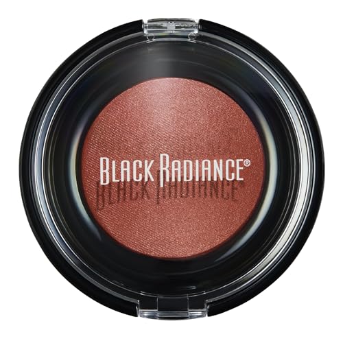
- ✅ Warm toasted-almond shade offers soft definition
- ✅ Dry application allows gradual color
- ✅ Damp application is a brand-described intensity option
- ❌ The understated earthy shade may need building on the very deepest tones
- ❌ Damp application can intensify color more than a beginner expects
🧪 Lash Lab Notes — Mahmuda (Homemaker & Beauty Enthusiast)
Keep the baked powder dry for the first everyday application. Changing to a damp technique should be a conscious choice for greater color intensity.
- 💡 Editor’s Note: Warm everyday blush need not be invisible. We would begin with the dry application for a realistic look at its color on your skin. Use more intensity only when your own cheek swatch shows it is needed.
To see how people use this baked texture, check customer comments on Black Radiance Artisan Color.
Best for soft, warm cheek definition you can build gradually.
After the individual picks, technique decides whether the color stays smooth on the cheek.
How to Apply Blush on Deep Skin Without Ashiness
Begin with a cheek swatch in daylight, not a heavy stripe on the back of your hand. Apply a small amount to the same complexion base you normally wear, blend the edge, and only then judge whether you need a richer shade or more product.
With a concentrated liquid such as a true red, start with one tiny dot and tap outward. For cream, press rather than repeatedly rubbing; for powder, load a brush lightly, tap off excess, and gradually build the center of the flush.
Avoid trying to fix weak pigment with a heavy chalky layer. If the color disappears once blended, a deeper shade or more suitable formula is often the cleaner answer. For a deliberately understated result, there is a dedicated guide to the finer details of soft blush application.
A subtle cheek finish depends as much on where you stop blending as on where you begin. That longer technique walkthrough keeps the natural look from becoming a full-face powder cloud.
Heavy edges, patchy cream over a powder base, and mismatched undertones create different problems. The troubleshooting guide separates those mistakes so you can identify what went wrong instead of buying a new color immediately.
A quick technique correction can save a shade you already like. Check the common errors before deciding the blush itself is the issue.
If your skin reacts easily to new cosmetics, the American Academy of Dermatology recommends testing a new skin-care or cosmetic product on a small area and stopping use if irritation develops. Shade compatibility and skin tolerance are different concerns; neither should be assumed from the color alone.
Frequently Asked Questions About Blush for Deep Skin
These short answers cover the final shade and formula decisions that often remain after you narrow down the picks.
❓ Can deep skin tones wear light pink blush?
Yes, but formula matters. A sheer lighter pink or one blended over a richer blush can work; a heavily white-based pastel may read chalky, so judge the blended cheek in natural light.
❓ Is cream blush always better than powder on dark skin?
No. A richly pigmented, finely blended powder can read beautifully on deeper complexions, while a cream gives a softer edge or dewy texture depending on its formula.
❓ Does my undertone matter more than my skin depth?
Both affect the result. Depth tells you how much color intensity may remain visible, while undertone helps you choose between plum, brick, raisin, warm red, or vivid cool pink.
❓ What is the best blush for deep skin tones on a budget?
NYX Buttermelt in Butta Than Before is a strong raspberry-colored starting point here, but its powder finish and vivid saturation may not suit a soft everyday look. If you want to compare a broader range of affordable blushes, continue with the budget guide.
One affordable recommendation is a useful starting place, not a complete answer to every price or formula preference. A wider comparison helps when budget becomes your main decision.
Final Thoughts: Choose Visible Color You Can Control
The best blush for deep skin tones is the one that stays visible after you blend it, while still letting you control the edge and finish. Start with shade depth, then choose the texture you enjoy applying; your cheeks deserve color that shows up rather than another disappearing act.
Last update on 2026-10-29 / Affiliate links / Images from Amazon Product Advertising API