
⚡ TL;DR: best color-correcting concealer
Start with the color of the discoloration. Peach or deeper orange-red can soften blue-brown under-eye shadows. Green helps balance visible redness. Lavender can address yellow-looking sallowness. Shade depth matters as much as hue. Keep the layer thin so our skin-tone makeup can do the final covering.
Top Picks
- 🏆 Best Overall — e.l.f. Camo — straightforward Peach for fair-to-medium dark circles
- 🥈 1st Runner-up — tarte CC Undereye Corrector — peach cream for localized under-eye darkness
- 🥉 2nd Runner-up — stila Correct & Perfect — several correcting colors in one palette
Ever add concealer to a dark under-eye and still see grey? Or spot a red patch through foundation? More coverage alone may not fix either color cast. That is where a carefully chosen corrector can help. The best color-correcting concealer should balance the cast without making our base heavy.
We picked seven different correcting products, each suited to a specific concern, shade, or format. A corrector changes how discoloration looks; it does not erase the underlying cause. The goal is a thin, targeted layer rather than a heavy new coat.
✨ Inside This Concealer Guide
🌸 Psst… A Little Beauty Note!
Some links in this post are affiliate links. If you spot something you love and shop through our links, we may earn a small commission—at no extra cost to you. Our picks are based on thoughtful research and, where mentioned, hands-on experience. Thanks for supporting Dappered Chic! 💕 Read our Affiliate Disclosure
Quick Comparison: Best Color-Correcting Concealer
These seven options suit different discoloration shades, skin depths, and coverage needs. Which one belongs in our routine? Start with the correcting shade, then look at texture and trade-offs.
| Product | Best For | Corrective Shade / Format | Key Trade-off |
|---|---|---|---|
| e.l.f. Camo | Fair-to-medium dark circles | Peach cream | Not deep enough for every skin tone |
| tarte CC Undereye Corrector | Targeted under-eye shadows | Light-medium peach cream | Pot needs careful pickup |
| L.A. Girl Pro Conceal | Deep-skin discoloration | Reddish GC967 cream | Intense hue needs blending |
| Milani Supercharged Tint | Medium-to-deep lighter coverage | 130 Deep Peach tint | Less opaque correction |
| Catrice Under Eye Brightener | Fair-to-light blue cast | 010 Light Rose cream | Can look pale on deep skin |
| stila Correct & Perfect | Mixed redness and dark circles | Multi-color palette | More shades than some need |
| wet n wild Photo Focus Care | Localized redness | Green liquid | Not for blue-brown shadows |
Choose the Right Correcting Shade for Your Discoloration
Think of corrector as a small color adjustment beneath makeup. Match the cast, then the depth of the shade you choose; applying the wrong corrective color can create another visible patch.
Seeing a bluish or purple-looking shadow on lighter skin? Peach or pink-peach may be a good starting point. On deeper skin, a richer peach, orange, or red-orange may balance a stronger dark cast better. Compare the actual shade against the discoloration.
Green is the color to reach for when you want to soften visible redness around the nose, cheeks, or a localized patch. Lavender is often marketed for yellowish sallowness, while some ranges include yellow for specific dull or violet tones. A manufacturer’s color map is a starting point, not proof that every complexion needs the same hue.
A quick mirror check can tell us more than a universal rule. Dab a little corrector on the discolored area and feather its edge. Is the original cast less obvious before concealer goes on? If not, reconsider the shade or depth rather than piling on more.
Color-Correcting Concealers: Our Seven Best Matches
Not every corrector solves the same problem. These seven picks cover different hues, depths, and formats. The product descriptions and brand shade guidance inform our choices; we are not claiming hands-on wear tests.
e.l.f. Camo Color Corrector
Best Overall Peach Corrector
A practical peach option for fair-to-medium skin with blue-purple shadows below the eyes.
Blue-looking under-eye shadows can show through regular concealer. Here, a little Peach Corrector may help. The named shade is designed for lighter and medium complexions, according to the brand. We still need a careful match to our actual discoloration.
The cream texture makes it easier to place color on one small patch. Begin at the dark cast, not the surrounding skin. Too much Peach beyond that area may leave an obvious tint beneath the next layer.
Bottom line: e.l.f. Camo is worth considering for fair-to-medium skin with blue-purple under-eye discoloration; not the right depth for stronger discoloration on very deep complexions.
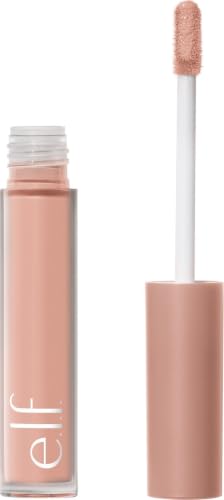
- ✅ Peach targets blue-purple-looking under-eye discoloration
- ✅ Easy to tap a small amount of cream exactly where needed
- ❌ A single Peach shade cannot match every complexion depth
- ❌ Spreading it too far may leave a visible peach cast

🧪 Lash Lab Notes — Zayba (A-Level Student & Beauty Enthusiast)
A tiny dab on the darkest under-eye spot is easier to judge. Why cover the whole area at once? Soften the edge first. Then see whether another layer is even necessary.
- 💡 Editor’s Note: We would choose the Peach shade for the discoloration, not just because this range has several colors. If your circles lean more brown than blue, a deeper peach or orange may be a better starting point.
To compare the Peach listing and buyer feedback, view e.l.f. Camo.
A simple peach starting point for fair-to-medium blue-purple circles.
Prefer a cream pot? The next pick takes a different route to peach correction.
tarte CC Undereye Corrector
Best Cream Corrector for Dark Circles
A focused match for light-to-medium under-eyes that need a peach cream.
A pot can offer a more deliberate way to place peach color. This light-medium option suits a focused under-eye correction step. It makes sense when a thin cream layer matches the darkness we want to balance.
The retailer calls this a radiant, full-coverage cream. That describes the formula, not proof of all-day wear. We would still apply the smallest useful amount and check how it sits beneath concealer.
Bottom line: tarte CC Undereye Corrector is worth considering for light-to-medium under-eyes that need a peach cream; a pot is less convenient for those who prefer a wand.

- ✅ Peach cream works well for careful placement
- ✅ Radiant cream offers a different feel from liquid formulas
- ❌ A pot may require a clean finger or separate applicator
- ❌ Light-medium peach will not match every complexion
🧪 Lash Lab Notes — Engr. Nusrat (Engineer & Beauty Enthusiast)
Take a small amount from the pot so the layer stays controlled. Pat rather than sweep. That helps keep the color only where correction is needed.
- 💡 Editor’s Note: A peach cream can be a good fit even if you already own a full-coverage concealer. We would make sure that missing piece is color neutralization rather than simply more opaque coverage.
For a closer look at this peach cream, explore tarte CC Undereye Corrector.
Consider this if you prefer a cream pot for light-to-medium under-eye darkness.
What if the dark cast needs a deeper color? The next pick goes richer.
L.A. Girl HD Pro Conceal Reddish Corrector
Best Reddish Corrector for Deep Skin
A stronger reddish option for deeper complexions with dark under-eye shadows.
On deep skin, pale peach can make a dark patch look ashy instead of even. The Reddish GC967 version brings a much richer correcting tone into the discussion, which makes this our purpose-built deep-skin option.
This tube format is listed as a cream with full coverage. It makes sense to apply it only where discoloration is strongest, then cover with a complexion shade that truly matches your skin.
Bottom line: L.A. Girl Pro Conceal is worth considering for deeper complexions with dark under-eye discoloration; a rich red-orange corrector may show through light or sheer concealer.
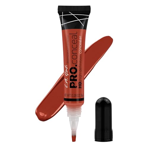
- ✅ Rich Reddish color offers a deeper correction option
- ✅ Tube design makes targeted application practical
- ❌ The pigment may look too strong on lighter skin
- ❌ Layer carefully so the reddish tone stays hidden
🧪 Lash Lab Notes — Dr. Sazia (Medicine Specialist & Beauty Enthusiast)
A corrector needs enough color depth to balance the shadow. Yet it should not become a new visible patch. Start sparingly and build only if the first layer is not enough.
- 💡 Editor’s Note: We would never treat one red-orange shade as a fix for every deep complexion. The skin-tone layer on top matters just as much, especially near the inner corner where color changes quickly.
If you are considering the Reddish variant, check L.A. Girl Pro Conceal.
Best suited to deeper complexions needing a richer corrector than peach.
For a softer daily look, a peach tint may feel easier to work with.
Choosing a deeper correcting hue is only the first part of finding a natural match. Our deeper-complexion guide goes further into which tones help different kinds of visible darkness.
Next, a lighter-feeling peach tint may be more appealing for everyday use.
Milani Supercharged Brightening Undereye Tint
Best Luminous Deep-Peach Undereye Tint
A focused match for medium-to-deep skin seeking a tinted peach under-eye layer.
Not every under-eye needs a thick coat of correction. The 130 Deep Peach option adds a deliberate warm tint for a medium-to-deep complexion that shows darker shadowing.
The manufacturer presents this as a brightening under-eye tint rather than an opaque camouflage product. That distinction makes it appealing when you want a modest tonal adjustment and intend to keep the rest of your base light.
Bottom line: Milani Supercharged Tint is worth considering for medium-to-deep skin seeking a tinted peach under-eye layer; a tint is not a substitute for heavy spot-coverage.

- ✅ Deep Peach suits a distinct complexion-depth range
- ✅ Tint format gives a lighter-coverage alternative
- ❌ Sheer correction may still need extra coverage
- ❌ Deep Peach may be too strong on fair complexions
🧪 Lash Lab Notes — Mahmuda (Homemaker & Beauty Enthusiast)
The shade itself does the color-correcting work. Shine alone cannot do it. Try a sheer pass and look in the mirror before deciding whether to add more coverage.
- 💡 Editor’s Note: We would choose this type of tint for a softer result, not promise the disappearance of dark circles. It is useful to decide in advance whether your priority is correction or maximum coverage.
To inspect the 130 Deep Peach option, see Milani Supercharged Tint.
A useful direction for medium-to-deep skin seeking a peach-tinted under-eye step.
Want a gentler rosy shade for fair skin? That is the next option.
Catrice Under Eye Brightener
Best Soft Cream Brightener for Fair Skin
A softer rose-cream choice for fair or light skin with a faint blue cast.
When under-eye discoloration is subtle, orange may be too much. A gentle rose can be more suitable. That makes 010 Light Rose worth comparing for fair or light skin with a mild bluish cast.
This is the original cream brightener, not the separately sold liquid version. The difference matters. Check the format carefully before comparing photos or listings.
Bottom line: Catrice Under Eye Brightener is worth considering for fair and light complexions with a slight bluish under-eye cast; the rosy tone may be too pale on richer skin.

- ✅ Light Rose addresses a specific fair-skin concern
- ✅ Cream texture allows small, precise dabs
- ❌ Often too pale for deeper skin tones
- ❌ May be too subtle for stronger brown discoloration
🧪 Lash Lab Notes — Dr. Rabeya (Dentist & Beauty Enthusiast)
Pat this cream gently instead of rubbing it across a wide area. Does a thin layer already mute the blue? Then stop before the skin starts looking pink.
- 💡 Editor’s Note: Our decision point is how much color is visible before makeup. A soft rose is often worth considering for a faint blue cast, while a stronger shadow may call for deeper peach.
For details on the Light Rose cream, browse Catrice Under Eye Brightener.
A calmer choice for fair-to-light skin with mild blue-looking shadows.
Need to correct more than one color? A palette can make sense.
stila Correct & Perfect Palette
Best Multi-Color Correcting Palette
An all-in-one option for redness, under-eye shadows, and yellow-looking areas.
Our chin may look red while the under-eye looks blue. Why use one correcting color for both? A multicolor palette lets us choose different pigments for different areas.
The brand describes five creams plus two tinted finishing powders. Each pan serves a separate role. The appeal is flexibility, not a claim that we should put every shade on at once.
Bottom line: stila Correct & Perfect is worth considering for people correcting redness, under-eye darkness, and sallowness in different areas; a full palette may be unnecessary for one specific discoloration.

- ✅ Several hues can address different discoloration areas
- ✅ Includes both cream and powder components
- ❌ More steps than a single targeted corrector
- ❌ Unused pans may make it poor value for one concern
🧪 Lash Lab Notes — Engr. Nusrat (Engineer & Beauty Enthusiast)
Start by keeping the colors separate. A little green on a red spot and peach under the eye are easier to assess. Mixing every pan together would defeat that targeted approach.
- 💡 Editor’s Note: We would only pay for a palette if more than one shade will earn its place in the routine. One well-matched corrector usually beats seven half-used pans.
If a palette matches your routine, compare Stila Correct & Perfect.
Best when we actually use at least two different correcting shades.
Only dealing with redness? A single green liquid is simpler.
Wet n Wild Photo Focus Care Color Corrector
Best Budget Liquid Corrector for Redness
A straightforward option for small areas of visible facial redness.
A red patch and a blue under-eye shadow are different problems. That is why this Green liquid corrector has a clear purpose: softening the look of localized redness.
The fluid formula can be placed on just the red patch, with soft edges. If we only want to correct redness, why buy a multipan palette? One green shade may be enough.
Bottom line: wet n wild Photo Focus Care is worth considering for localized visible facial redness; green is not the right color for purple or brown under-eye shadows.
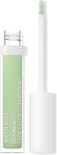
- ✅ Green is meant for visible facial redness
- ✅ One useful liquid shade instead of a larger palette
- ❌ Not the right hue for blue or brown dark circles
- ❌ Too much may leave a greenish cast
🧪 Lash Lab Notes — Fauzia (University Student & Beauty Enthusiast)
Place Green only where the skin visibly looks red. Feather out the edges. Check it in natural light before adding the skin-tone layer.
- 💡 Editor’s Note: We like that this choice makes the color decision straightforward. The saving comes from buying one useful shade instead of paying for colors you may never apply.
For the exact Green variant, review Wet n Wild Photo Focus Care.
Choose Green for an isolated red patch, not for dark under-eye shadows.
The seven choices cover our main color concerns. Now application matters.
Color Corrector Application and Skin Comfort
Begin with moisturized skin. Find the single patch that needs color correction. Why paint the whole face? A thin tap over the discolored spot is often a better first step than a heavy stripe.
Feather the edges, then add concealer or foundation in our skin tone. Do we need to keep applying colored pigment? Usually the goal is only to soften the cast; the next layer supplies regular coverage.
A corrector handles the cast; a skin-tone concealer handles the remaining coverage and finish. If that second layer creases or looks heavy, we have a separate comparison focused specifically on under-eye concealer formulas.
Under-eye coverage has its own challenges after the color is balanced. A dedicated dark-circle concealer guide helps you choose the next layer without repeating the corrector step.
Keep makeup tools clean and avoid sharing eye-area applicators. The American Academy of Dermatology also discusses makeup choices and habits that matter when skin is prone to breakouts.
The motion you use to add concealer matters once the corrector is placed. Our application guide explains how to blend complexion makeup without disturbing the carefully corrected spot underneath.
Avoid These Color-Correcting Mistakes
Wrong hue, wrong result. Green is for redness, not every dark mark. Likewise, peach under-eye pigment does not belong on every unrelated red patch. Choose the color according to what we actually see.
Going too pale can backfire. Light peach may leave a deeper brown or blue shadow, looking dull or grey. A richer orange or reddish corrector may fit when the lighter option does not.
Heavy-handed application is another trap. An opaque colored stripe may need a thick foundation layer to cover it. Focus on the discoloration, then stop when the color cast looks softer.
Brightness is not the same as correction. A luminous product can reflect light without balancing an unwanted cast. Judge those two jobs separately.
Color Correcting Concealer Questions, Answered
Why does one shade help while another looks uneven? Usually the question comes back to hue, depth, and how thinly we apply it. The aim is a compatible, lightly blended layer.
❓ Can I wear corrector alone?
A lightly tinted formula may work alone if it blends naturally. A strong green or reddish corrector is more likely to show without skin-tone makeup on top. The actual shade and placement matter.
❓ Is purple corrector for every yellow undertone?
No. Lavender is generally promoted for yellow-looking sallowness. That does not mean everyone with naturally warm undertones needs purple. Correct a visible color concern, not the skin tone we naturally have.
❓ What goes over green corrector?
Once Green has softened a red patch, add a skin-tone concealer or foundation. Keep the top layer thin. That helps stop green pigment from showing at the edges.
❓ Why does concealer look grey even after correcting?
Maybe the correcting shade is too light, cool, or sheer for the original darkness. Before adding more concealer, check hue and depth again. Grey-looking makeup alone does not prove a chemical oxidation reaction.
Final Thoughts: Match the Color You See
A grey under-eye and a red patch need different colors. Start with peach or a deeper orange-red for a suitable dark cast. Green is for redness. Reach for a palette only if several correcting shades would earn their place.
One thin, well-matched layer may make the rest of the base easier. After the cast looks softer, choose a regular concealer by the coverage and finish we want.
Correcting visible color is only half the complexion decision. Our broader guide compares everyday formulas for the coverage layer that goes over your corrector.
Last update on 2026-11-20 / Affiliate links / Images from Amazon Product Advertising API