⚡ TL;DR: bronzer that does not look orange
Start with a shade at the right depth and a brand-described neutral or cool direction, then test it against your own base in daylight. Fenty Maple Glaze, Anastasia Amber, and Benefit Hoola Deep are three useful starting points for different textures and complexion depths, not universal shade guarantees.
Top Picks
- 🏆 Best Overall — Fenty Sun Stalk’r Soufflé — Muted, buildable mousse direction
- 🥈 1st Runner-up — Anastasia Cream Bronzer — Neutral light-medium cream shade
- 🥉 2nd Runner-up — Benefit Hoola — Deep neutral matte powder
There is a difference between looking gently sun-warmed and finding an unexpected orange streak across your cheeks. The search for a bronzer that does not look orange works better when you narrow down actual shades, rather than assuming the whole bronzer line will suit you.
✨ Inside This Bronzer Guide
🌸 Psst…
Some links in this post are affiliate links. If you shop through them, we may earn a small commission at no extra cost to you — like a little coffee while we keep testing beauty favorites. ☕💄
Quick Comparison: Best Bronzer That Does Not Look Orange
These eight shades do different jobs. Some add gentle color; others add definition or glow. Compare the precise shade, not just the name on the jar.
| Product / exact shade | Best starting depth | Color direction | Formula / finish | Main trade-off |
|---|---|---|---|---|
| Fenty Sun Stalk’r Soufflé | Check depth in person | Neutral-oriented range | Mousse-like / matte | May look strong on fair skin |
| Anastasia Cream Bronzer | Light-medium | Neutral | Cream / soft matte | Not a powder finish |
| Tower 28 Sculptino | Light-medium | Neutral | Cream contour / soft matte | More sculpt than glow |
| Saie Sun Melt | Fair to fair-light | Neutral | Cream balm / radiant | Can feel emollient |
| Hourglass Ambient Lighting Bronzer | Light-medium | Neutral | Powder / radiant | Visible sheen |
| Benefit Hoola | Deep | Neutral | Powder / matte | No luminous effect |
| Laura Geller Bronze-n-Brighten | Very fair to light | Brand's no-orange claim | Baked powder / natural | Depth limited to fair skin |
| Saie Dew Bronze | Light-medium to tan | Neutral | Liquid / soft focus | Too light for rich skin |
Find a Bronzer Shade That Is Less Likely to Turn Orange
Start by choosing how dark the bronzer needs to be. A shade that is too light may disappear, and one that is too dark can read like a stripe before its undertone even matters. Compare the product to your face and neck while wearing the foundation or skin tint you normally use.
Then pay attention to the direction of the color. A manufacturer-described neutral shade is a stronger starting clue for this particular goal than a shade called golden, caramel, or warm, although individual skin can shift the apparent result. Cool shades can look more shadow-like, which may be excellent for contour and less appealing for a summer-bronzed glow.
Finish comes after shade and depth. Matte does not automatically mean neutral. And a soft glow does not have to mean orange.
Cream and liquid formulas can melt into base makeup. Powder offers a more controlled sweep over set foundation. Neither format fixes a shade that looks too warm.
Finally, swatch on the cheek near the edge of your everyday base and inspect it by a window or outdoors in indirect daylight. Wait briefly before judging the settled color. A bronzer should contribute believable dimension without demanding that you correct its warmth with another makeup product.
Eight Neutral-Leaning Bronzer Options, by Skin Depth and Formula
Every pick here points to one exact shade and one verified product record. Brand promises are useful clues, but the color against our own skin still decides.
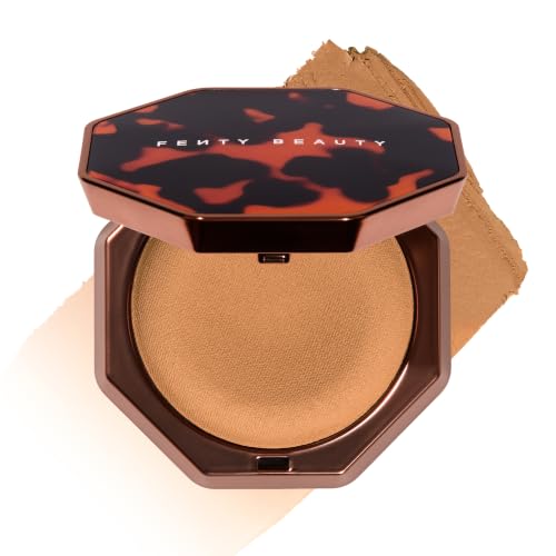
Fenty Sun Stalk’r Soufflé in Maple Glaze
Best Overall Mousse
Think soft, buildable color here rather than a bright golden sweep. The mousse texture gives us room to start small.
Maple Glaze is the specific shade to evaluate here, not an invitation to buy any Sun Stalk’r product. Fenty positions the Soufflé line around more neutral undertone choices, making this one a logical place to start when a gold-heavy bronzer keeps clashing with your complexion. The selected PKB listing identifies a 0.52-ounce variant, so the purchasing target is precise.
The appeal is control: you can approach bronze in thin layers instead of committing to one saturated sweep. Still, the maker’s neutral-facing description is not a promise that Maple Glaze will suit all fair, medium, or deep complexions. On very light skin the color depth itself may be the obstacle, even if the undertone seems restrained.
Bottom line: Choose Maple Glaze if you want a neutral-oriented, buildable mousse; skip it if the depth looks too strong in daylight.
- ✅ Neutral-oriented mousse shade family
- ✅ Buildable placement rather than a single heavy sweep
- ❌ May be too deep for the palest complexions
- ❌ Neutral branding cannot replace a personal swatch
🧪 Lash Lab Notes — Fauzia (University Student & Beauty Enthusiast)
When a shade is meant to look muted, add a small amount first and check that you still see skin underneath. A softer edge will not rescue a poor undertone match.
- 💡 Editor’s Note: We would start with one cheek swatch rather than applying both sides of the face. If the initial muted bronze still reads orange, shade depth or your underlying skin color may be the deciding factor.
Explore the listing and buyer reviews for Fenty Sun Stalk’r Soufflé to confirm the exact shade before purchasing.
Reader recommendation: Best for shoppers who like softly muted mousse bronze.
Prefer a cream in a pot? The next shade brings a different kind of control.
Anastasia Beverly Hills Cream Bronzer in Amber
Best Light-Medium Cream
Amber is a named neutral shade, not simply a warm bronzer in a cream pot.
Amber matters because Anastasia Beverly Hills describes that named cream-bronzer shade for light-to-medium complexions with neutral undertones. It is not interchangeable with the line’s more golden options. The linked product record is the Amber 1-fluid-ounce version, so the name on the checkout listing deserves as much attention as the packaging.
Cream lets you place color where warmth is wanted and blend the edge into your foundation. The available product specification calls the formula matte and describes a second-skin texture, although those are product claims, not independently measured wear results. Someone who prefers a dry, brush-and-go powder may find the cream format less convenient.
Bottom line: Choose Amber for a neutral light-medium cream; skip it when you want a dry powder application.

- ✅ Brand-described neutral shade for light-medium skin
- ✅ Soft-focus matte cream presentation
- ❌ Cream requires careful blending into base makeup
- ❌ Not suited to a powder-only routine
🧪 Lash Lab Notes — Mahmuda (Homemaker & Beauty Enthusiast)
A cream bronzer can look like part of the base if the edges vanish into foundation. Compare the swatch next to your actual makeup rather than against bare wrist skin only.
- 💡 Editor’s Note: We would compare Amber beside a small swipe of your usual foundation. An obvious difference there is more useful than a promising product photo shot under studio lighting.
Explore the listing and buyer reviews for Anastasia Cream Bronzer to confirm the exact shade before purchasing.
Reader recommendation: Best for light-medium wearers who enjoy cream blending.
But what if even a quiet bronzer feels golden? A contour-led shade may be the better starting point.
Tower 28 Sculptino Cream Contour in Getty
Best Shadow-Like Sculpt
Sometimes we want a little shadow, not a summer tan. That is where this balm makes sense.
Getty is a deliberately different option: Tower 28 calls this Sculptino shade light-medium neutral, while categorizing the stick chiefly as a cream contour. That distinction matters for a shopper whose biggest complaint is not insufficient color but an orange stripe where facial shadow should be. The matched 0.16-ounce cream product is the exact Getty variant.
Rather than a golden-tan impression, this choice aims toward quiet definition. You may prefer it under the cheekbone, while using a gentler bronze elsewhere for actual warmth. It is not a straight swap for a radiant summer bronzer, and the contour-like quality can look flat if spread broadly across a complexion that needs brighter warmth.
Bottom line: Choose Getty for subdued face definition; skip it when you want visibly golden, radiant bronze.

- ✅ Getty is expressly labelled light-medium neutral
- ✅ Cream contour gives restrained definition
- ❌ Contour result is quieter than true bronzing
- ❌ Shadow color can look flat on some skin
🧪 Lash Lab Notes — Engr. Nusrat (Engineer & Beauty Enthusiast)
Getty solves a definition problem more than a tan-color problem. Pairing it with a genuinely neutral bronzer can separate sculpting from warmth.
- 💡 Editor’s Note: We keep this pick in the lineup specifically because sculpting and bronzing are not identical jobs. Choose based on which job you are actually trying to do.
Explore the listing and buyer reviews for Tower 28 Sculptino to confirm the exact shade before purchasing.
Reader recommendation: Best for light-medium wearers seeking more shadow than sun.
On fairer skin, the depth of the shade can matter just as much. The next balm takes a softer route.
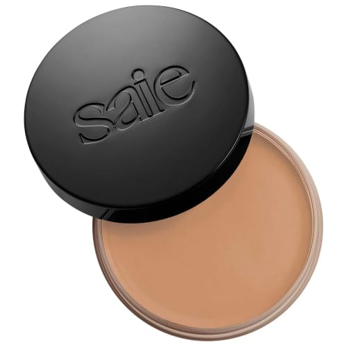
Saie Sun Melt Cream Bronzer in Fair Bronze
Best Fair-Skin Balm
Fair Bronze is chosen for its fair-skin depth and neutral direction together. One label alone would not be enough.
Saie offers an unusually useful bit of shade language: its Fair Bronze Sun Melt is classified as neutral for fair-to-fair-light skin. That narrows the search more responsibly than choosing a product merely because the compact looks pale. The current PKB confirms the 01 Fair Bronze cream-balm bronzer in a 1-ounce size.
A balm can be pressed on in a modest amount and worked into a light foundation without a hard powder edge. The finish is meant to look natural and softly radiant, which differs from the dry matte effect of a sculpting powder. If you dislike balmy textures or prefer sharp contour placement, its creamy slip may not suit your routine.
Bottom line: Choose Fair Bronze for fair neutral balm warmth; skip it if your base cannot handle an emollient finish.
- ✅ Fair Bronze is maker-labelled neutral
- ✅ Cream balm suits gentle blending
- ❌ Balmy texture is not every wearer’s preference
- ❌ Fair shade may be too light for medium skin
🧪 Lash Lab Notes — Zayba (A-Level Student & Beauty Enthusiast)
Fair-bronze product labels are useful only if both shade depth and undertone fit. A too-dark neutral balm can still read as an unnatural band.
- 💡 Editor’s Note: We would apply Fair Bronze only where a little warmth is missing, not as a full-face tint. That makes it easier to assess the color before building it up.
Explore the listing and buyer reviews for Saie Sun Melt to confirm the exact shade before purchasing.
Reader recommendation: Best for fair wearers wanting a neutral cream balm.
A powder can keep the neutral direction while changing the finish entirely.
Hourglass Ambient Lighting Bronzer
Best Radiant Neutral Powder
A neutral bronze hue comes with luminous powder rather than a flat matte finish.
Hourglass describes Nude Bronze Light as a neutral bronze for light-to-medium complexions, mixed with its illuminating powder technology. That shade description is the reason this specific compact is here. The PKB identifies the full-size 11-gram Nude Bronze Light product; do not confuse it with Luminous Bronze Light, the similarly named but separately shaded bronzer.
The advantage is an airy, radiant finish that does not rely on picking a strong gold undertone for visible color. Fine powder can diffuse along the cheeks and temples instead of leaving a hard cream border. The trade-off is shine: anyone seeking a completely matte shadow should consider the Tower 28 option or a matte powder instead.
Bottom line: Choose Nude Bronze Light for radiant neutral powder; skip it if even subtle sheen bothers you.

- ✅ Official shade description calls Nude Bronze Light neutral
- ✅ Airy illuminating powder finish
- ❌ Radiant finish may emphasize texture you prefer matte
- ❌ Light-medium depth does not extend to deep skin
🧪 Lash Lab Notes — Dr. Rabeya (Dentist & Beauty Enthusiast)
The light-catching finish can soften the look of applied color, but shine is a separate decision from undertone. Pick both deliberately.
- 💡 Editor’s Note: We would make finish the final filter here: Nude Bronze Light is a strong consideration if glow is desirable, not just tolerated. Powder lovers who demand matte can move on.
Explore the listing and buyer reviews for Hourglass Ambient Lighting Bronzer to confirm the exact shade before purchasing.
Reader recommendation: Best for light-medium wearers who welcome subtle radiance.
Deeper complexions need their own shade-depth choice, not a pale neutral borrowed from another range.
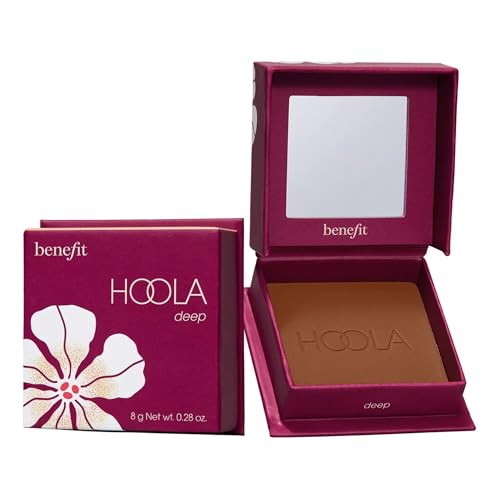
Benefit Hoola Matte Bronzer in Deep
Best Deep-Skin Matte
A deeper neutral-labeled matte shade broadens the choices beyond light and medium skin.
The Deep variant is a specific shade in this matte powder range, not the original Hoola compact renamed for deeper skin. The brand recommends Deep for deeper complexions; a retailer shade chart identifies this variant as neutral rather than the distinctly warmer Medium shade. The verified PKB entry is the Deep 0.28-ounce powder with a buildable matte finish.
This is a more sensible destination for someone who finds light neutral bronzers barely visible or chalky on deeper skin. A matte powder is also practical when a cream bronzer feels too emollient for the rest of the base. Yet neutral and deep are separate variables: check the shade against your own undertone and depth, because even a brand-labeled neutral may reveal extra red or orange on some faces.
Bottom line: Choose Hoola Deep for deeper-skin neutral matte powder; skip it if you need a noticeably radiant finish.
- ✅ Deep variant is intended for deeper complexions
- ✅ Buildable, matte powder texture
- ❌ Matte effect is not for a glow-seeking shopper
- ❌ Deeper skin still needs undertone checking
🧪 Lash Lab Notes — Dr. Sazia (Medicine Specialist & Beauty Enthusiast)
Deep-skin bronzer shopping often fails when reviewers equate neutral with light. Compare a sufficiently deep powder first, then assess its color direction.
- 💡 Editor’s Note: We would not treat this as a universal dark-skin match. The valuable feature is having a deeper neutral-labeled option to test in person.
Explore the listing and buyer reviews for Benefit Hoola to confirm the exact shade before purchasing.
Reader recommendation: Best for deeper complexions seeking neutral matte powder.
When a matte look matters more than a glowing finish, it helps to compare additional powder formulations before deciding. A dedicated matte-bronzer guide lets you assess alternatives without confusing finish with undertone.
For fair skin, baked powder provides a lighter-feeling alternative.
Laura Geller Bronze-n-Brighten in Fair
Best Soft Baked Finish
A fair baked powder favors diffused warmth and a natural-looking finish.
Laura Geller’s Fair baked bronzer is included for shoppers who want modest warmth without an obvious painted-on tan. The brand positions Fair for very fair through light complexions, and its marketing emphasizes avoiding orange pigment. Treat that as the maker’s formulation claim, not an independent guarantee that every wearer will see zero warmth shift.
Its baked-powder format offers an alternative to rich cream on days when a natural finish feels easier to manage. Starting with a light pass is wise: fair does not automatically mean cool, and even finely dispersed pigments need a foundation shade that works with them. The selected PKB record is the single Fair Natural Finish compact; its exact net weight remains unconfirmed.
Bottom line: Choose Fair for a diffused baked-powder option; skip it if a much darker shade is necessary.

- ✅ Fair variant serves very fair to light skin
- ✅ Baked powder with natural finish
- ❌ Fair depth will not show well on darker skin
- ❌ Brand claim cannot guarantee zero orange cast
🧪 Lash Lab Notes — Mahmuda (Homemaker & Beauty Enthusiast)
The baked format may blend the color into a softer edge, yet no powder texture can change a mismatched pigment. A daylight cheek swatch remains the test.
- 💡 Editor’s Note: We would buy the Fair variant intentionally, not simply the first Bronze-n-Brighten listing. This is one case where the shade name is part of the recommendation.
Explore the listing and buyer reviews for Laura Geller Bronze-n-Brighten to confirm the exact shade before purchasing.
Reader recommendation: Best for fair wearers who prefer baked powder.
Prefer liquid color? There is also a named neutral shade worth a close look.
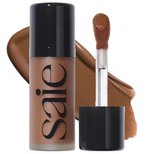
Saie Dew Bronze in Spritz
Best Neutral Liquid
A neutral liquid gives light-medium to tan skin another texture to consider without picking a warm shade.
Spritz supplies a liquid option without pretending that the unlisted deep shade Sail is available. Saie identifies Spritz as light-medium to tan with neutral undertones; the PKB confirms the 03 Spritz variant at 0.4 ounce, or 12 milliliters. The brand describes a soft-focus, targeted application style with a doe-foot applicator.
That format suits someone who prefers tapping controlled dots into a liquid or cream base instead of dusting powder over it. Keep the initial number of dots small so you can see what the shade itself looks like once blended. This is not the deep-to-rich Sail shade, and it cannot substitute for someone who specifically needs Sail’s depth.
Bottom line: Choose Spritz for controlled light-medium-to-tan liquid warmth; skip it if you need a rich-depth shade.
- ✅ Spritz is maker-labelled neutral
- ✅ Doe-foot liquid format supports targeted placement
- ❌ Spritz is not a deep-rich shade
- ❌ Liquid demands blending before it sets into the base
🧪 Lash Lab Notes — Engr. Nusrat (Engineer & Beauty Enthusiast)
Choose the neutral Spritz designation because it matches the intended complexion range. Swim is warmer and Sail deeper; neither is the same product identity.
- 💡 Editor’s Note: We would test one dot over your usual foundation and let it settle before adding more. If Spritz lacks depth, do not try to create Sail by piling on layers.
Explore the listing and buyer reviews for Saie Dew Bronze to confirm the exact shade before purchasing.
Reader recommendation: Best for light-medium to tan wearers seeking neutral liquid bronze.
Before checking out, put the shade label through a simple daylight test.
Shade-Selection Checklist Before You Buy
Step 1: Find the depth first. Match the amount of color you want to add to your actual skin depth, not to a shade-name ranking. Deep skin may need a much richer bronzer than a neutral light-medium compact can provide.
Step 2: Read the whole shade description. Neutral, cool, neutral-warm, and golden-warm are not interchangeable words. For example, Saie lists Spritz as neutral but Swim as warm, even though both sit inside Dew Bronze.
Step 3: Compare a cheek swatch with your usual base. Apply a small amount near your cheekbone and blend its edge into your foundation. A brown smear on a bare arm often tells you less than a swatch near your face and neck.
Step 4: Judge it in natural daylight. Indoor yellow lighting can disguise a warm edge or exaggerate a muddy one. Look at the color, not only the smoothness of the blend, and check again after the product has settled.
Step 5: Stop at the first convincing layer. If a light pass looks right but more product turns conspicuously orange, the depth or saturation may be excessive. Do not assume another layer improves the shade.
If a product you already own looks orange or muddy, that is a different question from choosing a new shade in advance. The existing guide addresses the diagnostic side.
What If Every Bronzer Still Looks Warm?
Some complexions, especially those with olive or distinctly cool undertones, may make even a manufacturer-labeled neutral bronze read unexpectedly orange. That does not make every product deceptive; the color is being judged against your individual skin, the makeup underneath it, and the amount applied. A very cool contour may solve the shadow problem but leave you missing the warmth you wanted.
If that sounds familiar, separate two goals before shopping again: adding believable warmth to the cheeks and adding sculpted depth beneath them. Tower 28 Getty fits the quieter second job; a neutral bronzer that matches your depth is the candidate for the first. Avoid chasing a supposedly universal gray shade, because it may turn ashy or flat instead of flattering.
If your priority shifts to finish, texture, or budget instead of orange-cast avoidance, the larger category guide offers a broader shortlist. Hue and exact shade remain the deciding filters here.
Questions About Non-Orange Bronzer
The most common sticking points are whether a shade is truly neutral and whether the right formula can change the color it creates. Here is how to keep those decisions separate.
❓ Is cool bronzer always better than neutral bronzer?
No. Cool-toned color can provide contour-like shadow, but bronzer is usually meant to add some warmth. A neutral shade at the correct depth may look more natural than an overly gray cool brown.
❓ Which bronzer shade should fair skin try first?
Start with a fair-specific, maker-described neutral like Saie Sun Melt Fair Bronze, then compare Laura Geller Fair if you prefer baked powder. Check both in daylight because even light shades can lean orange on a particular complexion.
❓ Can deep skin use a neutral bronzer without looking ashy?
Yes, if the bronzer is deep enough and the color direction complements the skin. Benefit Hoola Deep is one matte neutral-labeled option to compare; a fair or light-medium neutral powder is not an interchangeable alternative.
❓ Are cream bronzers less orange than powder bronzers?
Not by default. Cream and liquid textures may be easier to diffuse over a creamy base, while powders sit differently on the skin. Pigment shade, depth, and the completed face makeup still determine the visible color.
❓ Can a contour stick replace bronzer?
Sometimes, when your goal is shadow and definition rather than warmth. Tower 28 Sculptino Getty is included as that crossover choice, not as a promise of classic sun-kissed color.
Final Thoughts on Choosing a Bronzer Without Orange Cast
The payoff is a little believable warmth instead of the orange streak that sent you searching in the first place. Begin with the depth your skin needs, narrow by the brand’s specific shade undertone, and finish with a daylight cheek swatch beside your regular base.
For a muted, buildable mousse, consider Fenty Maple Glaze. For a neutral cream suited to light-medium depth, compare Anastasia Amber; for a deeper matte powder, examine Benefit Hoola Deep.
If you would rather sculpt than bronze, Getty may be the more useful product. No shade is orange-proof on every face, but a careful match makes the odds much better.
Last update on 2026-10-29 / Affiliate links / Images from Amazon Product Advertising API