
⚡ Quick Answer: eyeliner for men
A subtle result depends on three things: shade contrast, line width, and placement. For definition without a drawn-on stripe, we can start with a softer dark shade and a narrow line close to the upper lashes. Then we check with our eyes open before adding more.
Most beginners are not chasing an elaborate eye look immediately. We usually just want a little more definition without letting the liner take over. Eyeliner for men is not a separate product category or a gender-specific technique; the useful choice is simply how visible we want the result.
That visibility choice is the focus here: subtle, clearly defined, or deliberately bold. We will use only enough technique to make that decision practical. For deeper fundamentals, eye-shape methods, and full application help, the linked guides handle those topics without turning this page into another general tutorial.
✨ Inside This Liner Guide
🌸 Psst…
Some links in this post are affiliate links. If you shop through them, we may earn a small commission at no extra cost to you — like a little coffee while we keep testing beauty favorites. ☕💄
Choose Your Visibility Level First
Want to avoid accidentally going heavier than planned? Decide on the finish before drawing. We can think in three broad levels: barely-there definition, clear everyday liner, and an intentional statement look. None is more or less appropriate for men; each just creates a different visual effect.
The three dials of subtlety are contrast, width, and coverage. Dark brown or a softer black usually contrasts less than the deepest matte black. A narrow line near the upper lash roots reads quieter than a thick band. Keeping liner to a smaller area, such as the outer upper lash line, also stops it from dominating the whole eye.
And we do not have to turn every dial together. Black liner can still look restrained when the line stays very thin and the placement stays limited.
Brown can still look obvious when it is thick and wraps around the entire eye. So “use brown” or “keep it natural” only tells part of the story. The final effect comes from the combination.
Still unsure which shade gives the right contrast? Brown versus black is the next comparison worth settling. The dedicated color guide explains how each changes the overall effect without sending this article into a shade-by-shade detour.
What if the goal is rock, goth, emo, smoky, or graphic liner? Stronger contrast is not an error then; it is intentional. The same framework still applies. We are simply choosing a higher-visibility setting on purpose.
Pick the Format That Matches the Finish
For a first subtle attempt, pencil is more forgiving. Pencil and gel-pencil lines can usually be built with short strokes, then softened before the edge feels too crisp. Retractable pencils skip the sharpening step, although their tips may not stay as fine as a freshly sharpened wooden pencil. Liquid fits better when a sharp edge or graphic definition is actually the goal.
| Format | Best for | Main advantage | Main trade-off |
|---|---|---|---|
| Pencil or gel pencil | Subtle or smoky definition | Easy to build gradually and soften | Tip sharpness and wear vary by formula |
| Retractable pencil | Quick beginner-friendly use | No sharpener needed | Broader tip can make ultra-fine lines harder |
| Liquid liner | Crisp or graphic looks | Precise, high-definition edge | Less forgiving if you want a soft first pass |
Narrowed it down to liquid or pencil? The useful difference is control, finish, and how much correction time each gives us. That comparison deserves more depth than this audience guide needs.
“Easier” is still a practical judgment rather than a universal rule. Someone already comfortable drawing crisp lines may prefer liquid right away. A first-time user who wants time to soften or correct intensity may find pencil easier to control.
There are several eyeliner formats, but we only need one practical distinction here. Pencils and gel pencils soften more easily, while liquid gives a crisper line. The complete eyeliner guide covers the wider format and application picture.
A Subtle First-Pass Method
Do we need a full wing tutorial just to see whether eyeliner suits us? No. A first pass can stay deliberately reversible. Every choice below can be intensified later, while starting small makes it easier to notice what improves the eye instead of simply adding more pigment.
Step 1: Start with a dark-brown or soft-black pencil.
A lower-contrast shade gives us more room to learn placement before liner becomes the first thing people notice. For an obviously rock or graphic result, black is completely valid; it simply turns up the contrast dial.
Step 2: Add tiny strokes close to the upper lash roots.
Short marks are easier to manage than one perfect uninterrupted line. For the smallest change, we can keep most definition toward the outer portion instead of automatically circling the whole eye.
Step 3: Soften the edge only when it looks harsher than intended.
Pencil or gel pencil can be blurred slightly while it is still workable. Once the line looks intentional, stop. “Smoky” should be a chosen finish, not endless rubbing that spreads pigment farther than planned.
Step 4: Check with our eyes open before adding anything else.
This is the most useful stopping rule. Look straight ahead in normal lighting and ask whether the definition is visible enough. If it is, we are done. Width, contrast, or coverage only needs to increase when the current result is genuinely too subtle for the goal.
These four steps are a first-pass framework, not a complete pencil-liner lesson. Want deeper help with line control, hand position, and fuller application? The dedicated technique guide is the better next stop.
Three Eyeliner Picks That Fit This Guide
These are examples that support the guide, not a ranking of the “best eyeliner for men.” Each covers a different beginner need: adjustable blendability, inexpensive retractable convenience, or a more premium smoky pencil feel. Affiliate links appear below; DapperedChic may earn a commission from qualifying purchases at no extra cost to you.
Maybelline Tattoo Studio Automatic Gel Pencil
Blendable beginner pick
Want room to build definition gradually? A mechanical gel pencil makes that easier than committing to a hard liquid edge. Expressotini/Smokey Brown offers a lower-contrast route, while darker options can bring more presence. That makes the blendable brown-to-black range idea practical without changing the visibility framework.
Maybelline describes the formula as waterproof and smudge resistant. Those are manufacturer positioning claims, not a promise of identical wear for every person. The automatic format also removes sharpening from the routine. The trade-off is that a mechanical point may not create the razor-fine edge wanted for a graphic line.
Bottom line: A flexible beginner choice when we want to move from restrained definition toward a smokier look without starting with liquid precision.

- ✅ The retractable gel-pencil format keeps a first routine uncomplicated.
- ✅ Brown-toned and darker options let us adjust the visibility level.
- ✅ Short strokes can be softened when a less rigid edge suits the look.
- ❌ A look that specifically depends on an ultra-fine, crisp liquid-style edge.
- ❌ Anyone treating manufacturer wear claims as a guarantee of zero transfer in every condition.

🧪 Lash Lab Notes — Zayba (A-Level Student & Beauty Enthusiast)
I like that a retractable pencil can be softened after application, because that gives a first-time user more room to correct intensity than a crisp liquid line. I would start with the smallest amount that still shows with the eyes open, then decide whether another pass is really needed.
- 💡 Editor’s Note: Think of the brown option as a contrast control, not a rule for men. Prefer a darker look? The same narrow-placement framework can still keep stronger pigment controlled.
Wondering what buyers say about texture and wear? Read current reviews for the Maybelline Tattoo Studio Pencil before deciding.
Reader Recommendation: Best for a beginner who wants a retractable pencil that can be built and softened little by little.
Care Tip: Advance only a small amount at once, recap after use, and remove eye makeup gently when wear is over.
If this format feels right, a broader pencil roundup can help us compare other formulas while keeping the same subtlety framework. That is more useful than treating one pencil as universally best for every eye or finish.
Choose this route when adjustability matters more than getting the sharpest possible edge immediately.
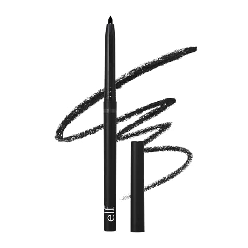
e.l.f. No Budge Retractable Eyeliner
Simple budget entry point
This retractable matte pencil plays a different role: easy experimentation without a sharpener or a premium commitment. The Black variant has intentionally higher contrast than brown. So the simple budget entry point works best when we control visibility through width and placement instead of expecting the shade itself to look soft.
The formula is positioned as creamy, water-resistant and smudge-resistant. Buyer feedback commonly praises smooth application, strong black color, convenience, and value. Wear, smudging, texture, pigmentation, and tip breakage get mixed feedback, though. Those points are better treated as user-reported patterns than guaranteed performance.
Bottom line: A practical low-cost option for a beginner who wants matte black and no-sharpening convenience, as long as the first line stays narrow when subtlety is the goal.
- ✅ The retractable design means there is no separate sharpener to manage.
- ✅ Matte black can give clear definition with very little product.
- ✅ Buyer feedback supports its appeal as an accessible everyday experiment.
- ❌ A look built specifically around lower-contrast brown.
- ❌ Anyone needing an extremely fine tip or expecting zero smudging in every condition.
🧪 Lash Lab Notes — Fauzia (University Student & Beauty Enthusiast)
I see the low-cost retractable format as an easier way to experiment, but matte black will still read stronger than brown. I would keep that first pass very narrow, then judge the result before adding any width.
- 💡 Editor’s Note: Convenience is the strongest reason to pick this one, not a special “men’s” formula. The black shade can still read understated when we limit it to the lash roots instead of building a thick band.
Want to see how current shoppers rate its convenience and wear? See the e.l.f. No Budge Eyeliner.
Reader Recommendation: Choose it for inexpensive, no-sharpening matte definition when black matches the intended contrast.
Care Tip: Retract only a little product at once to reduce breakage, then soften promptly if a blurred edge is the goal.
This is the straightforward convenience pick. If a softer shade or premium kohl texture matters more, keep moving.
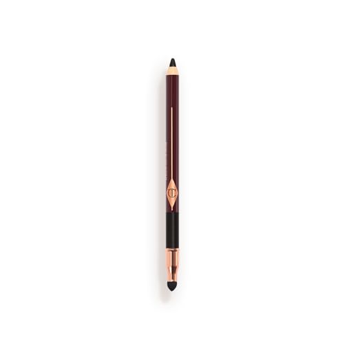
Charlotte Tilbury Rock ‘N’ Kohl
Premium smoky option
Bedroom Black is a smoky matte black. That makes this a premium smoky option, not a lower-contrast brown pick. The creamy kohl-to-matte positioning and built-in smudging use fit a deliberately softened, lived-in edge rather than the least expensive first experiment.
Charlotte Tilbury positions the formula as waterproof and smudge-proof with extended wear. Buyer feedback commonly praises the color, silky application, longevity, and soft texture. Smudge resistance gets mixed reviewer feedback, and the product is in a higher price tier. Neither the marketing claims nor the premium position should become a universal performance guarantee.
Bottom line: A stronger match when we value a soft smoky pencil experience and premium feel more than low contrast or minimal spend.
- ✅ The creamy kohl-style texture can support precise or intentionally smudged looks.
- ✅ Built-in smudging utility works well for a softer, less rigid edge.
- ✅ Reviewer patterns commonly praise the color, application, longevity, and texture.
- ❌ Anyone who specifically needs a verified dark-brown shade for lower contrast.
- ❌ A budget-first beginner mainly looking for the simplest inexpensive trial product.
🧪 Lash Lab Notes — Dr. Rabeya (Dentist & Beauty Enthusiast)
I think of a soft kohl texture as another way to control the visual edge: keep the placement narrow, then blur only enough to take away harshness. Bedroom Black is still a dark shade, so I would rely on the open-eye check instead of assuming “smoky” automatically means subtle.
- 💡 Editor’s Note: Pick this for the premium, smudgeable feel, not because Bedroom Black is low contrast. If genuinely lower shade contrast is the priority, a brown pencil is the better match.
Curious how buyers experience this premium kohl? Check reviews for Charlotte Tilbury Rock ‘N’ Kohl.
Reader Recommendation: Best for a premium smoky black look when softening matters more than low contrast.
Care Tip: Keep pressure light, smudge while the line remains workable, and remove it with an eye-area makeup remover.
Choose this path for an intentionally softer edge, not because premium automatically means more subtle.
Eye Shape Changes What Stays Visible
A line can look surprisingly different when the eye closes and opens. Hooded lids, monolids, and double eyelids expose different amounts of mobile lid space. That means copying someone else’s line thickness can leave ours looking thinner, thicker, or partly hidden once we look straight ahead.
So what is the useful check? Apply a small amount, open both eyes normally, and judge what is actually visible with eyes open. If part of the line disappears, adjust only what needs to stay visible. If it suddenly looks heavy, reduce width or coverage rather than assuming the eye shape needs a totally different aesthetic.
Eye-shape labels describe; they do not prescribe. Two people with hooded eyes, for example, can still prefer different placements and visibility levels.
Want more detail on how lid structure changes placement? The dedicated eye-shape guide handles that depth better. Keeping it there also stops this audience-specific guide from becoming a shape-by-shape tutorial.
Lash Line vs. Waterline: Keep Safety in the Decision
Subtle liner does not require placing cosmetic product directly on the moist inner eyelid rim. We can get plenty of definition near the visible lash line, and waterline is not required for a close-to-the-lashes effect.
What does the available evidence tell us about placement? A small 2015 crossover pilot indexed on PubMed involved only three female subjects. It found faster and greater cosmetic-particle migration into the tear film when eyeliner sat posterior to the lash line than when applied anterior to it.
Migration peaked around five to ten minutes in that experiment. That makes the study useful for explaining a placement mechanism, not for predicting one person’s irritation risk.
A later PubMed also discusses how eye cosmetics can affect tear-film stability and contaminate contact lenses. This does not mean everyone wearing liner near the eye will have a problem.
It means contact-lens wearers and people with sensitive or dry eyes have a stronger reason to stay conservative about placement and hygiene.
The U.S. Food & Drug Administration advises using cosmetics intended for the eye area and avoiding shared eye cosmetics. It also advises stopping use if irritation occurs and seeking medical attention if irritation persists. Those basics matter more than chasing a particular “guyliner” technique.
What about tightlining? It generally means placing liner very close to the lash roots to increase the impression of lash density. We stop at that definition here because exact placement deserves its own technique instructions.
Waterline placement needs its own safety decision because it puts product closer to the ocular surface than an external lash-line application. We may wear contacts, deal with recurring irritation, or simply want the trade-offs before trying it. In any of those cases, the dedicated safety guide is more useful than assuming the inner rim is necessary for subtle definition.
If Your Liner Smudges or Transfers
First, is the softness intentional? A deliberately smudged pencil edge can be part of the look. Unwanted transfer is different: pigment moves somewhere it was not meant to go, such as the upper lid or below the eye.
For a first diagnostic, we can check three things. Is the line thicker than needed? Does the placement make it touch another part of the lid with the eyes open? Is the formula positioned for longer or more water-resistant wear?
Watery eyes, oilier lids, application thickness, and formula differences can all change wear, so “waterproof” is not a universal guarantee.
Still getting the same transfer after reducing excess product and checking placement? Then the problem needs a more focused troubleshooting pass. The full smudging guide covers common causes and fixes without turning this section into a complete diagnostic.
Confidence Without a “Male” Rulebook
Men do not have to keep eyeliner invisible, wear only black, or make the finish deliberately rough. “Guyliner” can be a useful colloquial label in a style conversation. The cosmetic is still eyeliner, though, and the meaningful choice is the look we want.
Subtle, sharp, smoky, goth, emo, rock, and graphic liner can all be intentional. What matters is whether the result fits our style, setting, and comfort level, not somebody else’s idea of masculinity. It is a style choice, not a gender test.
Why do beginner questions sound so familiar across communities? Recent discussions often come back to the same controls covered here: brown versus black, staying close to the lashes, and avoiding a more made-up result than intended. Those are questions about outcome and confidence, not evidence that we need a separate male-only product system.
For almost invisible definition, we can keep contrast, width, and coverage low. For dark, obvious liner, we can turn those dials up deliberately. The point is simple: choose the effect rather than arriving there by accident.
Common Questions About Eyeliner for Men
A few beginner questions remain after the visibility framework. We will keep the answers short because the deeper technique and safety topics already have dedicated guides above.
❓ Can men wear eyeliner without it looking too dramatic?
Yes. We can keep the line narrow, close to the upper lashes, and limited in coverage. A lower-contrast shade can add another layer of subtlety. Then we check with the eyes open before making the line thicker.
❓ Is brown or black eyeliner better for men?
Neither is universally better. Dark brown usually gives softer contrast, while black creates stronger definition. The useful choice depends on how visible we want the liner, not a gender rule. Width and placement can make either shade read more or less dramatic.
❓ Is pencil or liquid eyeliner easier for a beginner?
Pencil or gel pencil is often more forgiving for a subtle first try because we can build it with short strokes and soften the edge. Liquid makes sense when crisp precision is the actual goal, especially for graphic or sharply defined looks.
❓ Does eye shape change how men should wear eyeliner?
Eye shape can change how much liner stays visible with the eyes open, but it does not dictate one correct style. We can apply a small amount, look straight ahead, and adjust only what disappears, transfers, or feels visually too heavy for the intended result.
Final Thoughts: Make the Eyeliner Match Your Intent
Worried about ending up with a drawn-on black stripe? Keep one rule in mind: choose the visibility first. Then adjust shade contrast, line width, and placement one notch at a time. Start smaller than expected, check with the eyes open, and add only what improves the result.
Subtle, smoky, rock, goth, and graphic eyeliner are all style choices. The right version is the one that looks intentional to us, not the one that follows a made-up rule about who eyeliner is for.
Last update on 2026-10-18 / Affiliate links / Images from Amazon Product Advertising API