
⚡ TL;DR: eyeshadow palette for blue eyes
Want the easiest contrast? Warm bronze, copper, peach, and brown palettes give us a clear route. Rose and mauve can work just as well when cooler colors feel better.
The best palette is not the one with one perfect pan. We need coordinated light, midtone, lid, and depth shades that can finish a whole look.
Top Picks
- 🏆 Best Overall — Tarte Tartelette in Bloom — Warm-neutral balance with useful structure
- 🥈 1st Runner-up — ColourPop Nude Mood — Simple warm-neutral value in nine pans
- 🥉 2nd Runner-up — Urban Decay Naked3 — A softer rose-neutral alternative
A beautiful palette gets annoying fast when only three shades cooperate. We have all seen that shelf-clutter problem.
The best eyeshadow palette for blue eyes needs three things: contrast, cohesion, and a color story that works with the complexion too. So this guide stays focused on coordinated palettes, not single shadows.
✨ Inside This Eyeshadow Guide
🌸 Psst…
Some links in this post are affiliate links. If you shop through them, we may earn a small commission at no extra cost to you — like a little coffee while we keep testing beauty favorites. ☕💄
Quick Comparison: Best Eyeshadow Palette for Blue Eyes
Six palettes, one goal. Which route fits us best? Some keep things tight with four pans, while others give us a much broader neutral wardrobe.
| Product | Best For | Shade Story | Palette Size | Key Trade-Off |
|---|---|---|---|---|
| Tarte Tartelette in Bloom | Best all-around balance | Neutral bronze | 12 shades | Less suited to distinctly cool looks |
| Anastasia Soft Glam | Everyday-to-night flexibility | Neutral, rose, bronze | 14 shades | More choice than minimalists need |
| Too Faced Natural Nudes | Maximum range | Warm nude, caramel, rose-gold | 16 shades | Larger palette means more decision overhead |
| ColourPop Nude Mood | Budget-conscious simplicity | Warm neutral | 9 shades | Less tonal range than larger palettes |
| Urban Decay Naked3 | Cooler rose neutrals | Rose, mauve, taupe | 12 shades | Less ideal for orange-heavy warmth |
| Charlotte Tilbury Bella Sofia | Compact bronze looks | Bronze, copper | 4 shades | Few alternate color routes |
How to Choose a Palette That Flatters Blue Eyes
Where do we start? With the kind of contrast that feels natural on the whole face.
Copper, bronze, peach, caramel, and warm brown typically stand out clearly against blue irises. Rose, mauve, burgundy, and taupe can add definition too. They simply feel less orange-heavy, which may suit cooler styling preferences better.
Next: does the palette work as a system?
A useful color story usually gives us a light shade for softening or brightening. We also want at least one workable transition tone, a lid shade or two, and enough depth for the outer corner or lash line.
That light-to-deep order matters. A long row of pretty pans means less if several shades do the same job.
Then we check the usable shade ratio. A 16-pan palette is not automatically more versatile than a four-pan quad.
What matters is whether those extra pans open different routes. Soft daytime neutrals, warmer bronze looks, rose-toned looks, and deeper evening definition all count. Near-duplicates do not add the same kind of range.
And what about finish?
Mattes usually handle transition and depth cleanly. Satin, metallic, or shimmer shades can bring light-catching contrast to the lid.
We do not need every finish in one case. Still, a thoughtful mix can make even a smaller color story feel complete.
One last filter matters just as much: complexion preference. Blue eyes may stand out beside copper, but that does not mean orange-heavy makeup will feel right on every face.
The sweet spot? Iris contrast and the rest of the makeup should both feel intentional.
Best Eyeshadow Palette for Blue Eyes
Pan count is not the contest here. Each palette below solves a different problem.
We looked first at shade versatility and cohesion. Then we asked a simpler question: can this palette build a complete look without another one stepping in to fix obvious gaps?
Tarte Tartelette in Bloom Palette
Best Overall
Looking for one neutral palette we can reach for without overthinking it? This is the easiest place to start.
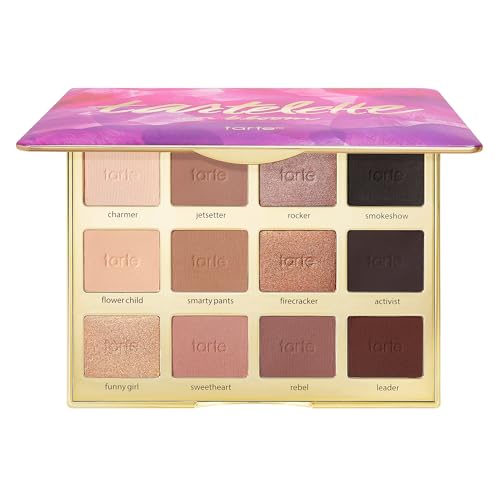
It is a neutral-and-bronze powder palette built around balanced warm-neutral structure. Matte and shimmer options take us from softer looks into deeper ones.
The warm bronze direction gives blue eyes an intuitive contrast route. But it does not stop at one copper-lid idea. The broader neutral setup keeps the palette useful for more than a single look.
That is really the strength here: cohesion. Light, midtone, shimmer, and deeper neutral territory all have clear jobs.
So we can move from fresh makeup toward evening definition without immediately needing another palette.
What did buyers say? In the supplied product data, feedback is especially positive about the matte-and-shimmer mix, soft texture, blendability, and everyday usefulness.
The listing also describes the formula as long lasting. We keep that in the product-claim lane, though, rather than treating it as our own wear-test result.
Bottom line: Best balanced one-palette option for warm-neutral contrast and day-to-night structure. A distinctly cool color story is still better served elsewhere.
- ✅ Neutral and bronze shades work together for complete looks
- ✅ Matte and shimmer finishes give us useful variety
- ✅ Buyer feedback often highlights blendability and everyday usefulness
- ❌ A clearly cool rose or mauve story may feel more suitable elsewhere
- ❌ Familiar neutrals may feel too conventional when unusual colors are the goal

🧪 Lash Lab Notes — Mahmuda (Homemaker & Beauty Enthusiast)
I like a light-to-deep sequence because every shade has a clear job. That makes everyday makeup easier to read, and the palette can move from soft definition to a deeper finish without another compact.
- 💡 Editor’s Note: We would pick this when ease matters more than novelty. Warm neutrals are everywhere; the useful part is having those browns and bronzes arranged into a color story that actually works together.
Curious what the neutral mix feels like in real routines? See how current buyers describe the Tarte Tartelette in Bloom before deciding whether it suits ours.
This fits best when one neutral-bronze palette needs to move from daytime to evening without much fuss.
Want more variety than that? The next picks give up some simplicity for broader or more specialized shade routes.
Anastasia Beverly Hills Soft Glam Palette
Best for Everyday-to-Night
Need more room between a quiet daytime eye and a smokier evening one? Soft Glam gives us that space.
This 14-shade powder palette has nine ultra-mattes and five metallics. That mix gives it the easiest day-to-night range in this roundup.
One understated combination is only the starting point. Neutral, rose, bronze, and deeper shades let us build intensity in smaller steps.
That makes the palette flexible. It also creates the obvious trade-off: more pans mean more choices.
If a nine-pan or four-pan routine already feels ideal, fourteen shades can be unnecessary. But when we enjoy changing intensity, those extra midtones and deeper shades have distinct roles.
So what does the supplied feedback tell us? Review themes are strong for pigmentation, color selection, blendability, and smooth application.
Longevity is less consistent. Some reviewers also mention fallout, so we cannot treat wear or cleanliness as universally consistent.
Bottom line: Best for flexible intensity when several soft-to-smoky routes matter more than compact simplicity. Minimalist routines may be happier with fewer pans.

- ✅ Nine matte and five metallic shades give broad finish coverage
- ✅ Buyers consistently praise pigmentation and blendability
- ✅ The shade range can move from everyday looks into stronger definition
- ❌ Fourteen shades can feel excessive in a streamlined routine
- ❌ Mixed longevity feedback matters when crease-free all-day wear is the priority
- ❌ Some reviewers mention fallout, which can mean extra cleanup
🧪 Lash Lab Notes — Dr. Rabeya (Dentist & Beauty Enthusiast)
I find the gradual light-to-deep progression the useful part here. Several midtones and deeper shades let us build definition in steps, so the same palette can cover restrained daytime makeup and a more defined evening look.
- 💡 Editor’s Note: More choice is only useful when we will use it. We would lean toward Soft Glam for those extra midtones and depth shades, not because a bigger palette automatically looks more impressive.
Wondering how that wider range works across different routines? Read current feedback on Anastasia Soft Glam.
This is the neutral option for us when both soft everyday makeup and fuller-glam looks need to live in one palette.
And if even more finish and shade variety sounds useful? The next palette takes that idea further.
Too Faced Born This Way Natural Nudes Palette
Best for Maximum Shade Range
Do we actually enjoy having options? If yes, this is where the roundup opens up.
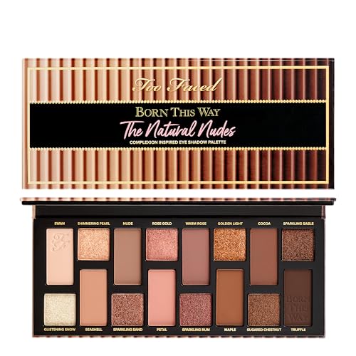
The 16-shade creamy-powder palette spans warm neutrals with matte, metallic, and shimmer finishes. It is our widest finish-and-shade playground here.
Warm nude, caramel, rose-gold, and deeper chocolate shades create several neutral directions. We are not locked into one bronze route or one rose route.
But a larger palette earns its space only when those roles get used. More lid finishes and more depth options can be genuinely helpful.
If we keep reaching for the same four pans, though, all that extra choice becomes decision overhead.
What does the supplied feedback support? Review themes are strongly positive on pigmentation, blendability, neutral versatility, shimmer quality, and longevity.
There was no distinct negative performance theme in that data. So the fair caution is palette size and our own usable-shade ratio, not an invented formula weakness.
Bottom line: Best for maximum creative range when several warm-neutral routes and finishes will get real use. A tighter palette makes more sense for a minimalist routine.
- ✅ A broad warm-neutral range opens several different look directions
- ✅ Matte, metallic, and shimmer finishes widen lid and depth choices
- ✅ Reviewer themes strongly favor pigmentation, blendability, and longevity
- ❌ Sixteen shades can add needless choice when the routine stays fixed
- ❌ The larger format is inefficient if only a few warm neutrals get regular use
🧪 Lash Lab Notes — Engr. Nusrat (Engineer & Beauty Enthusiast)
For me, a large palette works when the pans solve different jobs, not when they just raise the count. The finish and shade variety matter most if we use those alternate routes instead of returning to the same small cluster.
- 💡 Editor’s Note: We would not choose this simply because sixteen is the biggest number in the table. Its real appeal is switching between quiet matte definition and brighter reflective lids while staying in the same neutral family.
Does a bigger palette sound worth the space? Before committing, compare current buyer impressions of Too Faced Natural Nudes.
This works best for routines that genuinely use several warm-neutral finishes and different intensity levels.
Prefer fewer decisions and a lower-cost warm story? The next palette cuts the size down sharply.
ColourPop Nude Mood Palette
Best Budget
Want the warm-neutral idea without buying a large shade collection? Nude Mood keeps things compact.
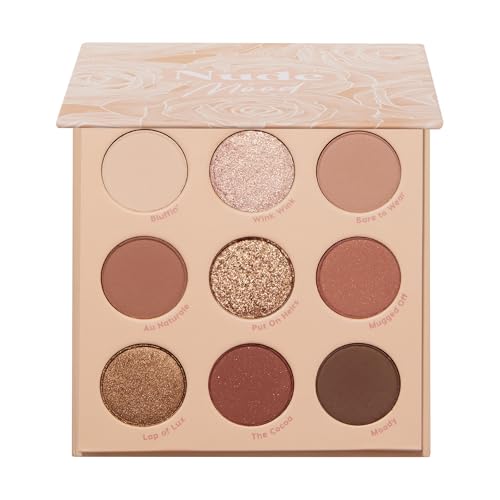
It is a nine-pan warm-neutral palette with matte and metallic finishes. The point is compact value, not maximum range.
The tighter layout still covers the basic neutral structure. We get matte support plus reflective accents, without lots of competing color directions.
That simplicity can be especially approachable for a first palette or an easy daily routine. Fewer pans mean fewer decisions.
The trade-off is just as clear. Nine shades cannot create as many tonal variations as the 12-to-16-pan palettes above.
What did buyers highlight? Supplied review themes are positive for color payoff, pigmentation, finish mix, ease of application, and value.
Longevity feedback is mixed. Some buyers also reported shattered pans on arrival, so delivery condition is a more concrete concern than the compact color story itself.
Bottom line: Best budget-friendly compact pick for a focused warm-neutral routine. Wider tonal range still calls for a larger palette.
- ✅ Nine pans keep the warm-neutral color story easy to follow
- ✅ Matte and metallic finishes cover structure plus lid contrast
- ✅ Buyer feedback repeatedly highlights pigmentation and value
- ❌ Nine shades give fewer light-to-deep variations than larger palettes
- ❌ Mixed longevity feedback may matter for very long-wear expectations
- ❌ Some buyers report shattered pans on arrival, so delivery condition deserves a check
🧪 Lash Lab Notes — Fauzia (University Student & Beauty Enthusiast)
I see the smaller size as useful when budget and speed both matter. Fewer pans compete for the same role, although that also leaves less room to change undertone or intensity once the warm-neutral combinations feel familiar.
- 💡 Editor’s Note: The value is not only about spending less. If nine coordinated shades already cover the looks we wear, a bigger palette can turn into clutter instead of an upgrade.
Want to see whether that value holds up for recent buyers? See whether recent buyer feedback supports the value and color payoff of ColourPop Nude Mood.
This is a strong fit when we want an uncomplicated everyday-to-glam neutral palette on a tighter budget.
The next palette does not simply get bigger or smaller. It shifts the whole direction from warm nude to rose-toned neutrals.
Urban Decay Naked3 Palette
Best for Cooler Rose Neutrals
What if copper and orange are not the colors we want around the eye? Naked3 gives us the clearest alternative here.
This 12-shade rose-toned neutral palette mixes matte and shimmer options. It offers a cooler rose-neutral route for blue eyes.
Soft pink, rose, mauve, burgundy, and taupe lead the color story. A copper accent is still available, so warm contrast is not completely missing.
That matters when classic blue-eye advice works for the iris but feels wrong on the rest of the face. Definition does not have to mean a strongly warm complexion look.
The supplied product data describes buildable rose-toned neutrals. It also notes a dual-ended brush and mirror.
Reviewer themes are positive for color selection, blendability, application, and longevity. Physical durability is the recurring downside, because several reviews mention palettes arriving damaged or broken.
Bottom line: Best cooler alternative to bronze when romantic rose and mauve neutrals feel more natural. A strongly orange-brown story belongs elsewhere.

- ✅ Rose, mauve, taupe, and copper offer a distinct non-orange contrast route
- ✅ Buyers repeatedly praise the color selection and blendability
- ✅ The included brush and mirror add practical portability
- ❌ A dominant copper-or-bronze palette is not the main story here
- ❌ Repeated shipping-damage reports make arrival condition worth checking
🧪 Lash Lab Notes — Dr. Sazia (Medicine Specialist & Beauty Enthusiast)
I think of rose and mauve as a realistic option when orange-heavy makeup does not suit our styling preference. Eye contrast and skin undertone are separate filters, so a cooler-looking neutral palette can feel more harmonious even when warm shades create stronger color-wheel contrast.
- 💡 Editor’s Note: We would choose this because the color preference fits, not because cool shades are somehow more correct. Iris contrast is less useful if the whole palette feels disconnected from the rest of the face.
Curious how buyers feel about both the tones and the packaging? Check how current buyers describe the rose-toned range and packaging of Urban Decay Naked3.
This is ideal when rose-toned neutrals feel more wearable than a predominantly bronze palette.
Want the opposite kind of simplicity? Our last pick returns to bronze and trims the decision down to four coordinated pans.
Charlotte Tilbury The Bella Sofia Palette
Best Compact
Four shades. One bronze-and-copper direction. That is the appeal here.
Bella Sofia is a four-shade quad built around four-pan cohesion, with satin-matte and shimmer finishes.
It stays close to the classic warm-contrast route for blue eyes. Each pan also has an obvious place inside one coordinated look system.
That can feel reassuring for a beginner or minimalist. There is simply less redundancy to sort through.
And the catch? Four shades cannot give us the undertone shifts, alternate lid colors, or broad day-to-night pathways found in larger palettes.
The supplied product data positions the quad as a portable day-to-evening system. It also highlights blendable, crease-resistant formula claims.
Reviewer themes are positive on color and longevity. Value for money is the clearest recurring concern.
Bottom line: Best compact bronze system when a guided four-shade story sounds better than endless choice. Broader color experimentation needs a larger palette.

- ✅ Bronze and copper create a focused contrast direction for blue eyes
- ✅ Four pans reduce overlap and decision fatigue
- ✅ Reviewer themes are favorable for color and longevity
- ❌ Four pans leave fewer undertone and intensity routes
- ❌ Value concerns matter when a premium purchase is expected to offer more shades
🧪 Lash Lab Notes — Zayba (A-Level Student & Beauty Enthusiast)
I like how a four-pan setup makes each shade’s job easier to understand. That clarity can suit a beginner, but it also means we have less room to pivot when a different undertone or finish sounds better.
- 💡 Editor’s Note: This is the moment to choose clarity over variety. The quad makes sense for a cohesive bronze look; it makes less sense when the fun comes from exploring several unrelated directions.
Wondering whether owners feel limited or relieved by the compact format? For a closer look, see feedback on Charlotte Tilbury Bella Sofia.
This is best for beginners or minimalists who want a portable bronze-and-copper palette with clear roles.
Six palettes later, what is left to decide? Mostly which contrast route works with the rest of the face.
Why Warm, Rose, and Mauve Palettes Work With Blue Eyes
Why does warm eyeshadow get recommended so often for blue eyes? The basic reason is visual separation.
Copper, bronze, peach, caramel, and warm brown sit far enough from blue that the iris can look clearer or more noticeable by comparison.
But warm is not our only route. Rose, mauve, plum, burgundy, and taupe can still create contrast while looking softer, smokier, or less orange on the face.
A palette also does not need every pan to be warm. One or two reflective warm accents can sit comfortably beside cooler transition and depth shades.
So what is the useful takeaway? It is not “blue eyes must wear orange.”
We need a deliberate contrast strategy plus enough supporting shades to finish the look. That is the part worth keeping.
If the color-theory question matters more than the palette itself, this buying guide only takes us so far. The dedicated color guide gives that contrast mechanism more room and compares how different shade families behave.
Warm or Rose-Toned: Match the Palette to Your Undertone and Style
Can a copper shade flatter the eyes and still feel wrong on the face? Yes, because eye contrast and skin undertone are separate filters.
Copper may make blue eyes stand out strongly. A cooler rose or mauve palette can still feel more harmonious with blush, lip color, hair tone, or the overall makeup mood.
That is why we would not reject a palette just because it is not maximally warm. We can start with the route that feels good on the face.
Then we check the structure. Does the palette give us enough light, middle, and deep shades to make that route practical?
Palettes are only one way to use contrast shades around blue eyes. Singles and other eyeshadow formats belong in the broader category too.
Want to compare those formats instead of staying inside coordinated palettes? The broader blue-eye guide is the better next stop.
A compact warm palette can be smarter for a simple bronze routine. A larger rose-neutral option can make more sense when softer undertone changes matter.
Neither wins automatically. The better palette is still the one whose pans we will actually use together.
Safer Palette Use Around the Eyes
What matters before color payoff or palette cohesion? Basic eye-area hygiene.
According to the FDA, eye cosmetics should be used carefully to reduce contamination and irritation risks.
The everyday habits are simple. We should wash our hands before applying eye makeup, keep applicators clean, and avoid sharing eye cosmetics.
If a product causes irritation, stop using it. “Clean,” “natural,” or similar marketing language should not be treated as a safety guarantee.
What about using a product somewhere it was not designed to go? The FDA also cautions against repurposing products such as lip liner around the eyes.
Ingredients or color additives may not be approved for that use. So products around the eye should be used only as intended for the eye area.
These are general safety habits. They cannot predict whether one specific palette will suit an individual.
Persistent irritation or other eye symptoms deserve appropriate professional medical advice, not a cosmetic workaround.
Blue-Eye Palette Questions, Answered
Shortlist done. What questions usually come next? These answers stay focused on coordinated palettes rather than turning into a full technique or single-shade guide.
❓ Do blue eyes need warm shadows?
No. Warm bronze, copper, peach, and brown tones often create strong contrast.
Rose, mauve, burgundy, and taupe can also be flattering. Personal undertone preference and the overall makeup look still matter.
❓ Can blue eyes wear blue eyeshadow?
Yes. Blue shadow creates a more tonal effect than the warm-versus-cool contrast we get from copper or bronze.
Deeper liner or neutral transition shades can help keep the iris distinct. Technique still decides whether the eye stays defined or the whole look becomes too tonal.
Want the full application approach? The dedicated guide handles that procedure instead of repeating it here.
❓ Is a big palette better for blue eyes?
Not automatically. Extra pans help only when they add real roles, undertone options, or finish variety.
A compact palette can be more versatile in practice when every shade participates in a complete look.
❓ What if warm shades clash with my undertone?
We can choose a rose, mauve, taupe, or balanced neutral palette instead of forcing an orange-heavy story.
The goal stays the same: create eye contrast while keeping the whole face cohesive.
❓ Do I need both matte and shimmer shades?
No, although the mix is convenient. Mattes can handle transition and depth, while shimmer or metallic shades can add lid contrast.
A narrower finish mix can still work when the shades cover the roles needed for our usual look.
Final Thoughts on Choosing a Blue-Eye Palette
After all those options, what should actually win? The smallest color story that gives us the contrast route we like and enough light-to-deep shades to finish a look.
Put more simply: choose the color story you’ll actually use. A coherent four-pan bronze quad can beat a sprawling palette when most of the bigger palette stays untouched.
Once we have the palette, the next useful move is building complete combinations instead of collecting more colors. The looks guide turns the same blue-eye goal into full combinations.
What comes after eyeshadow? Eyeliner can reinforce the palette’s contrast or change the definition around the lash line.
The eyeliner guide compares color directions specifically for blue eyes.
Mascara can change the finished effect too. It can move the look from softer to more defined without changing the eyeshadow palette itself.
The mascara-color guide helps us choose that final framing color for blue eyes.
A useful palette should make getting dressed up easier, not merely look impressive while open. If the shades work together, suit the complexion, and cover the intensity levels we really wear, cohesion matters more than a long pan count.
Last update on 2026-10-18 / Affiliate links / Images from Amazon Product Advertising API