
⚡ TL;DR: Best Color Corrector
Start with the discoloration you actually see, then consider your skin depth. That matters more than a dramatic coverage promise. Peach, green, orange, yellow, and multi-shade palettes answer different needs.
Top Picks
- 🏆 Best Overall — e.l.f. Camo Peach — targeted fair-to-medium shadow correction
- 🥈 1st Runner-up — e.l.f. Camo Green — localized facial redness correction
- 🥉 2nd Runner-up — e.l.f. Camo Orange — deeper cool-shadow correction
Have you ever blended a corrector only to notice its green or peach tint more than the original shadow? The best color corrector aims to quiet the discoloration, not trade it for a new colored patch.
We looked at seven distinct options, considering their intended shades, listed textures, and the complexions each is designed to complement. Your best match depends on the mark you want to soften and the skin around it.
✨ Inside This Color Corrector Guide
🌸 Psst…
Some links in this post are affiliate links. If you shop through them, we may earn a small commission at no extra cost to you — like a little coffee while we keep testing beauty favorites. ☕💄
Quick Comparison: Best Color Corrector
Think of the picks as a starting map for color and texture. Each review also explains where that option may fall short.
| Product | Best For | Format | Main Catch |
|---|---|---|---|
| e.l.f. Camo Peach | Fair-to-medium blue-purple shadows | Cream corrector | Too warm for some undertones |
| e.l.f. Camo Green | Localized redness | Cream corrector | Green can remain visible |
| e.l.f. Camo Orange | Tan-to-rich cool shadows | Cream corrector | Too vivid on fair skin |
| NYX Pro Fix Yellow | Fair-to-light dullness | Cream stick | Not for every discoloration |
| Catrice Under Eye Brightener | Light rose-toned brightening | Cream | May be too pale for deeper shadows |
| Milani Supercharged Tint | Medium-to-deep lighter correction | Cream tint | Light coverage may be insufficient |
| MAKE UP FOR EVER Underpainting | Very-light multi-shade needs | Cream palette | Very Light range only |
Pick the Shade That Fits Your Discoloration
Think of correcting as balancing visible color. Green counters red-looking areas, while peach and orange are used against cooler shadows. A thin contrasting layer can make an unwanted hue less noticeable under complexion makeup; it does not address the cause of the discoloration.
For a blue-purple under-eye cast on fair-to-medium skin, peach is often the first shade worth considering. As skin depth increases, warmer orange may make more sense. Yellow can be useful for certain fair-to-light areas that look dull, and rose tones suit some lighter under-eyes.
Blue deserves a closer look at the label. Certain blue products are made to adjust foundation that looks too warm, rather than act like an everyday under-eye corrector. Follow the purpose stated for the particular shade.
Matching the hue is a start, but not the whole decision. A shade that looks balanced on one complexion can read too intense or too pale on another.
Still unsure where correction ends and concealer begins? Understanding what each step does can keep you from buying a shade you might not need.
Best Color Correctors by Shade and Format
These seven options serve different color concerns and application preferences. They are not ranked by unverified wear tests; their places here reflect the specific uses supported by the product information.
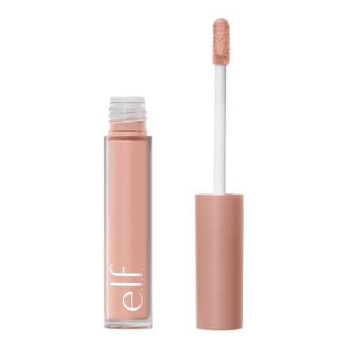
e.l.f. Camo Color Corrector — Peach
A familiar peach shade for targeted blue-purple-looking shadows on fair to medium complexions.
Sometimes concealer alone leaves an under-eye area looking gray. A restrained touch of peach underneath can help balance that cool cast before you finish with your skin-tone shade.
The supplied listing identifies this Camo option as a full-coverage cream corrector. That is a reason to be careful with placement: concentrate on the shadow instead of coating the whole under-eye.
Bottom line: For localized cool-toned darkness on fair-to-medium skin, choose the peach shade before a deeper orange.
- ✅ Peach option targets a familiar under-eye color concern
- ✅ Dedicated shade keeps the routine simple
- ❌ A peach cast may remain if it is applied too widely
- ❌ Fuller coverage may be more than a minimal brightening look needs

🧪 Lash Lab Notes — Zayba (A-Level Student & Beauty Enthusiast)
Begin with a tiny dot on the area that looks discolored. Diffuse the border gently so you do not end up covering a visible peach edge with more makeup.
- 💡 Editor’s Note: Peach is a good starting point when the shadow itself looks blue or purple, but it is not a universal match. Shade depth and how little you use make the result believable.
See the peach shade and listing details for e.l.f. Camo Peach.
Our recommendation: Choose this shade for a small, cool-toned under-eye patch.
A red-looking patch is a different shade problem.
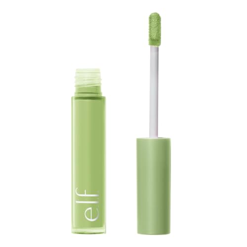
e.l.f. Camo Color Corrector — Green
A targeted green option for visible facial redness, not for dark under-eye circles.
The redness beside your nose or across a cheek is not the same as a cool-looking under-eye shadow. For those visibly red spots, green is the corrective shade family commonly offered.
This green variant is a standalone cream product, and its listing describes full coverage. You can make better use of that coverage by keeping it on the red area instead of spreading green across unaffected skin.
Bottom line: Best for small red-looking areas when a thin green layer blends cleanly beneath your base.
- ✅ Direct shade role for visible redness
- ✅ Single-purpose shade avoids a bulky palette
- ❌ Not a match for every type of dark discoloration
- ❌ Visible green is a risk if the layer is too heavy
🧪 Lash Lab Notes — Dr. Rabeya (Dentist & Beauty Enthusiast)
Apply green to the red-looking spot, not the surrounding area. Check it at a normal viewing distance; if the green itself stands out, blend away some of the product.
- 💡 Editor’s Note: This is an easy shade to misuse because the color looks dramatic in the tube. The payoff comes from using less product over the right spot, not from covering the surrounding skin.
Check the shade identity and customer listing for e.l.f. Camo Green.
Our recommendation: Consider it for localized redness under a complexion-matching base.
For richer complexions, cooler shadows may need more warmth.
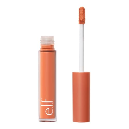
e.l.f. Camo Color Corrector — Orange
An orange shade intended for deeper-looking cool discoloration on tan to rich complexions.
On a deeper complexion, a pale peach can sometimes look ashy against a blue-purple shadow. Orange gives you a warmer corrective direction without automatically adding another layer of concealer.
Be careful with the variant: this is Camo Color Corrector in Orange, not Peach. The product record calls it a full-coverage cream, so identifying the shade correctly is central to this recommendation.
Bottom line: A sensible deeper-skin option when orange matches the cool shadow better than pale peach.
- ✅ Warm corrective hue designed for deeper-looking shadows
- ✅ Dedicated orange variant with a clearly identified shade
- ❌ Orange may remain visible on fair skin
- ❌ Full coverage can add texture if layered heavily
🧪 Lash Lab Notes — Mahmuda (Homemaker & Beauty Enthusiast)
Keep the orange patch just large enough to cover the deepest shadow. Once its edges are blended, look again before deciding whether to put a skin-tone concealer over it.
- 💡 Editor’s Note: Orange is not a more powerful version of peach that everyone should buy. It is a different hue choice, best judged against both the shadow and the surrounding complexion.
Review the Orange variant details for e.l.f. Camo Orange.
Our recommendation: Choose orange only when your skin depth and discoloration support it.
Texture and application style matter too.
NYX Pro Fix Stick Correcting Concealer
A precision stick for small dull-looking patches that call for yellow correction.
Some days, you only want to soften a small area that looks a bit flat, not cover a dark circle. A stick gives you a direct way to reach that spot without applying corrector across your face.
The product record specifies the cream stick in shade 0.3 Yellow and lists medium coverage. NYX associates the yellow version with dullness on fair-to-light skin; it is not presented as a catch-all discoloration fix.
Bottom line: Useful for a precise yellow correction when a stick feels easier to control than a spreadable cream.

- ✅ Pointed stick format suits small targeted areas
- ✅ Medium listed coverage can suit modest discoloration
- ❌ Yellow is not the ideal hue for strong red patches
- ❌ A creamy stick may be less handy over broad areas
🧪 Lash Lab Notes — Engr. Nusrat (Engineer & Beauty Enthusiast)
Touch the stick lightly to a small section, then soften the border using a clean tool. This gives you a chance to see whether yellow is helping before adding more.
- 💡 Editor’s Note: We like the format distinction here: a stick is about control, not automatically better wear. Choose it for a small placement task and skip it if your concern is broad facial redness.
Compare the listed Yellow variant for NYX Pro Fix Yellow.
Our recommendation: Best for small fair-to-light dullness patches and precision work.
For an even softer-looking under-eye effect, consider rose tones.
Catrice Under Eye Brightener
A rose-toned cream brightener for light under-eye discoloration.
Sometimes the under-eye needs a subtle shift in tone more than an opaque orange veil. A light rose shade can be an easier place to start on a fair complexion.
The selected Catrice item is 010 Light Rose, a cream with medium listed coverage in its record. It is not a general substitute for a deep-orange corrector.
Bottom line: Best for a softer rose-toned under-eye correction when the complexion and shadow suit a light shade.

- ✅ Light-rose variant is specifically identified
- ✅ Medium listed coverage offers a different level from fuller creams
- ❌ May not balance deeper blue-purple shadows
- ❌ Rose tone can look bright against some skin depths
🧪 Lash Lab Notes — Dr. Sazia (Medicine Specialist & Beauty Enthusiast)
Test the cream only over the shadow, not far down the cheek. A small area makes it easier to see whether the rose shade blends naturally.
- 💡 Editor’s Note: Light Rose is a fit question, not a universal anti-dark-circle answer. It works as a distinct option for someone who finds orange too obvious and wants a lighter-looking correction.
See the exact 010 Light Rose option for Catrice Under Eye Brightener.
Our recommendation: Consider this for light under-eye shadows on a compatible complexion.
If you prefer less opacity, a tint has a different job.
Milani Supercharged Brightening Undereye Tint
A lighter-coverage deep-peach tint for medium-to-deep under-eye correction.
If thicker coverage feels like too much beneath your eyes, consider a tint as a gentler first step. Its lighter approach is worth weighing against a traditional full-coverage corrector.
The product record lists light coverage for the 130 Deep Peach variant, intended for medium-to-deep skin. Although both it and e.l.f. Orange have a warm direction, their recorded coverage levels give them different roles.
Bottom line: A useful lighter-coverage option for medium-to-deep complexions that suit deep peach.

- ✅ Light listed coverage supports a modest correction goal
- ✅ Clearly specified 130 Deep Peach color direction
- ❌ Less opacity may leave pronounced darkness visible
- ❌ Not the same corrective hue as strong orange
🧪 Lash Lab Notes — Fauzia (University Student & Beauty Enthusiast)
Try a sheer layer first, and check what remains visible before adding concealer. A tint can support correction without having to stand in for a full-coverage base.
- 💡 Editor’s Note: This earns a separate place because opacity changes the decision. If a heavy-looking layer bothers you, the light listed coverage is the real reason to consider this variant.
Review the Deep Peach 130 tint listing for Milani Supercharged Tint.
Our recommendation: Try it when you want a lighter first layer over medium-to-deep skin.
Palettes ask a slightly different question.
MAKE UP FOR EVER Ultra HD Underpainting Palette
A multi-pan correcting and concealing palette built for very light complexions.
A palette can be practical when you regularly face more than one small area of discoloration. First, make sure the included shades actually suit your complexion; extra pans are not automatically extra value.
According to the brand, the 20 Very Light version contains two correcting shades alongside two concealer shades. That exact version is designed around a very light range and should not be treated as a one-palette answer for medium or deeper complexions.
Bottom line: Best for a very-light complexion looking for both correcting shades and concealers in one cream palette.

- ✅ Multiple pans address more than one complexion task
- ✅ Dedicated palette format reduces separate containers
- ❌ 20 Very Light is not universal across skin depths
- ❌ A palette can be more than needed for one small patch
🧪 Lash Lab Notes — Zayba (A-Level Student & Beauty Enthusiast)
Give every pan a job before you reach for it. A palette earns its space when you use more than one correction shade, not simply because several colors come in the case.
- 💡 Editor’s Note: The useful point is convenience for a defined complexion range. Anyone outside Very Light should treat this particular version as the wrong shade match, however attractive the format looks.
See the 20 Very Light palette details for MAKE UP FOR EVER Underpainting.
Our recommendation: Choose this only when the very-light shade range fits.
So when is one shade enough?
Two people can have similar blue-purple shadows yet need different warm correctors because their skin depth differs. The deeper-skin guide helps put that peach-versus-orange choice into context.
Palette or Single Shade: What Should You Buy?
If you always correct the same little patch, one reliable shade is easy to use and store. A palette becomes more appealing when you regularly need distinct colors for several concerns.
But more pans do not automatically mean more inclusivity. The Underpainting palette reviewed above is the 20 Very Light version. Buying it for a deeper complexion would not turn those light concealer shades into a suitable match.
When your color concerns change from area to area, it is worth asking whether you would really use the extra pans. The palette comparison walks through that trade-off.
If you only need one useful shade and would rather skip paying for unused colors, the narrower drugstore roundup may be a more relevant place to compare options.
How to Keep Color Corrector from Showing Through
The easy mistake is applying so much pigment that the corrector becomes the new thing you notice. Put a small dot on the most discolored area, blur the edges, and look at the result in natural light.
If you can still see green, peach, or orange through foundation, another thick layer may make things worse. First, reduce the amount. Then consider whether a softer hue or a different shade depth would blend in better.
Keep corrector out of your eyes and away from broken skin. Discontinue use if irritation develops. These cosmetics can change how discoloration looks, but they do not treat a medical condition.
A little pigment in the right place, careful blending at the edges, and only the skin-tone coverage you need: that is the basic sequence. The longer how-to guide is useful if your layers keep turning heavy.
Seeing the correction color after foundation is not quite the same as needing additional coverage. The troubleshooting guide addresses that stubborn color-show-through problem directly.
Which Format Fits Your Routine?
Choose a texture for the placement it makes comfortable, not as proof of superior performance. A stick can focus on a spot, a cream can reach a small patch, and a tint can offer a lighter starting layer.
Extra layers can be particularly noticeable around the eyes, so start sparingly with any texture. Without direct test evidence, claims about all-day wear, zero creasing, or universal sensitive-skin suitability would be too strong.
A stick is worth considering when you want to work precisely on one small area. The dedicated format guide explains that control-focused use case in more detail.
Under-eye discoloration does not look identical on every complexion. A separate guide can help you weigh peach, rose, and orange against what you see.
When Concealer Alone Is Enough
Before adding another product, check what your existing concealer already achieves. If it makes the area look even and natural, a corrector could simply mean one more layer.
One corrective shade may be worth adding when concealer leaves a gray or reddish cast behind. It can stay a small supporting step instead of replacing your usual complexion match.
For a minor shadow, it is worth checking whether your current concealer already solves the issue. That comparison may save you from an unnecessary purchase.
If you finish with concealer, choose its complexion shade as carefully as the corrector color. The related guide focuses on that skin-tone coverage step rather than contrasting pigment.
Frequently Asked Questions About Color Correctors
A few shade questions are worth sorting out before you spend anything. The answers here are about cosmetic color matching, not the medical reasons skin may look discolored.
❓ Can green color corrector cover dark circles?
For visible redness, green is generally the relevant corrective direction. For blue-purple-looking shadows, peach or orange is more likely to fit, depending on complexion depth.
❓ Is orange corrector too strong for fair skin?
Yes, it can look too strong. Orange may remain noticeable under a fair base, making peach a more practical first shade family to assess.
❓ Should foundation always go over a corrector?
Not necessarily. Use only as much skin-tone coverage as the result needs, checking in natural light. A well-blended correcting layer may not need much over it.
Final Thoughts on Choosing a Color Corrector
Buy for the unwanted hue first. Next, select a formula you can control on the affected spot. A small, well-blended amount usually makes more sense than covering a larger area by default.
When a green, peach, or orange cast remains visible, revisit the hue and how much you applied before reaching for extra concealer.
Once the spot correction is done, a foundation matched to your skin can help the wider complexion look cohesive. The next guide focuses on that finishing shade-and-coverage choice.
Last update on 2026-10-29 / Affiliate links / Images from Amazon Product Advertising API