⚡ TL;DR: best eyeshadow for dark brown eyes
Very dark brown irises can make some shades fade into the background. So what keeps the lid visible? Usually, it is either saturated color—purple, plum, or blue—or reflected light from copper, bronze, and gold.
The goal is not simply choosing another very dark neutral. We need enough saturation or shine to create clear separation.
Top Picks
- 🏆 Best Overall — Juvia’s Place The Violets — Layered purple contrast
- 🥈 1st Runner-up — about-face Matte Fluid Eye Paint — Opaque graphic blue
- 🥉 2nd Runner-up — Urban Decay 24/7 Eyeshadow — Reflective copper contrast
Dark brown eyes can make a pan shade look quieter once applied. That happens most when the shadow sits close to the iris in depth.
Our picks for the best eyeshadow for dark brown eyes keep visibility front and center. We looked for useful contrast, clear pigment, and finishes that stop the lid from reading as one dark value.
✨ Inside This Eye Shadow Guide
Quick Comparison: Best eyeshadow for dark brown eyes
Not sure whether cool color or warm shine suits the look? These six picks solve the same visibility issue in different ways.
Use the table to compare cool contrast, warm reflection, and faster one-and-done formats.
| Product | Best For | Color/Finish | Format | Main Trade-Off |
|---|---|---|---|---|
| Juvia's Place The Violets | Purple contrast | Purple metallics | 6-pan palette | Multi-shade routine |
| about-face Matte Fluid Eye Paint | Bold contrast | Bright blue matte | Liquid shadow | Precise placement |
| Urban Decay 24/7 Eyeshadow | Warm reflectivity | Deep copper metallic | Powder single | Mixed smudge feedback |
| Laura Mercier Caviar Stick | Quick plum look | Dusty plum matte | Cream stick | Stick durability |
| Charlotte Tilbury Luxury Palette | Coordinated berry look | Berry rose-gold | 4-pan quad | Mixed value feedback |
| Juvia's Place The Warrior | Warm palette look | Gold bronze tones | 9-pan palette | Larger shade set |
Best Eyeshadow for Dark Brown Eyes: 6 Picks That Stay Visible
Six picks, but six different jobs. Purple and blue push color contrast hardest.
Copper, plum, berry, gold, and bronze take warmer or softer routes. The important part is that each still creates visible separation.
Juvia’s Place The Violets Palette
Best High-Contrast Palette
Want obvious cool-toned contrast without a giant palette? This compact purple wardrobe keeps the choice focused.
Purple already separates clearly from an almost-black brown iris. This six-pan pressed-powder palette leans into that strength.
Instead of padding the set with barely-there neutrals, it gives us purple shades plus glitter and metallic finishes. That keeps the color family doing the visual work.
Does the formula support that color story? Reviewer feedback repeatedly praises pigmentation, a silky feel, coverage, and an all-day appearance.
That performance matters here. A flattering color idea does little if the shade sheers away before the contrast becomes visible.
Bottom line: Best for layered purple contrast when several intensities sound better than one one-and-done shade.

- ✅ Strong purple color helps keep the visibility-first goal clear.
- ✅ Several purple tones let us move from soft to bold inside one compact palette.
- ✅ Reviewer patterns regularly praise smooth texture and blendability.
- ❌ It is less direct when we only want one shade and one application step.
- ❌ A very soft application can mute the contrast because finish and intensity depend on technique.
🧪 Lash Lab Notes — Fauzia (University Student & Beauty Enthusiast)
I would start with a mid-tone, then add metallic intensity only where it helps. The six-pan setup keeps the choices manageable while still giving us more than one purple depth.
- 💡 Editor’s Note: Why does this palette make sense here? It commits to the purple family that creates the contrast instead of burying those shades among similar neutrals. The trade-off is straightforward: we still have to enjoy a palette routine rather than a single swipe.
Want a broader read on buyer feedback first? Read reviews for Juvia’s Place The Violets.
Reader recommendation: This fits best when purple is the main contrast plan and buildable palette looks feel natural.
Care tip: Tap away extra powder first. Then build the pigment slowly and use small circular motions for a cleaner edge.
Want even stronger color separation? The next pick turns that contrast up.
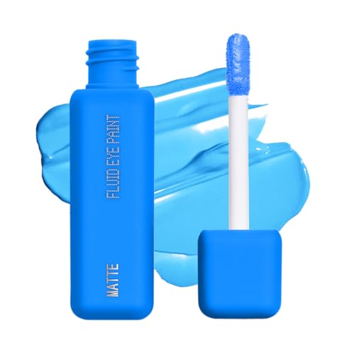
about-face Matte Fluid Eye Paint
Best Bold Blue
Want the lid to look unmistakably blue beside deep brown eyes? This saturated liquid matte does exactly that job.
Blue Monday is not trying to be subtle. That is the point.
The verified product data describes a bright blue liquid matte with high coverage. Reviewer feedback also repeatedly calls it opaque, long-lasting, and budge-resistant.
The liquid format changes how we apply it, though. A small amount creates a concentrated block of color.
So what is the catch? Placement needs more care than a forgiving powder wash.
Blend before the formula sets when softer edges are the goal. If a full blue lid feels too strong, keep the color tighter to the lash line.
Bottom line: Best for maximum blue contrast when a graphic matte result sounds right and deliberate placement feels comfortable.
- ✅ High-coverage bright blue creates a clear color break beside dark brown eyes.
- ✅ Reviewer patterns support opaque color plus strong staying power.
- ✅ Wearing the formula alone can keep a bold look mechanically simple.
- ❌ Vivid matte blue can feel too intense when muted or neutral makeup is the preference.
- ❌ The faster-setting liquid format benefits from more careful placement and blending.
🧪 Lash Lab Notes — Zayba (A-Level Student & Beauty Enthusiast)
I would begin with a thin layer so the saturated color is easier to steer before it sets. Keeping that first pass near the lash line also lets us test the contrast without covering the whole lid.
- 💡 Editor’s Note: Is maximum visibility the priority? This is the pick to consider. We would still start small, because the same opacity that makes the blue effective also makes extra product harder to disguise.
Want to know how buyers describe the color and wear? See feedback for about-face Matte Fluid Eye Paint.
Reader recommendation: This makes sense for bold matte contrast, especially when one liquid shade sounds easier than a palette.
Care tip: Start with a small amount and blend before it sets. At the end, remove it gently with a suitable eye-makeup remover.
Blue too cool or graphic? Metallic copper creates separation with warmth instead.
Urban Decay 24/7 Longwear Eyeshadow
Best Warm Metallic
Prefer warmth over jewel-tone contrast? This deep copper metallic uses reflected light to keep the lid visible.
Ember is the warm answer to the purple and blue options. It does not create the largest hue difference.
Instead, the deep copper metallic finish makes a brighter reflective plane across the lid. That can help dark brown eyes look richer without moving into a jewel tone.
The powder single also keeps the decision focused. Product data supports buildable color, smooth application, high pigment payout, and long-wear feedback.
What needs a little caution? Smudge resistance is mixed.
That makes Ember especially practical when we want one polished metallic shade and do not need a full warm palette.
Bottom line: Best for concentrated copper shine when warm definition from one shadow is the goal, with some caution around smudging.
🧪 Lash Lab Notes — Engr. Nusrat (Engineer & Beauty Enthusiast)
I like the simplicity of one pan when a bigger palette feels like extra decision-making. Pressing the metallic shade onto the lid, rather than sweeping repeatedly, can concentrate the reflective finish where it shows most.
- 💡 Editor’s Note: Want warmth that still looks obvious? Ember fills that space. It does not rely on dramatic blue-versus-brown contrast, but the metallic finish still creates a distinct focal point around the eye.
Curious how pigment and wear translate in real use? Check buyer feedback for Urban Decay 24/7 Eyeshadow.
Reader recommendation: Choose this when one warm metallic shade sounds better than a multi-color palette.
Care tip: Use a brush or fingertip and build thin layers. Finish by removing it with a gentle eye-makeup remover.
Want cool contrast with less setup? The next pick moves into a faster cream-stick routine.
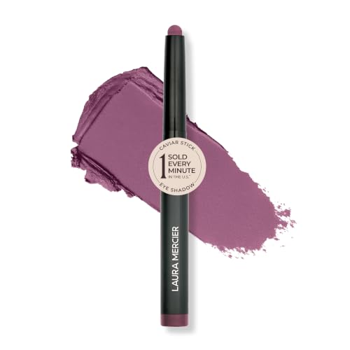
Laura Mercier Caviar Stick Eyeshadow
Best One-and-Done Plum
Need quick contrast without building a full eye look? This dusty-plum cream stick keeps the routine direct.
Matte Dusk takes a muted purple route. Even so, it keeps plum’s main advantage on very dark brown eyes: the hue remains different from the iris.
The bigger practical win is the stick format. Verified data supports smooth glide, creamy application, buildability, and all-day wear feedback.
But here is the hardware issue. Review themes include recurring reports of sticks breaking or falling out of the tube.
That does not cancel the formula’s fit. It does mean careful handling and secure capping belong in the purchase decision.
Bottom line: Best for fast plum definition when direct-to-lid application matters more than palette flexibility.
- ✅ Dusty plum gives dark brown eyes clear cool-toned separation.
- ✅ The cream stick makes a quick one-and-done application easier.
- ✅ Reviewer feedback regularly praises glide, color, and wear.
- ❌ Repeated stick-breakage complaints matter when travel makeup gets rough handling.
- ❌ Matte plum provides less sparkle-based brightness than a shimmer or metallic option.
🧪 Lash Lab Notes — Mahmuda (Homemaker & Beauty Enthusiast)
I would place the color straight on the lid, then soften only the edge. The stick format keeps that simple, while dusty plum can add visible definition without turning the routine into several palette steps.
- 💡 Editor’s Note: Can convenience and contrast work together? Here, yes. We would still treat the stick gently because the packaging-durability feedback is specific enough to matter.
Want to weigh the creamy texture against those packaging complaints? Review feedback for Laura Mercier Caviar Stick.
Reader recommendation: This is a strong fit for a quick matte-plum look with few tools and direct placement.
Care tip: Swipe the color onto the lid and blend promptly. Cap the stick securely, then use a suitable remover at the end of the day.
Prefer a coordinated warm-red look instead? The next quad combines berry depth with rose-gold light.
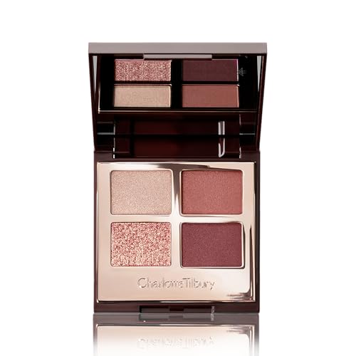
Charlotte Tilbury Luxury Palette
Best Berry-and-Rose-Gold Quad
Want more contrast than plain brown neutrals without a large palette? This four-shade berry and rose-gold setup keeps things coordinated.
Walk Of No Shame mixes red, crimson, and rose-gold tones. The finishes span satin-matte, shimmer, and metallic.
Why does that mix work here? Berry brings a different hue beside dark brown eyes, while rose-gold adds reflected light.
Together, those two effects help stop the whole look from sitting at one depth.
Product data also supports smooth blendability and positive longevity feedback. That matters in a compact quad because the shades need to work together.
The trade-off is value. Feedback is mixed, so the small coordinated format needs to be something we actually want—not just the color story.
Bottom line: Best for coordinated berry warmth when a compact quad with both depth and reflection fits the routine.
- ✅ Berry and crimson tones bring warmer color contrast than standard brown neutrals.
- ✅ Rose-gold shimmer adds another layer of reflected-light separation.
- ✅ Four coordinated shades keep the sequence contained and easy to follow.
- ❌ Mixed value feedback matters when palette value is judged mainly by shade count.
- ❌ The warm berry story looks less graphic than saturated blue or violet.
🧪 Lash Lab Notes — Dr. Rabeya (Dentist & Beauty Enthusiast)
I would use one deeper berry for definition, then one reflective rose-gold for light. With only four pans to coordinate, that sequence stays clear without making the eye look unnecessarily complicated.
- 💡 Editor’s Note: Want more than one shade but less than a large palette? This is the controlled middle ground. The honest trade-off is value: the compact edit needs to matter more than raw pan count.
Still deciding whether four shades feel worth it? See buyer reactions to Charlotte Tilbury Luxury Palette.
Reader recommendation: Choose this when a compact berry look with a built-in reflective accent sounds right.
Care tip: Begin with the lighter shade and deepen only where needed. Add shimmer last, where extra light makes sense.
Want a closer look before deciding on this quad? The full review covers the four Walk of No Shame shades individually, including the sparkle shade’s trade-offs and the palette’s value.
Want warmer shades with more variety? The final pick moves fully into gold-and-bronze territory.
Juvia’s Place The Warrior Palette
Best Gold-and-Bronze Palette
Looking for a fuller warm palette? These nine pans build luminous gold and bronze looks that stay dimensional beside deep brown irises.
Warrior I is the widest warm option in this lineup. Verified shades include gold, brown, and bronze in a pressed-powder palette.
Why does it work for dark brown eyes? The answer is not simply “brown matches brown.”
Metallic warmth, pigment, and tonal variation work together. That combination helps keep the lid from becoming one flat dark field.
Reviewer patterns support pigmentation, smooth application, coverage, blendability, and long wear. The more concrete drawback is durability feedback.
Some buyers report damaged or broken pans. That makes shipping and handling condition the clearer concern, rather than the color story itself.
Bottom line: Best for warm palette variety when gold and bronze options with several intensity levels sound useful.
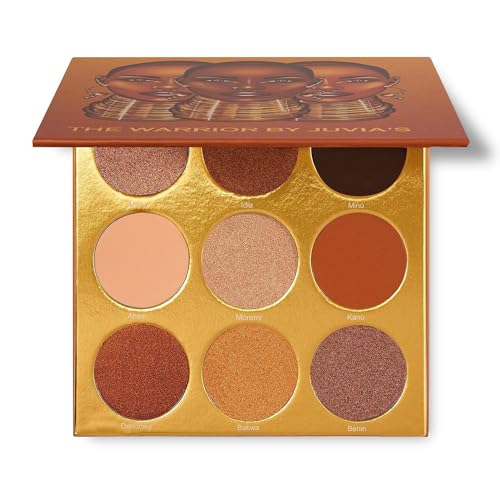
- ✅ Gold and bronze finishes add visible reflective lift to warm looks.
- ✅ Nine shades give us more depth choices than one shadow or a compact quad.
- ✅ Reviewer feedback repeatedly supports pigmentation and blendability.
- ❌ Nine pans create more choice than a one-shadow routine needs.
- ❌ Some reviewer feedback mentions damaged or broken product on arrival.
🧪 Lash Lab Notes — Dr. Sazia (Medicine Specialist & Beauty Enthusiast)
I would use warm metallics when brightness matters without a stark color contrast. Keep powder away from irritated skin, and stop using a cosmetic if it causes discomfort around the eyes.
- 💡 Editor’s Note: What makes this palette useful is warm color that still stays visible. We would lean on metallic and lighter-reflective shades for separation. Using only the deepest browns would miss the reason this palette belongs here.
Want to compare buyer comments on pigment, blending, and delivery condition? Read comments for Juvia’s Place The Warrior.
Reader recommendation: This suits warm gold-and-bronze variety when building looks from a palette is part of the fun.
Care tip: Tap off extra powder and build the pigment in layers. Follow current package directions around the eye area.
Now that the product roles are clear, which kind of contrast fits the look we actually want?
How to Choose Eyeshadow That Stays Visible on Dark Brown Eyes
Does a very dark brown iris automatically need an even darker shadow? No.
If the lid shade sits close to the iris and lash line in depth and finish, the eye area can read as one dark value. Softer indoor light can make that effect more noticeable.
Some shade families can fall into that low-contrast zone when their depth is too similar. Want to see which brown-eye colors are hardest to make distinct when “popping” the eyes is the goal?
First: think about color contrast.
Purple, plum, blue, and green create chromatic contrast. In simple terms, the hue itself looks different from brown.
Next: think about reflected light.
Copper, bronze, gold, and other reflective warm shades create value contrast. Light catches the finish and lifts the lid away from the iris.
Saturation matters as well. A washed-out blue may separate less clearly than a well-pigmented copper.
A deep matte plum can still read distinctly because its undertone differs from very dark brown. So which route works best? It depends on whether we want drama, warmth, or quieter definition that still remains visible.
This guide stays intentionally narrow and focuses on very dark irises. For a wider framework across lighter, medium, and deep brown eyes, the parent guide is the better next stop.
That broader guide compares shade families without the extra “almost-black iris” visibility filter used here. It is especially useful when the eyes are not particularly dark or when we want a wider color map.
Dark Brown Eye Shade Cheat Sheet
Need a fast starting point? Use this table as a guide, not a rulebook.
Finish, placement, skin tone, undertone, and application intensity can all change the amount of contrast we actually see.
| Shade Family | What It Does | Best Finish Direction | Best For |
|---|---|---|---|
| Purple / plum | Cool hue contrast | Matte or metallic | Visible everyday-to-bold color |
| Royal / sapphire blue | Maximum hue contrast | Matte or shimmer | Graphic definition |
| Copper / bronze / gold | Reflected-light contrast | Metallic or shimmer | Warm luminous looks |
| Berry / crimson | Warm hue contrast | Satin or shimmer | Softer statement color |
| Green | Complementary separation | Satin or metallic | Alternative cool-earthy contrast |
What if subtlety is the whole point? Low-contrast taupes and browns can still work.
In that case, we are choosing harmony over maximum visibility. That is simply a different goal from picking a shade specifically to stand out against very dark irises.
A natural-look guide makes more sense when quiet definition matters more than strong pigment contrast. It keeps the brown-eye harmony while dialing back the saturation and shine used in this roundup.
Common Questions About Eyeshadow for Dark Brown Eyes
Dark brown irises raise a few shade questions that do not come up in quite the same way for brown eyes generally. Here are the practical answers, without turning this into another full color guide.
❓ What eyeshadow colors make dark brown eyes pop?
For color contrast, saturated purples, plums, and blues usually create the clearest break. Copper, bronze, and gold can also create strong reflective contrast.
What tends to look most noticeable? Usually, it is the shade that remains distinct from the iris and lash line in hue, brightness, or finish.
❓ Is black eyeshadow bad for dark brown eyes?
No. It can simply look low-contrast when the goal is clearer definition around very dark brown eyes.
Black works better when smoke and depth are the aim. If we also want separation, add a brighter metallic, colored lid, or lighter inner-corner accent.
❓ Can I wear brown eyeshadow with dark brown eyes?
Absolutely. Brown shadow is not “wrong.” It usually creates a more harmonious, lower-contrast result when its depth sits close to the iris.
Want brown to read more clearly? Try a lighter caramel, reflective bronze, or warmer copper-brown.
❓ What if I want strong contrast without covering my whole lid in blue or purple?
Bring the saturated shade closer to the lash line and keep the lid softer. Colored eyeliner can give us a strong blue, plum, or green accent with much less surface area than a full shadow look.
Full-lid jewel tones feel like too much? Eyeliner gives us a smaller canvas for the same contrast idea.
The next guide looks specifically at liner colors that work well with brown eyes.
❓ Should dark brown eyes avoid neutral eyeshadow?
No. Neutrals still make sense when subtlety is the goal.
The issue is depth. A neutral that nearly matches the iris can look flatter than expected. For clearer definition, choose more reflectivity, a lighter value, or a warmer or cooler undertone.
Final Thoughts: Choose Contrast Before Depth
When shadow seems to disappear beside very dark brown eyes, is going darker the answer? Not automatically.
Start by choosing the kind of separation we want. Color contrast can come from purple, plum, blue, or green. Reflected-light contrast can come from copper, bronze, and gold.
Then match the format to the routine. A palette gives variety, a stick or liquid adds speed, and a single shadow keeps the choice focused.
There is no universal “most flattering” shade in this decision. The better result is the shade that creates the amount of visible separation we actually want.
Last update on 2026-09-28 / Affiliate links / Images from Amazon Product Advertising API