
⚡ TL;DR: charlotte tilbury walk of no shame eyeshadow
This four-pan compact makes sense for a specific kind of routine. We need to already enjoy warm berry, crimson, and rose-gold eyes. The smoother core shades are easy to work with.
The sparkly Pop shade is the trade-off: it can look sheerer and shed more fallout unless we press it on with a fingertip or damp flat brush.
So what matters most here? Not the prestige packaging. The real question is whether these four coordinated shades match the looks we repeat often enough to make a luxury quad worthwhile.
If we’re searching for charlotte tilbury walk of no shame eyeshadow, one detail matters first. This review covers the four-pan Luxury Palette, not the separate Eyes to Mesmerise cream shadow that now shares the Walk of No Shame name. We’ll compare the pans, the four-step system, the best-fit user, and the compromises that come with this focused color story.
✨ Inside This Eye Shadow Guide
🌸 Psst…
Some links in this post are affiliate links. If you shop through them, we may earn a small commission at no extra cost to you — like a little coffee while we keep testing beauty favorites. ☕💄
What Is the Charlotte Tilbury Walk of No Shame Palette?
Walk of No Shame is a 5.2 g four-pan powder eyeshadow quad in Charlotte Tilbury’s Luxury Palette line. Its colors lean red, crimson, and rose-gold. Across the pans, we get satin-matte, shimmer, and metallic-looking finishes in the brand’s Prime, Enhance, Smoke, and Pop sequence.
Why can the name feel confusing? The palette used to be sold as Walk of Shame. Now Walk of No Shame also appears on a separate Eyes to Mesmerise cream eyeshadow. They are different products. Here, we’re talking about the four-pan powder compact.
The draw is the edit. Instead of a big spread of unrelated shades, this quad stays inside one close color family. We can move from a softer eye to deeper berry definition and sparkle without choosing among dozens of pans. That’s convenient when this color story already fits our makeup wardrobe. It also means each pan has to pull its weight.
Charlotte Tilbury Walk of No Shame Eyeshadow Review
So how does the palette feel once color story, texture, and everyday use are considered together? Here’s where the strengths and compromises become much clearer.
Charlotte Tilbury Luxury Palette Eyeshadow
A small berry-rose quad with a clear four-step route from base to sparkle.
The best argument for this palette is how well the shades belong together. Verified product feedback repeatedly praises the coordinated colors, smooth blending, and longevity. That makes the quad easy to read at a glance. We are not staring at fifteen pans and trying to decide which four make sense together.
But do all four pans behave the same way? No. Independent shade-level testing was strongest on the smoother early shades. The sparkly Pop-style shade showed sheerer-to-medium coverage, a more transparent base, and moderate fallout. It can still give the reflective finish the palette promises, but placement needs more care than it does with the other pans.
Bottom line: best for repeat berry-rose looks when we want coordinated shades and a compact routine; less convincing when we need a wide neutral wardrobe or sparkle that behaves easily with a dry brush.
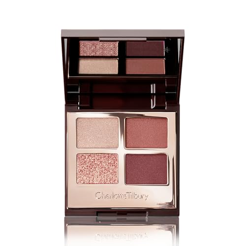
- ✅ The berry, crimson, and rose-gold tones are coordinated, so pairing the pans feels simple.
- ✅ Reports on the core shades point to smooth blending and an easy build from soft color to deeper definition.
- ✅ The four-pan layout keeps the routine small, clear, and quick to understand.
- ✅ Verified buyer feedback is positive about color quality and longevity.
- ❌ A tight color story gives us less variety than a larger palette with mixed tones.
- ❌ The sparkly Pop shade can look sheerer and create more fallout than the smoother pans.
- ❌ Value remains personal here, and verified feedback is mixed on whether four shades merit the premium price.
🧪 Lash Lab Notes — Zayba (A-Level Student & Beauty Enthusiast)
I find the Prime, Enhance, Smoke, and Pop order easy to follow because each pan has a clear job. For the sparkly Pop shade, I get more control by pressing it on with a fingertip or damp brush.
- 💡 Editor’s Note: We like a quad more when the shades clearly belong together. It cuts down the little decisions that can slow an eye look. But here’s the important nuance: Pop behaves differently enough to need a different application method. Treating every pan alike would hide both the convenience of this palette and its main limitation.
Want a current read on buyer feedback before deciding? Read reviews for Charlotte Tilbury Walk of No Shame.
Best for readers who keep coming back to warm berry and rose-gold eye looks.
Care tip: Start with the lighter shades, then build deeper color or shimmer as needed; take the look off with an eye-makeup remover, and stop use if irritation occurs.
What explains the uneven feel across the quad? Looking at each pan separately makes that much easier to see.
How the Four Walk of No Shame Shades Perform
We get a clearer picture when each pan is judged by its role, not by whether every texture feels identical. The smoother shades build the shape of the look. The most reflective pan works better as a finishing accent.
| Shade role | Color direction | Practical strength | Main trade-off |
|---|---|---|---|
| Prime | Light peach-champagne | Brightens and starts the look smoothly | Less of a standalone statement shade |
| Enhance | Warm sunset-pink | Adds warmth and builds the berry story cleanly | Color direction is specific rather than neutral |
| Smoke | Deeper berry/crimson | Adds depth around the outer eye and lash line | Can make the look distinctly red-toned |
| Pop | Rose-gold/copper sparkle | Adds high-shine dimension at the center of the lid | Sheerer payoff and more fallout; benefits from pressing on |
Which pans feel easiest first? Prime and Enhance are the low-friction pair. Independent testing found strong performance and smooth application there. Smoke brings the deeper berry definition that separates Walk of No Shame from a standard brown-and-gold neutral palette.
Pop needs a different touch. Its more emollient, transparent texture helps explain why a fluffy dry brush can scatter sparkle without building as much visible coverage. Pressing the shade onto the lid gives the particles a better chance to stay in place. A damp flat brush can make placement more intense as well.
And what about wear? One independent tester reported around 7.5 hours on the reviewed shades. That is one tester’s result, not a guaranteed wear time across every lid type, primer, climate, or application style.
How to Apply the Walk of No Shame Palette
The four-step order is useful because every pan already has a defined role. So what keeps the look easiest to control? We can keep the first three layers soft, then press Pop on as the finishing layer instead of treating it like another crease shade.
Step 1 — Prime the Lid
Sweep Prime over the lid for a light base. We can also bring a little toward the inner corner for extra brightness. A thin layer is enough, leaving room for the berry shades that come next.
Step 2 — Add the Enhance Shade
Blend Enhance through the crease and, if we like, lightly along the lash line. This is where the look starts moving away from pale shimmer and into the palette’s warmer sunset-pink direction.
Step 3 — Deepen With Smoke
Add Smoke at the outer corner, then blend a smaller amount through the crease or along the lashes. The deeper crimson tone creates the quad’s signature berry depth. Because it changes the overall direction quickly, building it in stages gives us more control.
Step 4 — Press On the Pop Shade
Press Pop onto the center of the lid with a fingertip instead of sweeping it back and forth. Want a more concentrated metallic effect? Independent testing suggests that a damp flat synthetic brush can help too. Both approaches are more controlled than brushing the sparkle on loosely.
That sequence is part of the appeal. It is also the limit. We get a ready-made path through the look rather than a wide-open collection of unrelated choices.
Once those four roles make sense, broader placement and blending skills become the useful next step. Our dedicated technique guide goes deeper into shaping and transitioning eyeshadow in general.
Who Is the Walk of No Shame Palette Best For?
The key question is simple: will we actually wear these colors often? If the answer is yes, the small format can be a strength. It suits a curated routine. It is not meant to replace a broad everyday palette full of taupes, browns, creams, and several accent families.
Best fit if you:
- reach for berry, red, rose-gold, and warm pink eye looks often;
- prefer a compact four-pan system instead of a large palette;
- are comfortable pressing sparkle on with a fingertip or flat brush;
- care more about coordinated shades than a high pan count.
Think twice if you:
- need one palette to cover lots of neutral and colorful directions;
- prefer to avoid visible sparkle fallout while applying eyeshadow;
- judge value mainly by pan count rather than how often the shades get used.
What about blue eyes? Warm berry and copper-leaning tones can create noticeable contrast against them, which helps explain why some buyers praise that effect. Still, eye color does not guarantee a flattering result. Undertone, depth, and personal taste matter just as much.
Buyer feedback also repeats a useful pattern. Coordinated color, blendability, and staying power get positive comments, while value is more mixed. That makes use frequency the better value test. Four shades we reach for often can be more useful than a much larger palette that sits untouched.
👉 If that compact berry-rose routine sounds like our makeup style, revisit the Charlotte Tilbury Walk of No Shame review above before deciding.
Walk of No Shame Alternatives to Consider
Like the Luxury Palette format but not the red-berry direction? The closest alternatives are other color stories in the same Charlotte Tilbury family, not generic “dupes.” They keep the curated-quad idea while changing the mood.
Pillow Talk shifts toward a softer nude-pink look. The Golden Goddess puts more focus on gold and bronze. The Bella Sofia stays warm, but bronze and copper take the lead instead of berry-red tones.
Are any of those automatically better? No. They are color-story alternatives, not a better-to-worse ranking. If the real goal is more variety, more price points, or options beyond one brand, a wider palette guide gives us a more useful comparison.
Passing on Walk of No Shame does not mean another Charlotte Tilbury quad has to be next. A broader comparison can help us decide whether a different format, color range, or value proposition fits the routine better.
Questions About the Walk of No Shame Palette
A few details are easy to mix up because the shade name now appears on more than one Charlotte Tilbury eye product. So which details matter most? These answers separate product identity from the main performance questions.
❓ Is Walk of No Shame the same as Eyes to Mesmerise Walk of No Shame?
No. We are reviewing the four-pan powder Luxury Palette here. Eyes to Mesmerise Walk of No Shame is a separate cream eyeshadow product.
❓ What was the palette previously called?
The Luxury Palette now uses the Walk of No Shame name. It was previously called Walk of Shame.
❓ How long does Charlotte Tilbury Walk of No Shame eyeshadow wear?
One independent tester reported about 7.5 hours of wear on the shades reviewed. That is tester-specific context, not a promise. Lid type, primer, climate, and application can all change wear.
❓ Is the Pop shade prone to fallout?
It can be. Independent testing found the sparkly pan more transparent and prone to moderate fallout. Results were better when the shade was pressed on with a fingertip or applied with a damp flat brush.
❓ How much product is in the Walk of No Shame Luxury Palette?
The current four-pan palette is listed with a total fill of 5.2 g.
Final Thoughts: Is Charlotte Tilbury Walk of No Shame Worth It?
The charlotte tilbury walk of no shame eyeshadow palette makes the strongest case when we truly want a compact berry-rose system and expect to repeat that look. The coordinated core shades and clear four-step layout are the strengths. In return, we accept extra fallout control with Pop and a narrow overall color range.
Need one palette for lots of unrelated looks? This quad is too focused for that job. But if crimson, warm pink, and rose-gold already belong in the regular rotation, the small format can feel intentional rather than restrictive.
So what decision rule works best? Buy for the color story, not the logo or the number of pans. This palette makes sense when these are four shades we will genuinely reach for, rather than when we expect a luxury compact to become our broadest eyeshadow collection.
👉 For one last check, compare that rule with the strengths and trade-offs in the Charlotte Tilbury Walk of No Shame review above.
Last update on 2026-10-18 / Affiliate links / Images from Amazon Product Advertising API