
⚡ TL;DR: best eyeshadow palette for hazel eyes
Which side of hazel do you want to show off? Mauve, plum, and red-violet can make the green look stronger.
Bronze, copper, gold, and warm neutrals lean the other way. They can make hazel’s gold-brown side feel richer. The best palette gives you that effect and enough support shades for a complete look.
Top Picks
- 🏆 Best Overall — Anastasia Soft Glam — Warm balance with gentle contrast
- 🥈 1st Runner-up — Almay Intense i Color — Guided color story for hazel eyes
- 🥉 2nd Runner-up — MAC Future Flame — Bold, fiery warmth
Hazel eyes can change character with the makeup around them. One day they may read greener. Another day, the amber and brown may stand out more.
That is why shopping around one so-called “best” shade can feel limiting.
The best eyeshadow palette for hazel eyes gives you a cohesive mix of shades that can pull forward green, gold, or warm brown without leaving half the palette untouched. We looked for cohesion, helpful support shades, finish variety, and clearly different color stories.
A huge pan count alone did not win points.
✨ Inside This Eye Shadow Guide
🌸 Psst…
Some links in this post are affiliate links. If you shop through them, we may earn a small commission at no extra cost to you — like a little coffee while we keep testing beauty favorites. ☕💄
Quick Comparison: Best eyeshadow palette for hazel eyes
Want the fast version first? Compare each palette’s job, color story, size, and finish mix here before reading the full reviews.
| Product | Best For | Color Story | Palette Size | Finish Mix |
|---|---|---|---|---|
| Anastasia Soft Glam | Best Overall | Neutral, bronze, rose, mulberry | 14 shades | 9 matte, 5 metallic |
| Almay Intense i Color | Made for Hazel Eyes | Hazel-focused coordinated tones | 4 shadows + primer | Shimmery-dominant mix |
| MAC Future Flame | Warm Contrast | Terracotta, orange, warm shimmer | 12 shades | Multiple finishes |
| Urban Decay Naked3 | Rosy-Mauve Looks | Soft pink, rose, mauve | 12 shades | Mixed finishes |
| Charlotte Tilbury Bella Sofia | Bronze/Copper Edit | Bronze and copper | 4 shades | Satin-matte, shimmer |
| Tarte Tartelette In Bloom | Everyday Neutrals | Neutral and bronze | 12 shades | Matte-led mix |
| NYX Ultimate Warm Neutrals | Budget Breadth | Warm neutrals | 16 shades | Multi-finish |
| Juvia's Place The Violets | Purple Contrast | Concentrated purples | 6 shades | Glitter, metallic |
Which Palette Colors Bring Out Hazel Eyes?
Why can two people with hazel eyes love completely different palettes? Hazel is not one flat color.
Green, amber, gold, and brown can show up in different proportions. So two smart palette choices can look nothing alike.
Purple-family shades use contrast. Mauve, plum, burgundy, and other red-violet tones sit opposite green on the color wheel.
That contrast can make the green in hazel eyes easier to notice. And no, you do not need a neon violet lid.
A muted mauve crease can do the job. So can a burgundy accent, only more softly.
Bronze, copper, and gold work differently. They echo the warmer flecks already in the iris instead of contrasting with them.
That can make amber and gold look richer. Warm browns and taupes then give those reflective shades a practical frame for everyday makeup.
What about finish? Mattes build shape and depth. Shimmer and metallic finishes catch light and can draw attention to green or gold flashes.
Choose the effect first, then check the supporting cast. You still need transition, depth, lid, and accent shades that cooperate.
Shopping one pan at a time is a different decision. If that is your plan, the narrower guide is the better next stop.
Purple or Bronze? Choose the Effect You Want
Stuck between purple and bronze? Think contrast vs. echo.
Purple, mauve, berry, and burgundy can pull green forward through contrast. Bronze, copper, gold, and warm brown echo hazel’s warmer tones instead.
Do your eyes look noticeably green? A rosy-mauve or purple palette can give you that red-violet relationship without feeling loud.
If your eyes lean warmer, bronze and copper may feel easier. Those shades repeat colors already visible in the iris.
Warm neutrals still count, too. Taupe, caramel, chocolate, and bronze may look subtler than plum.
Subtle is not the same as ineffective. For work, fast routines, or neutral-makeup fans, an easier wardrobe can be the smarter buy.
Beauty-community discussions are just as mixed. People with hazel eyes often mention mauve, purple, rust, peach, rose, gold, olive, and brown.
There is no single universally preferred family. Your taste and your own green-to-brown balance still matter.
Already know purple is the effect you want? A focused guide can go deeper without turning this roundup into a single-shade lesson.
It covers that contrast family with more detail than this palette guide needs.
The 8 Best Eyeshadow Palettes for Hazel Eyes
Which problem are you actually trying to solve? These picks are not eight versions of the same palette.
Some give you broad versatility. Some cut down the choices. Others deliberately lean warm or purple so the effect is obvious.
Anastasia Beverly Hills Soft Glam Eyeshadow Palette
This is a balanced shade wardrobe for warm glow plus soft red-purple contrast.
Want one palette that can move from everyday neutrals to warmer bronze looks? Soft Glam is built for that kind of range.
You also get rose and mulberry territory without turning the palette into a specialist color story.
Its 14-shade layout includes nine ultra-mattes and five high-shine metallics. That gives you enough finish roles to build a complete eye.
The color story is where it earns its spot. Neutral browns create structure. Bronze brings warmth.
Dusty rose and mulberry give hazel eyes a softer contrast route when you want more green to show.
Buyer feedback in the supplied product record is especially positive about pigmentation, blendability, color selection, and value. Longevity feedback is more mixed, and some buyers mention fallout.
Bottom line: Best balanced all-rounder when you want one palette to cover quiet neutrals and soft glam. Skip it if deep purple or a tiny edit is the real goal.

- ✅ Covers neutral, bronze, rose, and mulberry roles in one palette
- ✅ Nine matte and five metallic shades give you practical finish variety
- ✅ Buyer feedback often highlights pigmentation and easy blending
- ✅ Moves comfortably from everyday makeup into dressier color stories
- ❌ A compact four- or six-pan routine may suit you better
- ❌ Buyer feedback includes some fallout and mixed longevity comments
- ❌ The broader range can be unnecessary if you stick to one color family
🧪 Lash Lab Notes — Fauzia (University Student & Beauty Enthusiast)
I judge a larger palette by whether the transition, depth, lid, and accent shades can work together. For me, the real question is not “14 pans or fewer?” It is whether that mix can handle quick looks and polished ones without another palette.
- 💡 Editor’s Note: Soft Glam gives you several hazel-eye directions without forcing every look to feel colorful. Picture your routine first. If the browns, bronze, and rose-mulberry shades already make sense together, those extra pans have a job.
Want a reality check from current owners? See what people say about Anastasia Soft Glam.
Pick it for a versatile everyday-to-glam routine built around coordinated neutrals and warm accents.
Next comes the opposite idea: fewer choices and much more built-in guidance.
Almay Intense i-Color Shadow Palette
This is the most literal hazel-eye match here. Its guided layout keeps things simple, with made for hazel eyes positioning right up front.
Do big palettes make you freeze before the brush even comes out? Almay’s Hazel Eyes 030 colorway gives you a much narrower lane.
The compact includes four shadows plus a vitamin E-enriched primer base. A placement diagram shows you what goes where.
So you are not inventing the combination from zero.
The eye-color label is helpful, but it does not prove every other palette is less flattering. The real benefit is convenience.
You get coordinated shades, a preset sequence, and fewer decisions. Reviews in the supplied product data often praise pigmentation, flattering combinations, and ease of use.
Wear time, fallout, and breakage get more mixed feedback.
Bottom line: Best guided hazel-eye option if you want an edited, beginner-friendly path. Choose something larger if experimenting is half the fun.
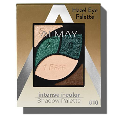
- ✅ Hazel Eyes 030 is directly curated for hazel eyes
- ✅ Four shadows plus a primer base keep the routine tightly edited
- ✅ The usage diagram cuts down guesswork for newer eyeshadow users
- ✅ Reviews often like the coordinated colors and simple setup
- ❌ Four shadows leave less room to experiment than a larger palette
- ❌ Buyer feedback on wear time and fallout is mixed
- ❌ Some buyers mention crumbling or breakage, so careful handling helps
🧪 Lash Lab Notes — Zayba (A-Level Student & Beauty Enthusiast)
I like guided placement when the goal is getting ready without building a combination from scratch. A compact layout also cuts decision overload. That can make this kind of set feel more usable than a much larger palette for a beginner.
- 💡 Editor’s Note: Treat the hazel-eye label as a shortcut, not a rule. We would buy this for the guidance and compact format first. The eye-color curation simply makes the starting point easier.
Want to know how that compact setup lands with other buyers? Check Almay Intense i Color feedback.
Choose it when you want a preset, eye-color-focused routine with fewer decisions.
If the guided format sounds good but you want more choice, there is a broader beginner-shopping path. It compares palettes by ease and usability, not by size alone.
Now the mood changes. We are leaving controlled guidance for a much warmer statement palette.
MAC Connect In Colour Future Flame Palette
Fiery terracotta and orange give hazel eyes fiery warm contrast. The effect is livelier than classic beige neutrals.
What if “warm” means more to you than tan and chocolate? Future Flame pushes the story further.
Its 12-pan range moves through terracotta, orange, cranberry-adjacent warmth, and shimmer. That creates a bolder way to emphasize hazel’s warm and green complexity.
And it does that without becoming a purple palette.
The listing positions the palette around pigment-packed color, silky texture, and fade resistance. Current research also confirms multiple finishes in the Future Flame story.
Those are manufacturer claims, not DapperedChic testing. The stronger buying reason is the shade architecture itself.
You get a warmer, bolder direction that clearly separates this palette from the neutral picks.
Bottom line: Best for vivid warm contrast if rust, orange, and terracotta are already your thing. Quiet-neutral fans may find it less intuitive.

- ✅ Brings a fiery warm story instead of another standard beige neutral set
- ✅ Twelve pans give you room for several warm combinations
- ✅ Multiple finishes add dimension to the orange-terra-cotta direction
- ✅ Works when you want hazel eyes to read warmer and more vivid
- ❌ Statement warmth can feel assertive if strong color is not your style
- ❌ No consolidated customer-review summary was supplied for this exact record
- ❌ It suits a clear warm-color preference better than a minimalist neutral routine
🧪 Lash Lab Notes — Fauzia (University Student & Beauty Enthusiast)
I would let one warm accent do most of the work here because these tones already make a stronger statement. Keeping the rest of the eye simple gives terracotta or orange room to show. The look does not have to become dramatic.
- 💡 Editor’s Note: Future Flame is easiest to defend when rusts and oranges already belong in your rotation. We would not buy it just because warm tones can flatter hazel eyes. The fiery color story needs to be the point.
Curious how buyers respond to that exact color story? Browse feedback for MAC Future Flame.
Choose it when you are comfortable with warm color and want a stronger terracotta-and-orange direction.
Want softer contrast instead? The next palette trades fire for rose and mauve.
Urban Decay Naked3 Eyeshadow Palette
Naked3 gives you soft rosy contrast when you want more green to show without going fully purple.
This palette lives in a useful middle ground. It is more color-directed than a brown-neutral set, but gentler than a concentrated violet palette.
Its 12-shade family centers soft pink, rose, and mauve neutrals. So red-violet-adjacent contrast can still look polished and wearable.
The supplied product data describes a rose-toned neutral palette with matte and shimmer finishes, buildable coverage, and a long-wearing formula claim.
Buyer feedback is especially positive about pigmentation, shade variety, blendability, wear, and the included brush and mirror. The recurring catch is physical durability.
Some buyers report palettes arriving damaged.
Bottom line: Best for soft rosy contrast if your hazel eyes lean green and you still want neutral usability. Go deeper purple if you want a more dramatic effect.

- ✅ Twelve rose, pink, and mauve neutrals keep the soft color story cohesive
- ✅ Mixed finishes give you both structure and reflective lid options
- ✅ Buyer feedback often praises pigmentation and blendability
- ✅ Easier for everyday wear than a dedicated violet palette
- ❌ It may feel too gentle if deep plum or saturated purple is the goal
- ❌ Some buyers say the physical palette arrived broken or damaged
- ❌ The rosy focus is less useful if bronze and copper are your main priority
🧪 Lash Lab Notes — Mahmuda (Homemaker & Beauty Enthusiast)
I like this softer rosy direction when green-enhancing contrast is the goal but deep purple feels like too much. Neutral mattes help keep pink and rose grounded. That makes the whole idea easier to fold into an everyday routine.
- 💡 Editor’s Note: Naked3 works best if you enjoy mauve contrast but do not want every look to read obviously purple. Its neutral framework makes that color direction easier to repeat.
Want to hear how owners describe both the shades and the packaging? Check Urban Decay Naked3 reviews.
Pick it for a soft rose-and-mauve wardrobe that still feels neutral enough for regular wear.
Prefer warmer hazel instead of greener hazel? The next quad is the compact bronze answer.
Charlotte Tilbury The Bella Sofia Luxury Palette
Four coordinated bronze-and-copper roles make Bella Sofia the compact bronze edit here.
Can four shades really be versatile? Yes, when each one has a clear job.
Bella Sofia uses defined Prime, Enhance, Smoke, and Pop roles. That gives you a repeatable bronze-and-copper routine without the visual clutter of a large palette.
The formula is presented as a rich pigment-infused powder with satin-matte and shimmer finishes. The supplied product record also notes positive buyer feedback about color, blendability, and longevity.
The trade-off is equally clear. This is a premium compact, and some reviewers question the value beside the small shade count.
At least one marketplace review also raised a seller-integrity concern. That concern is not independently verified, but it is worth remembering when you choose a seller.
Bottom line: Best compact bronze edit when you want a repeatable warm-glow routine. Skip it if you care more about breadth than simplicity.

- ✅ Four coordinated shades come with a defined application role
- ✅ Bronze and copper support the warmer side of hazel eyes naturally
- ✅ Satin-matte and shimmer finishes cover shape plus reflective detail
- ✅ The portable format suits a routine built around repeatable combinations
- ❌ Four pans give you limited variety if experimentation is the fun part
- ❌ Premium positioning can feel hard to justify if pan count matters to you
- ❌ Choose the seller carefully because one marketplace review alleged an inauthentic unit

🧪 Lash Lab Notes — Mahmuda (Homemaker & Beauty Enthusiast)
I find a four-pan edit easy to understand because every shade has a defined job. That kind of clarity can matter more than raw shade count. It is especially useful when a reliable routine matters more than a new combination every morning.
- 💡 Editor’s Note: Bella Sofia is the clearest proof here that “more shades” and “more useful” are different things. If all four roles match the way you do your eyes, the smaller format can be the more versatile choice for your routine.
Want a reality check on the compact format and premium positioning? See buyer comments on Charlotte Tilbury Bella Sofia.
Choose it for a streamlined bronze routine when defined roles matter more than a large shade library.
The next palette keeps the warmth but opens up the neutral wardrobe.
Tarte Tartelette In Bloom Palette
Tartelette In Bloom is the everyday neutral range pick when wearable bronze depth matters more than bright color.
Do you like hazel-enhancing makeup to still look like your normal neutral routine? This is the easy direction.
Its 12-shade structure stays in neutral and bronze territory. You get transition, depth, and lid options without building the whole eye around purple or orange.
The supplied record describes a clay-based powder palette. It also carries manufacturer claims around long wear and crease resistance.
Buyer feedback strongly favors pigmentation, blendability, longevity, and appearance. Coverage, fragrance, value, and blendability with certain primer or brush pairings are more mixed.
A couple of reviewers also report shades arriving broken in shipping.
Bottom line: Best for everyday neutrals when you want hazel-enhancing warmth inside a familiar wardrobe. It is not the obvious choice for visible purple contrast.

- ✅ Twelve coordinated neutral and bronze shades support repeatable looks
- ✅ Warm color can flatter hazel eyes without making the makeup feel bright
- ✅ Buyer feedback often favors pigmentation and longevity
- ✅ The range can move from subtle daytime looks into smokier neutral ones
- ❌ It is too restrained if obvious green-enhancing purple contrast is the main goal
- ❌ Some buyers give mixed feedback on fragrance and coverage
- ❌ A few shipping reviews mention broken or crumbled shades
🧪 Lash Lab Notes — Mahmuda (Homemaker & Beauty Enthusiast)
I see the neutral support shades as the reason this works for everyday makeup. The trade-off is subtlety. A bronze-and-brown story usually gives hazel eyes less visible contrast than a palette built around mauve or violet.
- 💡 Editor’s Note: This is for the person who wants the hazel-eye logic to disappear into an easy neutral routine. We would worry less about every shade feeling “special.” Ask whether the transition, crease, and lid combinations are ones you can repeat without thinking.
Want a broader sample of owner feedback on wear and blendability? Check Tarte Tartelette In Bloom feedback.
Pick it if neutral makeup is your default and you want warm, coordinated looks from daytime into deeper evening makeup.
Need more breadth for less money? NYX stretches the warm-neutral idea much wider.
NYX Ultimate Warm Neutrals Palette
Think of NYX as a warm-neutral library with budget-friendly breadth.
Want lots of options in one palette? You get 16 warm shades and a multi-finish format.
That makes this the broadest warm-neutral playground among the lower-cost directions here. You can move from lighter transitions to deeper browns, warm accents, and reflective shades.
You do not need a second palette just to keep the eye cohesive.
Still, more choice only helps when you can turn it into a routine. The supplied customer-review summary is positive about the neutral colors, smooth application, blending, wear, and value.
Pigmentation is more mixed. Some buyers find it strong, while others want more intensity.
So treat the 16 pans like a library. They are not a challenge you have to finish.
Bottom line: Best budget-friendly breadth if you want many warm choices and mixed finishes. Go smaller if too many options slow you down.

- ✅ Sixteen warm shades open up a broad range of combinations
- ✅ The multi-finish format gives you matte structure and reflective accents
- ✅ Buyer feedback often praises blending and value
- ✅ Warm neutrals are easy to work into daily makeup
- ❌ Buyer feedback on pigmentation is mixed, so keep intensity expectations realistic
- ❌ Sixteen pans can feel busy if a tightly edited routine suits you better
- ❌ The shades are not all specifically designed around a hazel-eye strategy
🧪 Lash Lab Notes — Zayba (A-Level Student & Beauty Enthusiast)
I would not expect a beginner to use all 16 pans just because they are there. I would pick a small repeatable group instead: a transition, a depth shade, one lid color, and one accent. That makes the larger palette feel much simpler.
- 💡 Editor’s Note: Think of this as a mini wardrobe you build inside a bigger palette. If three or four warm combinations already jump out at you, the size is useful. If you can picture only one, a smaller edit may be the better buy.
Want to see whether owner feedback matches your expectations for pigmentation and range? Read current comments for NYX Ultimate Warm Neutrals.
Choose it when budget matters and you want a wide warm-neutral range with several finishes.
If price is your main filter, a wider low-cost comparison can help. It keeps budget shopping separate from this guide’s hazel-eye color decision.
The last pick does the reverse of NYX. It gets narrower, because purple is the whole idea.
Juvia’s Place The Violets Palette
This is the focused-purple choice, with concentrated purple contrast for bringing green forward.
Need an all-purpose neutral workhorse? The Violets is not trying to be that.
Its six-pan pressed-powder story stays centered on purples. The supplied listing identifies glitter and metallic finishes.
That makes it a specialist palette for complementary contrast, not a one-box answer for every eye look.
And that specialization is exactly why it belongs here. Purple can create strong visual contrast against the green in hazel eyes.
Buyer feedback in the supplied record is enthusiastic about color, pigmentation, smoothness, ease of application, and wear. The catch is practical.
You may still want neutral mattes or browns from somewhere else for a quieter transition or crease.
Bottom line: Best concentrated purple contrast if you already want a purple-led effect. Choose a broader palette if you need neutrals in the same case.

- ✅ Six purple-focused pans keep the direction clear
- ✅ Glitter and metallic finishes bring light-catching dimension
- ✅ Buyer feedback is very positive about pigmentation and smooth application
- ✅ Complementary contrast gives you a direct route to emphasizing green in hazel eyes
- ❌ It is less self-contained if neutral transitions are part of your everyday routine
- ❌ A specialized purple story will not fit every makeup style
- ❌ Full ingredient information was not available in the captured product record
🧪 Lash Lab Notes — Fauzia (University Student & Beauty Enthusiast)
I would treat this as a specialist palette, not a neutral wardrobe. Purple can create strong green contrast on hazel eyes. Pairing it with neutral staples you already own can keep the result flexible when you do not want the whole look to read purple.
- 💡 Editor’s Note: Buy this because you genuinely enjoy purple, not because a color chart tells you to. If the accent family already fits your style, the six-pan focus becomes a strength. Otherwise, it can feel limiting.
Wondering how wearable owners find the purple intensity? See reviews for Juvia’s Place The Violets.
Pick it if you love purple, already own neutral staples, and want a stronger green-contrast effect.
The products are sorted. Now ask the question that matters at checkout: how many of these shades would actually earn space in your routine?
How to Choose a Palette You’ll Actually Use
A flattering accent pan can be exciting. But does the rest of the palette pull its weight?
Think of the palette as a small wardrobe before you buy. The pieces should support one another.
Start with the dominant color story. Mauve, berry, and purple give you the clearest contrast path when greener-looking hazel is the goal.
Prefer warmer amber and gold? Bronze, copper, gold, caramel, and warm brown make more sense.
A balanced palette can cover both directions. The shades still need to feel coherent together.
Next, stop counting pans and count roles. You usually need a transition shade, something deeper for definition, one or two lid options, and perhaps an accent.
A 16-pan palette is not automatically more versatile than a four-pan quad. If most of those 16 colors sit untouched, the extra choice did not help.
Usable shades beat pan count.
What comes third? Finish mix.
Mattes shape the eye and ground reflective color. Shimmer and metallic shades catch light, which can make warmer or greener flashes easier to notice.
Mostly wear matte looks? A sparkle-heavy palette may be less useful, even when the colors are technically flattering.
Then match the format to your actual routine. Bella Sofia and Almay’s guided set make sense when speed and repeatability matter.
Soft Glam and NYX give you more room to change the look. Neither approach is automatically better.
And you do not need “hazel eyes” printed on the package. Eye-color curation can make the first choice easier.
Long term, color story, cohesion, finish balance, and your own preferences matter more.
Common Questions About Eyeshadow Palettes for Hazel Eyes
Still have a few practical questions? These are the ones that matter after color story and cohesion are clear.
The answers are short on purpose. No single rule should pretend to fit every pair of hazel eyes.
❓ What eyeshadow palette colors make hazel eyes look greener?
Mauve, plum, burgundy, berry, and other red-violet tones can make green in hazel eyes more noticeable through complementary contrast. You do not need an all-purple palette.
One or two contrast shades surrounded by useful neutrals can be easier to wear.
❓ Do you need a palette made specifically for hazel eyes?
No. Almay’s guided Hazel Eyes colorway can make the choice simpler, but the best eyeshadow palette for hazel eyes is ultimately the one whose dominant color story creates your preferred effect and whose support shades you will actually use.
❓ Is a four-pan palette enough for hazel eyes?
Yes, when those four shades cover useful jobs and work together. A well-edited prime, transition or enhance, depth, and reflective accent combination can be more practical than a larger palette full of rarely used colors.
❓ What eyeliner and mascara colors pair well with hazel-eye eyeshadow?
Do you want the liner and mascara to reinforce the eye look or add another contrast? That choice belongs beside the palette decision, not inside it.
Eyeliner can define the color story. Mascara can make the finished eye feel softer, warmer, or more dramatic.
For eyeliner, the better next stop is a color guide built around hazel eyes. It compares adjacent tones without turning this palette guide into a second buying guide.
📌 Best eyeliner colors for hazel eyes
Mascara is its own finishing choice, especially when you are weighing classic dark definition against softer color effects. The focused guide keeps that decision separate and deliberate.
Final Thoughts: Build a Shade Wardrobe, Not a Pan Collection
What should you remember when every palette starts looking tempting? Choose the dominant color story that creates the hazel-eye effect you want.
Then make sure the support shades are ones you will really use. Build a shade wardrobe, not a pile of flattering pans surrounded by leftovers.
That could mean rosy mauves that pull green forward. It could mean bronze and copper that echo gold.
Or it could be a balanced neutral palette that moves between both. The better answer is the one that makes sense as complete looks, not just a pretty swatch.
Once the palette is settled, the fun part starts. The next guide turns those shades into repeatable combinations that feel like you.
Last update on 2026-10-18 / Affiliate links / Images from Amazon Product Advertising API