
⚡ TL;DR: best eyeshadow palettes for brown eyes
Brown eyes give us plenty of color options. Warm shades can echo the iris, while cooler or brighter colors can create contrast.
So what makes a palette worth buying? We want a cohesive mix of light, midtone, and depth shades in finishes we will actually use—not simply the biggest pan count.
Top Picks
- 🏆 Best Overall — MAC Bronze Influence — warm-and-contrast versatility
- 🥈 1st Runner-up — Mario Master Mattes — flexible matte depth
- 🥉 2nd Runner-up — Juvia’s Place The Warrior — rich bronze-gold payoff
Brown eyes make color fun. They also make shopping a little messy. Bronze, cool taupe, plum, and olive can all work for very different moods.
The best eyeshadow palettes for brown eyes turn that freedom into something easier: a color story that works together. This guide stays focused on palettes. For single-shade ideas, the broader brown-eye guide fits better.
✨ Inside This Eye Shadow Guide
🌸 Psst…
Some links in this post are affiliate links. If you shop through them, we may earn a small commission at no extra cost to you — like a little coffee while we keep testing beauty favorites. ☕💄
Quick Comparison: Best eyeshadow palettes for brown eyes
Which direction fits our routine fastest? These eight palettes cover very different needs, from all-matte definition to purple contrast and travel-friendly simplicity.
The table gives us the quick view. Then the matching review shows the trade-offs.
| Product | Best For | Color Story | Finish Mix | Palette Size |
|---|---|---|---|---|
| MAC Bronze Influence | Best Overall | Gold, bronze, taupe, olive | Mixed finishes | 6 pans |
| Mario Master Mattes | Matte Neutrals | Neutral browns | Matte only | 12 pans |
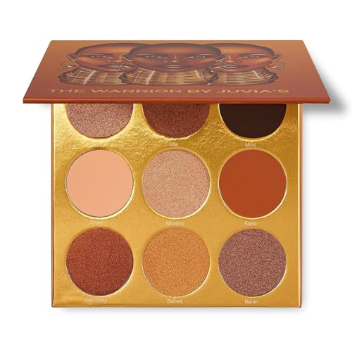
| Juvia's Place The Warrior | Warm Metallics | Gold, brown, bronze | Matte + shimmer | 9 pans |
| Juvia's Place The Violets | Purple Contrast | Purple-focused | Matte/shimmer/metallic/glitter mix | 6 pans |
| ColourPop That's Taupe | Cool-Toned | Cool taupes | Matte + metallic/shimmer | 9 pans |
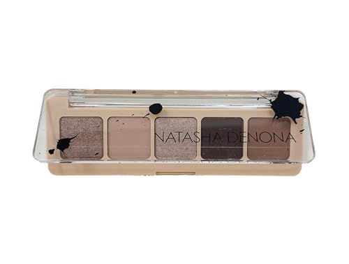
| Natasha Denona Mini Dream | Travel | Nude to burgundy-brown | 3 mattes + 2 metallics | 5 pans |
| COVERGIRL Spiced Copper | Budget | Warm copper | Shimmery | Compact palette |
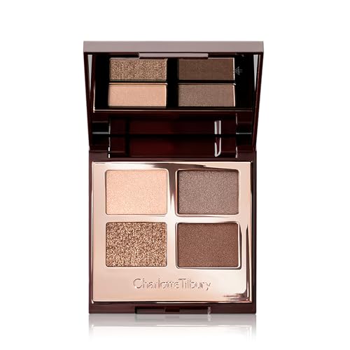
| Charlotte Tilbury Golden Goddess | Luxury Compact | Gold + bronze | Satin-matte + shimmer/metallic | 4 pans |
How to Choose a Palette for Brown Eyes
Brown eyes are flexible enough that eye color cannot make the whole decision for us. The bigger question is palette cohesion.
Do the shades work together? A useful palette should build a complete look without sending us back to three other products.
A practical palette usually gives us a lighter shade, one or more midtones, and enough depth for the crease or lash line. Finish mix matters too.
Do we reach for shimmer often? If not, a strong matte wardrobe can be more useful than a colorful palette packed with reflective shades.
Complexion and undertone can change the result just as much as iris color. A cool taupe may look polished on one complexion and flat or gray on another. A warm brown can look rich and bronzy on one person, then too orange on someone else.
On deeper skin, enough mid and deep shades matter even more. Primer can also help when a shadow applies more sheerly than we want.
Brown eyes work with warm-enhancing shades like bronze, copper, and gold. They can also take stronger contrast from plum, green, and blue.
Need the shade-level version of that idea? The guide below goes deeper, while this article keeps judging the palettes on cohesion.
More pans do not automatically mean more options. Ten shades at nearly the same depth can be less useful than five shades with clearly different jobs.
Once we know the finishes and depths we actually use, the color direction becomes much easier to choose.
Warm, Cool, or Color Contrast?
So should we match brown eyes or contrast them? Both can work.
One route echoes the warmth already visible in the iris. The other puts a cooler or brighter hue beside it for stronger contrast. Neither approach is more “correct”; they simply create different effects.
| Direction | Shade Families | What It Does | Best If You Want |
|---|---|---|---|
| Warm enhancement | Bronze, copper, gold, caramel | Echoes amber/golden warmth | Soft glow, bronzy definition |
| Cool neutral | Taupe, cool cocoa, muted gray-brown | Adds definition without orange warmth | Polished, understated contrast |
| Color contrast | Plum, violet, green, blue | Places a different hue beside brown | More noticeable color contrast |
Warm metallics can emphasize golden or amber warmth. Plum, violet, green, and blue create more obvious hue contrast.
That is why very different palette families can flatter brown eyes. There is no single color story that has to win.
Want the iris to look more defined against the rest of the makeup? The color relationship matters more than any special property of one product.
The deeper guide below explains which families create that effect and why.
A shade can sound flattering on paper and still look dull, harsh, or ashy once complexion and undertone enter the picture. That mismatch matters.
Need the specific avoid-list instead of a buying guide? The narrower guide below handles that question directly.
Now the color logic is clear. That makes the picks below easier to compare by the job each palette is meant to do.
Best Eyeshadow Palettes for Brown Eyes
Why eight palettes instead of eight versions of the same neutral idea? Each pick earns its place through a different color story, finish mix, size, or buying use case.
Brown eyes are flexible. The shortlist should be too.
MAC Connect In Colour Bronze Influence Palette
Best Overall — warm-and-contrast versatility
Six pans can be enough when every shade has a clear role. Here we get gold, bronze, taupe, and olive in one compact story.
That mix gives us familiar warm tones plus a greener contrast option. No giant palette required.
So what pushes it past a basic bronze palette? The two-direction color story.
We can keep the look soft and warm, deepen it with smoky neutrals, or use the olive/forest-green side for more contrast around the iris.
Bottom line: Compact versatility is the draw here when we want warmth and contrast together; matte-first routines may need more structure elsewhere.

- ✅ Six pans keep the color story focused and easy to read
- ✅ Warm metallics plus olive give us two brown-eye color directions
- ✅ Listing materials describe the powder color as pigmented and buildable
- ❌ Matte-first routines may feel boxed in by the mixed-finish focus
- ❌ More transition-depth options may call for a larger neutral palette
🧪 Lash Lab Notes — Dr. Sazia (Medicine Specialist & Beauty Enthusiast)
I like to think of a six-pan palette as six separate jobs. I would use lighter metallics for lift, midtones for transition, and deeper olive or bronze for definition instead of trying to use every shade at once.
- 💡 Editor’s Note: We like the fact that this palette gives brown eyes two clear routes without turning messy. The useful part is not bronze by itself. It is the way warm shades and olive contrast still belong in one look.
Mostly a matte person? The next pick gives us far more control over shape.
Need another angle before deciding? We can read buyer feedback for MAC Bronze Influence.
This is our compact choice for warm, smoky, and olive-accented looks.
Care tip: Start with a clean brush or fingertip, build slowly, and remove the eye makeup gently afterward.
Mixed finishes are flexible. But what if shine is not part of the plan?
The next palette puts matte control first.
Makeup By Mario Master Mattes: The Neutrals
Best Matte Neutrals — flexible matte depth
When crease color, soft definition, and a deeper outer corner do most of the work, matte-only can be more practical than mixed finishes. This 12-shade neutral wardrobe is built for exactly that kind of structure.
The main benefit is control. We can keep the eye soft, add deeper definition, or build a smoky shape without working around shimmer pans we barely use.
And the catch? If we want sparkle or metallic brightness from the same palette, we still need another product.
Bottom line: Matte-first control makes this strongest for layered neutral definition; a one-palette shimmer option needs a different pick.

- ✅ Twelve neutral shades give us plenty of transition and depth choices
- ✅ The all-matte format stays focused on shape and definition
- ✅ Buildable neutrals can move from subtle looks to smoky ones
- ❌ There is no built-in shimmer or metallic accent for reflective lids
- ❌ Twelve pans can feel like too much for a minimalist travel kit
🧪 Lash Lab Notes — Dr. Rabeya (Dentist & Beauty Enthusiast)
I think matte-only palettes make placement easier to read because shine is not competing with the shape. If I wanted brightness on the lid, I would add a separate shimmer only for that step.
- 💡 Editor’s Note: We would choose this when mattes already do most of the work in our routine. It also pairs easily with one favorite shimmer we already own, so reflective shades are not taking up space unused.
Need built-in glow? One of the mixed-finish palettes will make more sense.
Still deciding on matte-only? We can see what current buyers mention about Mario Master Mattes.
This is the pick for matte crease work, everyday definition, and smoky depth without built-in shine.
Care tip: Keep eye brushes clean, blend with thin layers, and remove the makeup with a suitable eye-makeup remover.
Want the opposite direction? The next palette puts warm shimmer, gold, and bronze right at the center.
Juvia’s Place The Warrior Eyeshadow Palette
Best Warm Metallics — rich bronze-gold payoff
Gold, brown, and bronze are the classic harmony route for brown eyes. This nine-pan palette commits to that warm direction.
Love looks that sit between glowing bronze and deeper warm smoke? That is exactly where this color story feels most at home.
The mix includes mattes and shimmers. So we can build shape first, then add the brighter metallic effect.
Buyer feedback in the supplied product record is strongly positive about pigmentation and blendability. Some customers also report damaged or broken palettes after shipping.
Bottom line: Warm bronze drama is the strength here for gold-and-bronze lovers; cool-neutral routines need a different lane.
- ✅ Gold, brown, and bronze stay tightly focused on the warm use case
- ✅ Mattes and shimmers give us both structure and reflective accents
- ✅ Buyer feedback repeatedly praises the color and smooth blending
- ❌ The strongly warm color story gives us less cool-tone contrast
- ❌ Some buyer feedback mentions damaged palettes, so checking the delivery matters
🧪 Lash Lab Notes — Engr. Nusrat (Engineer & Beauty Enthusiast)
I would build the depth first, then bring in the brightest metallic. Keeping the deepest brown near the lash line can give an all-gold look more shape instead of letting everything blend into one bright wash.
- 💡 Editor’s Note: We see this as the warm-glam pick, not the do-everything pick. The tonal range helps bronze and gold look layered instead of turning into one bright wash.
Want something cooler or more unexpected? The next options move away from this warm lane.
Curious about the buyer side of the story? We can check feedback on pigmentation and packaging for Juvia’s Place The Warrior.
This makes sense when gold, bronze, and deep warm brown are already our favorite eye colors.
Care tip: Tap off extra powder, build the color in layers, and blend with circular motions when needed.
Warmth is not the only way to highlight brown eyes. Want a clearer color contrast?
Purple is where the next palette earns its spot.
Juvia’s Place The Violets Palette
Best Purple Contrast — a dedicated violet color story
Another warm neutral palette can start to feel repetitive. Purple gives brown eyes a very different kind of emphasis.
This six-pan story leans fully into violets, including metallic and glitter finishes. It reads like a real contrast palette, not a neutral palette with one token purple.
That strong focus is also the limitation. This is not the natural choice when beige-and-brown everyday looks need to come from the same compact.
But if we deliberately want color around the eyes? The purple direction makes much more sense.
Bottom line: Purple contrast is the reason to choose this around brown eyes; neutral-only routines will get more use elsewhere.

- ✅ A dedicated purple family gives us a true alternative to warm neutrals
- ✅ Product materials describe the pressed color as highly pigmented and blendable
- ✅ Buyer feedback in the supplied record is positive about smoothness and color intensity
- ❌ A purple-first color story gives strict neutral routines less flexibility
- ❌ Glitter and metallic finishes may not fit a mostly matte routine
🧪 Lash Lab Notes — Fauzia (University Student & Beauty Enthusiast)
I like purple as a contrast color because we do not need a complicated multicolor look. I would start with one muted or deeper purple near the crease or lash line, then place the brighter finish only where we want the focus.
- 💡 Editor’s Note: We like this as a deliberate second-direction palette because it brings something our browns and bronzes cannot. Keeping the look tonal—several purples instead of purple plus every other color—can also make a bold family easier to wear.
Want that same “not warm” feeling with less color? Cool taupe is the quieter next lane.
Need another view on the violet color story? We can browse buyer reviews of Juvia’s Place The Violets.
This is the colorful pick when we still want one coordinated shade family.
Care tip: Keep brushes clean, tap off extra powder, and consider primer when stronger vibrancy and wear are the goal.
Prefer a quieter move away from warm browns? The next palette trades jewel tones for cool taupe.
ColourPop That’s Taupe Eyeshadow Palette
Best Cool-Toned — cool taupe balance
Not every brown shadow needs to lean caramel, copper, or orange. This nine-pan palette gives us a cooler route.
Five mattes and four metallics keep the taupe story muted while still giving us contrast.
That matte-to-metallic split is useful. We can shape the crease and outer corner first, then decide how much shine the lid needs.
The catch is complexion fit. Very pale or gray-leaning taupes can look subdued on some skin tones, so the deeper pans matter.
Bottom line: Cool-neutral definition is the appeal here without orange warmth; enough depth matters so taupe does not disappear.

- ✅ Five mattes and four metallics balance structure with shine
- ✅ The cool-taupe story feels clearly different from the warm bronze picks
- ✅ Buyer feedback in the supplied record praises smooth blending and the neutral shade mix
- ❌ Very cool or pale taupes can look gray or low-contrast on some complexions
- ❌ Some buyer feedback mentions shattered pans or mixed longevity experiences
🧪 Lash Lab Notes — Mahmuda (Homemaker & Beauty Enthusiast)
I would judge a cool taupe palette by its mid and deep shades, not just the palest ones. Very pale gray-taupes may not give every complexion enough depth, so I would anchor the look first and then decide how the palette reads.
- 💡 Editor’s Note: We reach for this lane when the usual warm-neutral palette keeps looking too orange. Nine pans also give us more room to adjust than a tiny quad without turning into a huge color library.
Is cool tone itself the priority? The dedicated roundup can take that comparison further.
Want the buyer perspective too? We can read reviews on blending, shade tone, and shipping condition for ColourPop That’s Taupe.
This is our cool-brown and taupe pick when we want matte structure plus reflective accents.
Care tip: A firmer brush can pack on color, while a fluffier brush helps soften the edges.
Cool-toned palettes go far beyond one taupe story. The differences in depth, finish, and color balance can be substantial.
Want to compare that whole family? The broader guide below is the better next stop.
The next palette stays small for a different reason. This time, portability is the point.
Natasha Denona Mini Dream Eyeshadow Palette
Best Travel Palette — compact five-pan versatility
A travel palette only earns space in the bag if the small size still covers the jobs we need. Mini Dream keeps the choice to five shades: three mattes and two metallics across nude, taupe, and burgundy-brown territory.
That compact setup can still build a complete look. It especially suits a simple transition-depth-shimmer formula without packing a larger palette.
So what do we give up? Five shades leave less room to change undertone, depth, or color direction from day to day.
Bottom line: Travel-friendly simplicity works here when five coordinated shades cover the looks we usually make.
- ✅ Five pans are easy to pack and quick to understand
- ✅ Three mattes plus two metallics cover basic structure and brightness
- ✅ Nude-to-burgundy-brown gives us more contrast than a plain beige mini
- ❌ Five shades limit how far we can shift undertone and depth
- ❌ Bigger-palette fans may miss extra transition and accent choices
🧪 Lash Lab Notes — Zayba (A-Level Student & Beauty Enthusiast)
I find a five-pan layout easier to read because there are fewer combinations to sort through. I would pair one matte transition, one deeper matte, and one metallic for a complete look without making the routine complicated.
- 💡 Editor’s Note: We like this kind of compact when fewer decisions are the real goal, not just a smaller package. A mini palette makes sense when every shade contributes to a look we would repeat.
Is portability the deciding factor? It is worth comparing this with travel palettes built around other color stories too.
Before it goes in the bag, we can see what current buyers report for Natasha Denona Mini Dream.
This is the compact routine for nude, taupe, burgundy-brown, and metallic accents.
Care tip: Follow the package directions and keep eye-makeup tools clean between uses.
Travel changes what matters in a palette: size, finish mix, and packaging can all rise in importance. Those trade-offs are bigger than a brown-eye-only comparison.
Want the wider travel view? The roundup below handles that job.
If portability matters less than keeping the purchase simple and affordable, the next compact moves warmer.
COVERGIRL Clean Color Spiced Copper Palette
Best Budget — simple warm copper color story
Sometimes we do not need a whole wardrobe of taupes, plums, and olives. We already know copper is the direction.
Spiced Copper keeps the choice narrow with a warm, shimmery story that lines up naturally with brown eyes’ golden warmth.
The supplied product record also highlights high-impact color and a soft vegan formula. Buyer feedback is positive about the colors, shimmer, and smooth application.
There is one practical caution. Some customers report broken product on arrival, so checking the palette as soon as it reaches us makes sense.
Bottom line: Simple warm value is the strength here when copper is the goal and a large palette is not.

- ✅ The focused copper story is simple to understand
- ✅ A shimmery finish supports quick warm-brightening looks
- ✅ Buyer feedback in the supplied record praises the color, smoothness, and blending
- ❌ The narrow warm story offers less variety than the larger palettes here
- ❌ Some customers report broken product, so checking the compact after delivery matters
🧪 Lash Lab Notes — Fauzia (University Student & Beauty Enthusiast)
I would choose a small copper palette when warm looks are already the preference and a large shade library is unnecessary. I keep expectations on one coordinated eye rather than asking a small palette to cover every color story.
- 💡 Editor’s Note: We see this as the low-friction option. We are buying one clear warm direction, not trying to cover every possible look. That can be a strength when copper is already our default.
Want more affordable palettes in different color stories? The drugstore category is the stronger next stop.
Need the buyer view on this warm compact? We can read reviews of COVERGIRL Spiced Copper.
This is the straightforward warm-copper choice when extra shade variety is not worth paying for.
Care tip: Use a clean brush or fingertip, blend as needed, and remove the makeup gently after wear.
Budget palettes cover far more than copper. The price tier can include very different color stories and finish mixes.
If price is our main filter, the wider field below helps us compare before choosing a shade direction.
The last pick flips the trade-off again. We get fewer shades, but in a more premium edited quad.
Charlotte Tilbury Luxury Palette — Golden Goddess
Best Luxury Compact — edited gold-and-bronze quad
Four pans can sound restrictive. But what matters is whether each one has a useful job.
Golden Goddess stays tightly focused on gold and bronze, with satin-matte plus shimmer/metallic finishes. The idea is simple: move from soft definition to a brighter lid without a long decision tree.
That simplicity is the whole point for a warm quad. It is also the limit.
We get much less room to adjust undertone or depth than in a nine- or 12-pan palette. Buyer feedback in the supplied record is also mixed on value.
Bottom line: Edited luxury warmth makes sense when gold and bronze already fit our routine; more variety calls for a larger palette.
- ✅ Four complementary shades keep the warm story tightly focused
- ✅ Satin-matte and shimmer finishes cover structure plus brightness
- ✅ The portable compact works for an intentionally edited routine
- ❌ Four pans leave little room to shift undertone or add more transition depths
- ❌ Mixed buyer opinions on value matter more at a luxury price tier

🧪 Lash Lab Notes — Dr. Sazia (Medicine Specialist & Beauty Enthusiast)
I think a four-pan quad can make placement feel straightforward because every shade has a narrower job. I would only accept the smaller range when that gold-and-bronze story already fits the routine from the start.
- 💡 Editor’s Note: We like this most when fewer, clearer choices are actually the goal and gold-and-bronze looks already feel natural. Four pans help only when those four jobs match our routine. Otherwise, the compact size becomes a restriction.
So what makes a small palette good? A color story we genuinely want to repeat.
Want another view on value and wear? We can check buyer reviews for Charlotte Tilbury Golden Goddess.
This is the polished gold-and-bronze pick when an edited four-pan routine feels like enough.
Care tip: Build the color with a clean brush or fingertip, then remove it gently with a suitable eye-makeup remover.
We have covered the main buying paths. But can a few edge cases still change the answer? Absolutely.
Brown-Eye Palette Questions
Not every decision belongs inside one product review. These quick answers help when eye color, complexion, and the rest of the eye look start pulling us in different directions.
❓ Can I wear colorful eyeshadow with brown eyes?
Yes. Plum, violet, green, and blue are useful contrast families around brown eyes, according to expert color guidance. Bronze and gold create a warmer, more harmonious effect.
So are brown and beige the only safe lane? No. We have more room than that.
❓ What if cool taupes look gray or ashy on me?
That usually points to complexion and undertone fit, not proof that cool tones are “wrong” for brown eyes.
What can we change? More depth, a less gray taupe, or a different color family may work better when the palette keeps looking flat.
❓ Do very dark brown eyes need different palette advice?
The same warm-versus-contrast framework still applies to very dark brown eyes. The difference is that depth and visible contrast may need more specific attention.
Want that narrower guidance? The dedicated guide below goes further.
📌 Eyeshadow ideas for dark brown eyes
❓ Is a bigger palette always more versatile?
No. A smaller palette can be more useful when the shades cover clear light, midtone, depth, and accent jobs.
A large palette can still feel repetitive. That happens when too many pans are doing the same thing.
❓ What eye-cosmetic hygiene basics matter?
Keep tools and products clean, avoid sharing eye cosmetics, and stop using a product if it causes irritation. Those basics matter.
The U.S. Food and Drug Administration also advises using products intended for the eye area and following eye-cosmetic safety practices.
❓ What eyeliner color should I pair with these palettes?
Once the shadow color story is set, eyeliner can either reinforce it or add another contrast point. That second color choice can change the whole effect.
Need a brown-eye-specific liner guide? The one below keeps that decision separate from the palette itself.
📌 Best eyeliner colors for brown eyes
Those edge cases are settled. The simplest final test is this: what kind of eye look do we actually repeat?
Final Thoughts on Brown-Eye Palettes
Start with the color direction and finish profile we wear most. Then choose the smallest cohesive palette that still gives us enough light, midtone, and depth.
Brown eyes give us unusual flexibility. The smartest purchase turns that freedom into looks we can build without overthinking every pan.
Sometimes eye color stops being the main filter. Color story, finish, or formula may matter more once we know our general direction.
Want to compare palettes beyond brown-eye-specific picks? The broader roundup below is the better next stop.
Shadow is only one part of the brown-eye color story. Mascara can finish the look from a different angle.
Ready for that adjacent choice? The next guide focuses on mascara color instead of adding more palette advice here.
Last update on 2026-10-17 / Affiliate links / Images from Amazon Product Advertising API