
⚡ TL;DR: color correcting primer
Green can soften the look of redness. Lavender helps a sallow cast look brighter. Cool pink brings a fresher impression. The best correcting base is usually the one that blends in so well we stop seeing its color.
Top Picks
- 🏆 Best Overall — stila One Step Correct Original — Three pigments, one soft-focus base
- 🥈 1st Runner-up — MAKE UP FOR EVER Step 1 — Focused green redness correction
- 🥉 2nd Runner-up — e.l.f. Brightening Lavender Primer — A simple lavender brightener
A color-correcting primer can make the morning base feel simpler when foundation leaves redness or dullness showing.
But bold green or purple in the bottle is not our goal. If that color sits visibly on the face, the effect can look less natural. Here we compare seven primer-format tints, not heavy standalone correcting concealers.
✨ Inside This Face Primer Guide
🌸 Psst…
Some links in this post are affiliate links. If you shop through them, we may earn a small commission at no extra cost to you — like a little coffee while we keep testing beauty favorites. ☕💄
Quick Comparison: Best Color-Correcting Primer
Tint matters. So does where and how much we apply. We can use this “best for” column as a starting point. It does not promise that any tint will vanish on every complexion.
| Pick | Correcting tint | Best for | Key limitation |
|---|---|---|---|
| stila One Step Correct Original | Green, lavender, peach | Several mild concerns | Less targeted correction |
| MAKE UP FOR EVER Step 1 | Green redness corrector | Noticeable facial redness | Shade must match concern |
| e.l.f. Tone Adjusting Primer | Green | Affordable redness prep | Too much can show green |
| e.l.f. Brightening Lavender Primer | Lavender | Yellow-looking dullness | May look cool on some skin |
| L.A. Girl PRO.Prep HD | Cool pink | Tired-looking complexion | Not a redness specialist |
| NYX Studio Perfect Primer | Green | Green-tint primer alternative | Finish needs personal checking |
| stila One Step Correct Kitten | Green, lavender, rosy shimmer | Added luminous finish | Glow may be unwanted |
What Each Correcting Primer Color Actually Does
Start with your visible concern, not your foundation shade. Green pigments can make diffuse redness look quieter, while lavender primers are designed to counter a yellow or sallow-looking cast. A cool pink tint adds an impression of brightness rather than functioning as the strongest neutralizer for flushed cheeks.
These are cosmetic effects, not fixed color-wheel equations that behave identically on every face.
On deeper skin, a very pale lavender or green base can create an ashy cast if the primer is thick; on lighter skin, a saturated green layer may remain obvious around the nose. Blend a small amount on an actual area of concern and inspect it in natural light before choosing to cover the whole face.
A multicolor formula uses a different trick.
Its colored ribbons blend as they leave the bottle, making a balancing veil instead of one concentrated shade. That can help when no single tone concern stands out. For redness alone, a focused green shade may make more sense.
How a Color Correcting Primer Differs From a Color Corrector
A tinted primer prepares skin for makeup and adds sheer visual correction.
A separate color corrector usually tackles more concentrated discoloration before concealer or foundation. It may carry much more pigment. That is why our choices here are primer bases, not opaque corrector pots, palettes, or under-eye concealers.
One small mark needs stronger coverage? Then a sheer tinted primer may not be the right product type.
Maybe we want to correct one dark spot rather than an overall red or dull cast. The separate guide explains the stronger correcting colors and formats for that more focused job.
Best Color Correcting Primer Picks
Every selection here is a distinct commercial variant. We start with the correcting color, then consider finish and texture. The right pick still has to suit how much makeup we actually want to wear.
stila One Step Correct Primer — Original
Best Overall Multi-Tone
A combined green, lavender, and peach primer for gentle, all-over balancing.
A little redness here, some dullness there. Which tint do we pick first? Original mixes green, lavender, and peach pigments in one primer. This can make the decision easier when several mild concerns compete for attention.
Its sheer, blended positioning can also suit days without foundation. The compromise? A mixed tint cannot target one concern as precisely as a single correcting color. That is often the very trade-off we are choosing.
Bottom line: A flexible option for mild, mixed tone concerns, not the best choice for pinpoint correction.

- ✅ Combines three correcting pigment families
- ✅ One primer step for varied mild concerns
- ❌ Not meant to provide opaque spot coverage
- ❌ May be less direct than a pure green shade

🧪 Lash Lab Notes — Mahmuda (Homemaker & Beauty Enthusiast)
When redness and sallowness appear together, I would consider a multi-ribbon primer. It may simplify our tint choice. I still suggest checking the dry finish in daylight before skipping a more focused shade.
- 💡 Editor’s Note: We would begin with Original when a few minor tone concerns compete. Its appeal is the pigment mix, not a promise to erase marks. A light application comes first; we can reassess the dried look.
Want to investigate how shoppers describe the Original finish? Read feedback on stila One Step Correct Original.
For mixed, mild redness and dullness in one primer.
Care tip: Follow the product directions and spread a little at a time.
Next comes a primer for one more specific concern: redness.
MAKE UP FOR EVER Step 1 Color Corrector Primer
Best Targeted Redness
Shade 4 Redness Corrector focuses on the appearance of redness. That is its job.
Do the cheeks look red while the rest of the face looks even?
Step 1 Redness Corrector may be a more direct match. We need that exact shade, though. It belongs to a larger Step 1 color-correcting primer family, and those related shades do different jobs.
The brand positions this line as a primer that improves the look of skin tone under foundation. Select the shade for the problem you can actually see: another Step 1 shade aimed at sallowness or dullness does not serve exactly the same job.
Bottom line: Best for a focused redness concern when you want primer-format prep.

- ✅ Specific shade 4 for visible redness
- ✅ Primer rather than an opaque corrector
- ❌ Not the shade to buy for lavender-style correction
- ❌ Not a treatment for skin inflammation
🧪 Lash Lab Notes — Dr. Sazia (Medicine Specialist & Beauty Enthusiast)
I separate cosmetic color correction from skin treatment. A green base can visually soften flushing, but it cannot treat the irritation beneath it. If skin burns or stings, I would put comfort and professional advice before more pigment.
- 💡 Editor’s Note: We would keep this pick tied to the actual Redness Corrector variant. The shade number matters. Similar Step 1 packaging may point to a very different correcting goal. Sensitive skin also needs its own tolerance check.
For owner impressions of the specific shade 4, open the reviews for MAKE UP FOR EVER Step 1.
For a primer that aims to visually soften facial redness.
The next option brings green correction closer to a drugstore budget.
e.l.f. Tone Adjusting Face Primer
Best Budget Green
An approachable green-tinted primer for redness-focused makeup prep.
Want to soften the look of redness without a complicated shade search?
This e.l.f. primer takes the straightforward green route. The brand describes a silky cream that spreads across the complexion. That makes it an accessible starting point for exploring tinted bases.
You do not need to paint the entire face green to get useful visual balancing. Begin around visibly red areas, then spread the edges so the tint disappears before adding foundation; the result depends on how the green reads against your own skin tone.
Bottom line: A budget-friendly route to green correction, provided the blended color stays discreet.

- ✅ Green shade directly addresses red-looking areas
- ✅ Creamy smoothing primer format
- ❌ Not designed for brightening yellow-looking dullness
- ❌ Over-application can leave a color cast
🧪 Lash Lab Notes — Fauzia (University Student & Beauty Enthusiast)
I would judge a green tint only after it blends around the cheeks and jaw. A bright green bottle tells us little about the finish. A thin layer may look much softer on skin.
- 💡 Editor’s Note: We like how simple the choice is: this is the green option. It is not an endless menu of nearby shades. Begin with less, then check the finish before building a second layer.
Before choosing a green tint, compare buyer observations for e.l.f. Tone Adjusting Primer.
For a lower-cost green tint without a complicated routine.
Care tip: Use as directed and start with a thin layer.
Lavender takes the conversation from redness into dullness.
e.l.f. Brightening Lavender Face Primer
Best Lavender for Sallowness
A lavender cream primer that targets dull and sallow-looking tone.
Skin looks tired or yellow-toned, rather than flushed? Lavender is worth exploring. The brand describes this e.l.f. option as a sheer, natural-matte correcting base. Its main job is subtle brightness, not concealing isolated spots.
The lavender decision is personal to your skin depth and undertone. If the swatch makes skin look chalky, adding more will not necessarily help; a very light blend or a different correction family is more sensible.
Bottom line: Best for sallow-looking dullness, not a one-size-fits-all purple wash.

- ✅ Lavender tint for dull-looking areas
- ✅ Sheer primer finish according to brand
- ❌ Not the first choice for isolated dark marks
- ❌ Pastel appearance can show on deeper complexions
🧪 Lash Lab Notes — Zayba (A-Level Student & Beauty Enthusiast)
I would start with one little lavender patch on a dull-looking area. We can check that first blend against the real undertone. That is easier to judge than spreading purple across the whole face.
- 💡 Editor’s Note: We would judge this one by a single question: does lavender soften that sallow look? Even sheer-looking bases may read too pale on some complexions. Daylight is the useful final check.
See what purchasers say about day-to-day application of e.l.f. Brightening Lavender Primer.
For soft lavender brightness beneath light makeup.
Care tip: Use a light layer according to the package directions.
Pink offers a different kind of brightness from lavender.
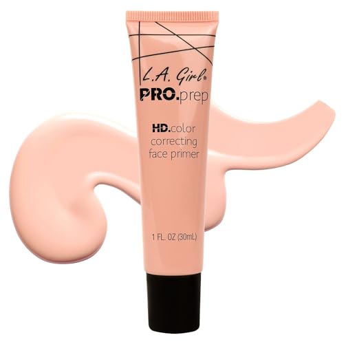
L.A. Girl PRO.Prep HD Color Correcting Primer
Best Cool Pink for Brightness
Cool Pink GFP913 is the soft-rose direction for a lackluster complexion.
Pink is not green in disguise.
It adds a fresher cast when skin looks flat or tired, rather than focusing on flushing. The Cool Pink GFP913 version of L.A. Girl PRO. Prep HD has its own shade identity. That is the one we are choosing here.
Choose this tint for the effect of brightness, not the expectation of opaque coverage. Because the source material does not establish how it wears across every skin tone, a small blended test is a more reliable decision than any generic claim about pink suiting everyone.
Bottom line: A targeted pink-primer choice for brightness, with outcome dependent on skin tone.
- ✅ Distinct Cool Pink GFP913 variant
- ✅ Primer format for pre-foundation use
- ❌ Not a substitute for green redness correction
- ❌ Independent long-wear evidence is limited
🧪 Lash Lab Notes — Fauzia (University Student & Beauty Enthusiast)
I would keep cool pink to the areas that look muted. Already rosy cheeks may not need it. The blended tint should brighten without leaving a visible pink film.
- 💡 Editor’s Note: We describe this by its actual purpose, not a promise of instant radiance. The shade is identifiable, but the finish depends on the undertone and how it blends. We would skip a noticeable pink cast.
Interested in the exact Cool Pink variant? Explore shopper feedback on L.A. Girl PRO.Prep HD.
For a subtle cool-pink brightening effect.
A second green option is worth considering if you are comparing bases.
NYX Studio Perfect Photo-Loving Primer
Best Green Smoothing Alternative
A separate green-primer route for those comparing redness-focused bases.
Want another green-tint primer to compare?
NYX Studio Perfect comes in a distinct green correcting shade. It gives us an alternative to e.l.f. Tone Adjusting without switching to opaque concealer. The specific SPP02 version matters, so do not assume another shade in this line works the same way.
As with any primer, the visible result matters more than the color in the tube. Try a thin veil in the reddest areas first and let it settle, especially if you plan to place foundation over it.
Bottom line: An alternate green primer for readers comparing formula feel and layered finish.

- ✅ Green SPP02 commercial variant
- ✅ Primer-format base for redness concern
- ❌ Not an independent answer to sallowness
- ❌ Performance against other green picks is untested here
🧪 Lash Lab Notes — Engr. Nusrat (Engineer & Beauty Enthusiast)
I would check the SPP02 shade, not just the Studio Perfect name. The particular green variant is what matters here. A small blend tells us whether it looks natural under foundation.
- 💡 Editor’s Note: We would compare its finished look with the other green primers. We are not claiming it won a blind smoothness test. Its place as an alternative is real, but the favorite formula still depends on the person wearing it.
Look into user comments about finish and layering with NYX Studio Perfect Primer.
For another dedicated green primer choice.
The final pick adds glow to multicolor correction.
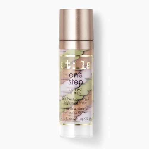
stila One Step Correct Primer — Kitten
Best Glow-Focused Multicolor
The Kitten version puts rosy shimmer into the familiar multicolor primer idea.
Kitten is the glowy sibling of stila Original, not simply new packaging.
The brand describes green and lavender pigments with a shimmering rose element. So this version may suit us when a brighter finish is part of the goal.
That glow changes the buying decision. A reader who prefers a quiet, natural-looking base may be happier with Original, while someone seeking visible luminosity may appreciate what Kitten adds; neither option should be substituted without noticing the formula variant.
Bottom line: Choose it for a brighter finish as well as correcting color, not for a fully matte look.
- ✅ Distinct Kitten shade with rosy radiance
- ✅ Multicolor correction in primer format
- ❌ Shimmer is not ideal for every finish preference
- ❌ Does not target one concern as precisely as shade 4
🧪 Lash Lab Notes — Mahmuda (Homemaker & Beauty Enthusiast)
I would check a luminous primer around textured or reflective areas. The tinted pigments may blend away while the glow still shows. Daylight helps us decide whether that is the finish we want.
- 💡 Editor’s Note: We would choose Kitten over Original only if we want extra radiance. It is a distinct product variant, despite the shared One Step Correct name. For a quieter result, Original may make more sense.
Check customer impressions of its distinct glow in the reviews for Stila One Step Correct Kitten.
For correcting color with an added luminous finish.
Once your tint is chosen, application decides whether it stays subtle.
How to Apply Tinted Primer Without a Green or Purple Cast
We only need enough correcting pigment to soften the look of the unwanted color.
More product is not the goal. A thin, well-blended layer usually makes more sense than trying to force opaque coverage from a sheer primer.
Step 1 — Prep Skin and Apply Sunscreen
Cleanse gently and use the moisturizer that already agrees with your skin. Apply your usual broad-spectrum sunscreen as directed; a tinted primer does not replace sunscreen unless it has its own approved SPF labeling and your applied amount supports that role.
Step 2 — Use a Thin Correcting Primer Layer
Start with a small amount over the areas that actually need correction. Spread it toward the edges and avoid stacking thick, opaque-looking layers just because the product appears faint in the bottle.
Step 3 — Check the Dried Tint in Daylight
Give the layer time to settle and check it by a window. The ideal result is skin that looks more even, not skin with a recognizable green, purple, or pink coating; if the pigment stands out, use less next time rather than doubling down.
Step 4 — Apply Foundation Gently If Wanted
If you want coverage, tap or spread foundation carefully over the settled primer without rubbing the layer off. If makeup starts rolling into little pieces, the problem may be the quantity or how the layers sit together, not the correcting shade.
Primer and foundation can pill even when the tint looks right. So what changed? Often the amount or order matters. The linked guide explores those layering problems before we replace the whole routine.
Sensitive Skin and Redness: What Primer Cannot Do
Green pigment can camouflage the appearance of redness, but it cannot treat inflammation, irritation, or rosacea. The American Academy of Dermatology cautions that some makeup and skin-care products can worsen irritation in rosacea-prone skin and recommends careful product selection and testing.
That matters more than the promised shade effect if your skin frequently burns or stings. Check fragrance and other potential irritants, test unfamiliar products carefully, and seek professional advice for persistent symptoms rather than trying to cover discomfort with additional primer.
Color Correcting Primer FAQs
Small details can decide whether a tinted base looks natural. Here are the questions that matter once it becomes part of a daily routine.
❓ Can you wear a color correcting primer without foundation?
Yes, as long as the blended finish looks natural on our skin. A sheer primer may make tone look a little more even. It does not give the same coverage as concealer or foundation.
❓ Is green or lavender primer better for redness?
Green is the more direct match for a visible red cast. Lavender usually aims at yellow or sallow-looking dullness. The two shades answer different concerns.
❓ Is pink primer suitable for all skin tones?
Pink can make the complexion look brighter. But depth and undertone change how it appears. We would test a thin blend rather than assume pale pink disappears on every face.
❓ Does tinted primer go before sunscreen?
We usually apply skincare and sunscreen first, following the sunscreen directions. Primer then goes before optional foundation. We should not mix sunscreen into primer unless the instructions specifically allow it.
❓ What if I want a primer but do not need any correcting color?
Not every face needs correcting color. A clear, hydrating, blurring, or mattifying primer might be a better match. We can choose texture and finish without adding pigment.
Sometimes the real problem is texture or makeup wear, not color. The broader primer guide compares those goals. It can help us avoid buying a tint we did not need.
Final Thoughts: Choose the Tint That Disappears
Green for redness.
Lavender for sallow-looking dullness. Pink for a fresher impression. That is a helpful starting map, but our final test is simpler: does a thin layer improve the look of skin without looking like a colored layer? We choose the tint we need, blend lightly, and let the finish decide.
Last update on 2026-10-29 / Affiliate links / Images from Amazon Product Advertising API