⚡ TL;DR: foundation for olive skin
Begin with shades that are actually described as olive at your depth, followed by neutral, yellow, and golden swatches for comparison. The better match blends into the jaw and neck once it settles, not the shade with the most convincing label.
Top Picks
- 🏆 Best Overall — Fenty Pro Filt’r 290 — warm-olive shade with matte finish
- 🥈 1st Runner-up — Hourglass Illusion 19 — medium-deep warm-olive glow
- 🥉 2nd Runner-up — Armani Luminous Silk 9 — tan neutral-olive alternative
Finding foundation for olive skin is easier when you stop treating olive as a shade depth. We can be fair, medium, tan, or deep and still find that a standard pink-beige foundation leaves a visible edge.
Here we compare eight specific bottle shades. Three are specifically described as having olive undertones; the others are honest side-by-side swatch candidates, not secretly rebranded olive matches.
✨ Inside This Foundation Guide
🌸 Psst… A Little Beauty Note!
Some links in this post are affiliate links. If you spot something you love and shop through our links, we may earn a small commission—at no extra cost to you. Our picks are based on thoughtful research and, where mentioned, hands-on experience. Thanks for supporting Dappered Chic! 💕 Read our Affiliate Disclosure
Quick Comparison: Best Foundation for Olive Skin
Look at the undertone evidence first. Then choose the finish that suits us. A shade that looks lovely on another person may still be too pink, yellow or deep for you.
| Foundation | Selected shade | Olive evidence | Formula direction |
|---|---|---|---|
| Fenty Pro Filt’r 290 | 290 | Warm olive stated for 290 | Medium coverage; soft-matte finish |
| Hourglass Illusion 19 | Shade 19 (medium-deep, warm olive) | Warm olive stated for 19 | Luminous finish; SPF 30-labelled |
| Armani Luminous Silk 9 | 9 - Tan, Neutral Olive | Neutral olive stated for 9 | Medium coverage; semi-matte to luminous |
| NARS Light Reflecting Gobi | L3 Gobi - Light 3 | Light yellow; not olive-labelled | Light yellow; formula finish needs your check |
| L'Oreal True Match N3 | N3 Light Medium | Neutral; not olive-labelled | Medium coverage; natural finish |
| Maybelline Fit Me 238 | 238 Rich Tan | 238 Rich Tan; olive status unverified | Medium coverage; matte finish |
| MAC Studio Fix NC25 | NC25 | NC25 yellow; not olive-labelled | Full coverage; compare the yellow tone |
| NARS Natural Radiant Punjab | Punjab | Punjab golden; not olive-labelled | Full coverage; natural radiant finish |
Best Foundation for Olive Skin: Eight Shades to Compare
An olive label helps only if the depth matches too. The others belong on a side-by-side swatch list that helps show whether you need less pink, less yellow, or a softer color at your depth.
Fenty Pro Filt’r Soft Matte Longwear Foundation
Best warm-olive matte — 290
That olive shade description makes a more specific starting point for someone seeking a matte base.
For a medium-to-tan complexion that turns pink with many beige foundations, shade 290 deserves an early spot on the swatch list. The brand specifically describes this shade as warm olive, rather than merely warm or neutral.
The selected Pro Filt’r Soft Matte formula is a medium-coverage liquid with a matte finish. This keeps the color decision separate from an overtly glowy finish with a more accurate undertone.
Bottom line: For medium/tan warm olive, start with this swatch. The undertone label does not mean shade 290 will have the right depth on every olive complexion.

- ✅ Shade 290 has a specific warm-olive description
- ✅ Medium-coverage matte format offers an alternative to luminous formulas
- ✅ Exact bottle shade is identified, not a vague range recommendation
- ❌ Too deep for many fair and light olives
- ❌ Matte finish may not be the preference of readers seeking glow
🧪 Lash Lab Notes — Engr. Nusrat (Engineer & Beauty Enthusiast)
Compare both 290’s colour and its finish. The name alone cannot make it the winner. A same-depth swatch reveals whether the warm cast blends with the neck or leaves an orange edge.
- 💡 Editor’s Note: A shade descriptor can narrow our search. It cannot replace a mirror. Before choosing, swatch 290 next to a neutral shade of similar depth.
Before choosing a soft-matte shade, compare buyer impressions of Fenty Pro Filt’r 290.
Consider shade 290 only if your depth is near medium/tan, and you prefer matte.
If your undertone fits but you want a brighter finish, the next olive-labeled option changes that trade-off.
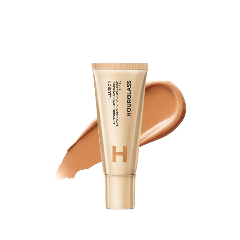
Hourglass Illusion Luminous Glow Foundation SPF 30
Best warm-olive glow — Shade 19 (medium-deep, warm olive)
This time, the warm-olive description belongs to a luminous formula.
Shade 19 is worth considering for medium-deep olive skin depth. Hourglass identifies this specific shade as warm olive, which is much more useful than guessing from a swatch photo.
Illusion Luminous Glow is positioned as a luminous foundation, and the selected tube carries an SPF 30 label. A foundation with SPF should not be our only sun-protection plan, because application amounts vary.
Bottom line: A luminous starting point for medium-deep warm olive. Shade 19 can be much too deep for fair olives, and its glossy finish is a separate decision.
- ✅ Official shade 19 descriptor explicitly says warm olive
- ✅ Medium-deep reference broadens the shade-depth examples
- ✅ Luminous alternative to the preceding matte base
- ❌ Not a fair-to-medium shade match
- ❌ SPF wording is not a substitute for adequate separate sunscreen
🧪 Lash Lab Notes — Dr. Rabeya (Dentist & Beauty Enthusiast)
Let the jawline match carry more weight than the tube label. A small jawline patch can show whether the medium-deep warm-olive shade harmonizes with the neck without relying on a hand swatch.
- 💡 Editor’s Note: Glow is a finish preference. It does not prove a correct color match. Swatch next to the neck and check for any yellow-orange seam after the formula settles.
For perspective on a luminous olive-labeled option, read feedback for Hourglass Illusion 19.
A sensible shade-19 trial for medium-deep warm olives who like a luminous base.
If your olive skin is deeper than shade 19, a targeted deeper-shade comparison may help more than selecting a lighter version of this formula. The next guide concentrates on that specific depth-and-undertone combination.
A neutral-olive label, rather than a warm-olive one, offers the next useful comparison.
Giorgio Armani Luminous Silk Foundation
Best tan neutral-olive pick — 9 – Tan, Neutral Olive
A neutral-olive shade description may help when warmer olive bases look too golden.
Armani shade 9 is identified as tan with a neutral-olive undertone in the selected listing. It could be a helpful point of comparison when a warm-olive shade still reads yellow against your neck.
The PKB’s exact listing is for Luminous Silk Foundation, Perfect Natural Glow, with medium coverage and a semi-matte-to-luminous specification. Armani also has a newer, differently named Luminous Silk reformulation; do not assume the formula in one listing is identical to the other.
Bottom line: At tan depth, compare this neutral-olive shade. The newer formula naming makes exact bottle and shade verification particularly important.

- ✅ Variant specifically labelled tan and neutral olive
- ✅ Medium-coverage option with a natural-glow orientation
- ✅ Adds a less warm olive-labelled comparison
- ❌ Tan depth will not suit most fair olives
- ❌ New and old formula names can be confused on shopping pages
🧪 Lash Lab Notes — Mahmuda (Homemaker & Beauty Enthusiast)
Keep this undertone comparison simple. Swatch tan neutral olive beside tan warm olive rather than judging both in separate mirrors or rooms.
- 💡 Editor’s Note: The recommendation is for this shade and formula, not every item named Luminous Silk. Check the actual formula name, shade 9, and bottle details before trusting a product listing.
To distinguish shopper experiences with the named listing, check Armani Luminous Silk 9.
Worth comparing if tan-depth warm shades regularly turn too gold.
Armani listings can be confusing because shade names appear beside both older and newer formula titles. A focused Armani guide is a better place to compare that brand’s options without mistaking one bottle for another.
At lighter depths, the closest swatch may not carry the word olive at all.
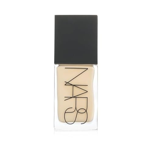
NARS Light Reflecting Foundation
Light yellow swatch candidate — L3 Gobi – Light 3
A light-yellow shade can still make a helpful control swatch. It need not claim an olive undertone.
Gobi, L3 in the Light Reflecting line, is a light shade with a yellow description. It makes a worthwhile comparison for fair and light olives who find pink bases conspicuous, but yellow and olive are not synonyms.
A fair olive with a cool or very muted green cast may still see this shade as too yellow. The test is whether the color disappears along the jaw, not whether the shade looks attractive in its bottle.
Bottom line: Useful for light yellow-leaning comparison. This is not a verified green-olive shade; reject it if the skin looks yellow or sallow.
- ✅ Specific L3 Gobi depth makes comparison easy
- ✅ Official light-yellow direction offers contrast with rosy shades
- ✅ Different line from the medium-depth picks
- ❌ Not olive-labelled by the brand
- ❌ May emphasize yellow rather than blend with muted olive tones
🧪 Lash Lab Notes — Fauzia (University Student & Beauty Enthusiast)
Treat Gobi as a comparison swatch, not a guaranteed olive match. Try it beside a similarly light neutral shade and choose the one with the quieter jawline edge.
- 💡 Editor’s Note: Even at the right depth, a light foundation can have the wrong undertone. A second light neutral swatch will show whether the yellow direction is helping.
For the details of other shoppers’ Gobi comparisons, inspect NARS Light Reflecting Gobi.
Try Gobi as a light yellow control if rosy shades look pink.
A neutral budget shade gives another useful reference point in the next depth range.
L’Oreal Paris True Match Foundation
Neutral drugstore comparison — N3 Light Medium
A neutral swatch can make it easier to spot an overly peachy or yellow match.
N3 Light Medium earns a spot in this comparison even though its name does not say olive. When two supposed warm shades look orange, a neutral control can help determine whether the problem is too much warmth rather than too much depth.
True Match is listed as a medium-coverage liquid with a natural finish. Its accessible format makes it a practical candidate for a side-by-side test, although not a guaranteed olive shade.
Bottom line: Think neutral comparison, not a confirmed olive match. N3 may look too beige or pinkish on a visibly green-muted complexion.

- ✅ Clear N3 Light Medium shade identity
- ✅ Medium coverage and natural-finish alternative
- ✅ Neutral direction makes a useful control swatch
- ❌ No established olive-green undertone for N3
- ❌ Neutral may still look pink on cool or muted olives

🧪 Lash Lab Notes — Zayba (A-Level Student & Beauty Enthusiast)
The N3 shade code cannot tell us as much as two swatches. Swatch N3 against a comparable golden foundation and observe the final neck transition once both dry.
- 💡 Editor’s Note: Neutral is not a magic stand-in for olive. If N3 blends more cleanly than a yellow swatch, that is a result for your complexion, not a new brand-wide rule.
For more context about the N3 variant, see reviews discussing L’Oreal True Match N3.
Consider this N3 comparator when light-medium golden shades keep turning orange.
At richer depth, the same contrast can be tested with a matte alternative.
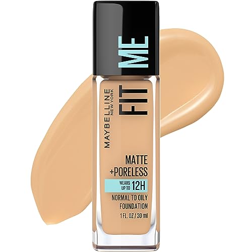
Maybelline Fit Me Matte + Poreless Foundation
Richer-depth matte comparison — 238 Rich Tan
A richer matte shade adds depth that fair-olive lists can overlook.
Shade 238 Rich Tan is included because olive skin spans many depths, not because this number is officially described as olive. Someone testing foundations at a rich-tan depth needs a plausible same-depth control rather than a lineup made only of light beiges.
This Fit Me Matte + Poreless liquid is listed with medium coverage and a matte finish. Some individual olive-toned users have reported that 238 was not an ideal match, so any recommendation has to stay conditional.
Bottom line: A rich-tan matte swatch, with undertone caution. Matching depth alone cannot prove the pigment suits cool or muted olive skin.
- ✅ Specific 238 Rich Tan bottle can be identified
- ✅ Matte medium-coverage formula
- ✅ Adds a different shade depth to the comparison
- ❌ Not documented as a dedicated olive shade
- ❌ Can be a mismatch even on a similar-depth olive complexion
🧪 Lash Lab Notes — Engr. Nusrat (Engineer & Beauty Enthusiast)
Check depth and undertone as two separate decisions. At rich-tan depth, comparing equal-depth swatches gives a clearer signal than going lighter to cancel orange colour.
- 💡 Editor’s Note: This choice gives deeper readers a genuine comparison, too. Reject it promptly if a dry swatch creates a warmer edge than your neck.
If shade 238 is on your trial list, review buyer shade notes for Maybelline Fit Me 238.
Useful only as a rich-tan matte swatch, not a preset olive match.
A light-medium yellow reference shows the opposite depth side of this color decision.
MAC Studio Fix Fluid Foundation
Light-medium yellow comparator — NC25
This light-medium yellow code is only a comparison, not an olive guarantee.
NC25 in this Studio Fix Fluid line is commonly described as yellow-leaning at a light-medium depth. That can make it helpful to swatch beside rosy bases that leave a pink jawline.
The exact selected bottle is the SPF 15 24HR Matte Foundation + Oil Control listing, not every product in the Studio Fix family. Its listed finish attributes should not be assumed to describe a different MAC foundation with a similar name.
Bottom line: A yellow-leaning comparison at light-medium depth. If a green-muted complexion needs less yellow saturation, NC25 can still stand out.

- ✅ Specific NC25 shade and Studio Fix line identity
- ✅ Light-medium depth adds a swatch reference
- ✅ Useful contrast to the neutral N3 direction
- ❌ Not documented as an olive-labelled shade
- ❌ Similar MAC product names can hide different formulations
🧪 Lash Lab Notes — Dr. Sazia (Medicine Specialist & Beauty Enthusiast)
Focus on the colour match, not a skin-health promise. Test a small area and discontinue any cosmetic that causes irritation instead of trying to correct the shade by layering.
- 💡 Editor’s Note: NC is brand-specific shorthand. It is not a universal olive code. Judge this one only against skin and nearby same-depth samples.
To check what purchasers say about this exact NC25 listing, explore MAC Studio Fix NC25.
Swatch NC25 beside a neutral light-medium option when pink cast is the issue.
Another medium-depth golden choice helps show when warmer pigments cross the line into peach.
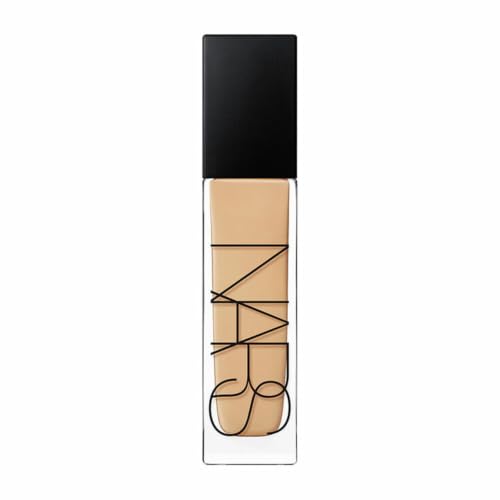
NARS Natural Radiant Longwear Foundation
Medium golden swatch candidate — Punjab
A medium-golden base may flatter warm olive skin or show unwanted peach.
Punjab is a medium shade with a golden description in the Natural Radiant Longwear line. Some warm olives may like that direction; others will find the foundation more peach or orange than their neck.
Its selected listing describes a natural/radiant finish and full coverage. More coverage cannot fix an undertone mismatch, so test a thin patch before judging the effect of a fuller application.
Bottom line: Consider this medium-golden option only after swatching. Punjab is not officially olive-labeled and should not replace a verified olive shade blindly.
- ✅ Specific Punjab medium-golden identity
- ✅ Natural/radiant finish for readers avoiding matte
- ✅ Full-coverage option among shade comparators
- ❌ Golden may read peachy on muted olives
- ❌ Not an established universal olive undertone match
🧪 Lash Lab Notes — Mahmuda (Homemaker & Beauty Enthusiast)
Try a small patch by the neck before coating the whole cheek. If Punjab makes the jawline warmer than the neck, look for a more muted same-depth base.
- 💡 Editor’s Note: An almost-right indoor swatch can look orange outside. Check the dried-down patch at the jaw before committing to a full face.
To explore real-world shade feedback for Punjab, browse reviews of NARS Natural Radiant Punjab.
A conditional medium-golden trial for warm olives who tolerate richer yellow pigments.
If Punjab is close in color but you still need a fuller explanation of this particular longwear formula, a dedicated product review is more useful than another undertone chart. It separates formula questions from the shade decision made here.
The strongest decision now is a controlled swatch test, not another shade-code guess.
How to Check an Olive Match Before Buying
There is no single olive shade that fits all undertones and depths. Instead, rule out a poor undertone at the correct depth before buying a bottle.
Step 1:
Match depth first. Put two or three small foundation swatches in a row from lower cheek to jaw, close to the neck. Each should be a similar lightness or depth so you can notice the pigment difference instead of the one that is simply darker.
Step 2:
Compare the color cast. A swatch that leaves a rosy stripe likely contains too much pink for your skin; an orange line may be too peachy or saturated. A lighter shade may not fix the problem when the mismatch is actually undertone.
Step 3:
Check after settling. Wait around 10–20 minutes and look in indirect daylight, then in your usual indoor light. The dried-down patch with the least visible jaw-to-neck boundary is the stronger candidate, even if its shade name says neutral rather than olive.
Some formulas seem darker or warmer after application. That visible change does not automatically prove a specific chemical reaction, but it does mean you should make the decision after the swatch has settled.
If the color keeps changing after application, the next guide separates common causes from shade-selection mistakes. It will help you tell a poor original match from a change that appears with wear.
When Neutral, Yellow or Golden Shades Help—and When They Do Not
Olive undertones can appear green-gold, muted grey-green, or somewhere between. Because shade systems differ by brand, neither a neutral label nor a warm label promises the same pigment mix from one foundation to the next.
Gobi and NC25 make light and light-medium yellow comparisons; N3 provides a neutral reference; Punjab contributes a medium golden direction; and 238 is a deeper matte swatch. Those are comparison tools, not olive-certified shades. If a golden patch looks orange or a neutral one looks chalky, you have useful evidence to reject it.
Once the shade blends at the jawline, choose among matte, natural and luminous finishes for your actual wear preference. The same olive match can be useful in one finish and uncomfortable in another, which is a separate shopping decision.
If you have solved the olive color problem but still need to compare broader finish and coverage choices, a general roundup is the right next stop. It covers priorities this focused shade guide deliberately leaves out.
Olive-Undertone Foundation Questions Answered
Olive undertones are easy to confuse with shade depth and surface redness. These four quick answers clear up the most common shopping mistakes before your next swatch session.
❓ Can fair skin have olive undertones?
Yes. Olive describes an undertone or visible color cast, not a medium or tan depth category. If you are fair, try genuinely fair or light shades and compare their pink, yellow, and muted casts side by side.
Fair olive readers often need lighter-depth options before worrying about the green or yellow cast. A fair-skin comparison provides that broader depth context without claiming every fair foundation is olive-friendly.
❓ Is olive skin always warm-toned?
No. Some olive complexions lean warm, while others appear neutral or cool and muted. A foundation that is marked warm may still look too orange on a cooler olive complexion.
❓ Can a neutral foundation work on olive skin?
Sometimes, particularly when the competing warm shades are too peachy. Neutral is not another word for olive, so let the jawline swatch decide rather than buying on its shade-code letter alone.
❓ Should I change shades when my skin gets deeper?
Possibly. Seasonal changes can alter your depth even when your underlying olive cast remains similar. Recheck the jawline when your neck color changes, and do not automatically jump to a warmer undertone just because your skin looks deeper.
Final Thoughts: Let the Jawline Decide
The most reliable choice is not the prettiest shade name or the most glowing finish. Pick the nearest depth, test it against alternative undertones, and keep the swatch that blends into both face and neck after drying. Reject a visible peach, pink, grey, or yellow boundary even when the formula itself seems appealing.
If even your starting depth is uncertain, a broader shade-matching walkthrough can narrow the range before you shop. It is especially useful when your face and neck look different under indoor lighting.
Last update on 2026-11-18 / Affiliate links / Images from Amazon Product Advertising API