⚡ TL;DR: best eyeshadow for blue eyes
Want the clearest contrast? Warm copper and bronze usually separate most visibly from blue eyes, especially with solid color payoff. Peach and gold feel softer. Mauve, plum, and berry add definition without leaning heavily orange.
Top Picks
- 🏆 Best Overall — Urban Decay 24/7 Ember — boldest copper color payoff
- 🥈 1st Runner-up — IT Superhero Copper Charisma — warm, long-wear stick format
- 🥉 2nd Runner-up — KIKO Long Lasting Golden Brown — easy everyday warmth for less
A pretty shade in the pan does not tell the whole story. What counts is the separation you can actually see around the iris.
To find the best eyeshadow for blue eyes, we put payoff and contrast first. Formula, finish, and ease of wear came next. We also kept this list to individual shadows, sticks, and creams. Palettes and full eye-look tutorials belong in their own guides.
✨ Inside This Eye Shadow Guide
🌸 Psst…
Some links in this post are affiliate links. If you shop through them, we may earn a small commission at no extra cost to you — like a little coffee while we keep testing beauty favorites. ☕💄
Quick Comparison: Best Eyeshadow For Blue Eyes
Need the differences at a glance? This table separates the color effect from the formula and finish. That makes a bold copper easier to compare with softer mauve or golden brown.
| Product | Shade Family | Formula | Finish | Best For |
|---|---|---|---|---|
| Urban Decay 24/7 Ember | Deep copper | Powder single | Metallic | Maximum contrast + payoff |
| L'Oreal Le Shadow Magnetic Bronze | Copper-brown | Cream stick | Shimmer | Affordable warm bronze |
| IT Superhero Copper Charisma | Warm copper | Waterproof stick | Shimmer | Easy long-wear contrast |
| Bobbi Brown Long-Wear Golden Bronze | Deep bronze | Cream stick | Shimmer | Polished neutral bronze |
| Laura Mercier Caviar Amethyst | Mauve | Cream stick | Pearl shimmer | Purple-family alternative |
| RMS Beauty Eyelights Cranberry | Berry | Cream shadow | Luminous | Rich berry definition |
| KIKO Long Lasting Golden Brown | Golden brown | Cream stick | Shimmer | Everyday budget warmth |
| Charlotte Tilbury Exagger-Eyes Bronzed Garnet | Reddish bronze | Cream stick | Satin Glow | Copper-meets-berry effect |
Why Warm Contrast Works on Blue Eyes
Why do copper and bronze show up so often for blue eyes? They sit on the warm, orange-adjacent side of the color family. That gives them strong visual contrast against blue.
It does not mean one shade flatters every person equally. But a clearly warm copper often separates the iris more than a pale neutral. A neutral that nearly matches the lid can fade into the background.
Here is the useful distinction: contrast and enhancement are not the same thing. Deep copper and bronze usually create stronger separation. Warm brown keeps the warmth but softens the effect.
Mauve, plum, and berry take another route. Their red-purple depth can frame blue eyes without creating the same orange-versus-blue contrast.
And blue shadow? It is not automatically a bad choice. It simply gives you a more tonal, lower-contrast look. Pick it when coordination matters more than maximum iris separation.
Want the color theory without the product list? The guide below goes deeper into the shade families behind that visible separation.
The Best Eyeshadows for Blue Eyes
So what earned a spot here? Each product solves a slightly different color problem.
We ranked visible effect first, especially payoff and complementary contrast. Then we weighed formula, finish, application, wear feedback, and the practical trade-offs that show up on the lid.
Urban Decay 24/7 Eyeshadow in Ember
Best Overall — strongest copper payoff
Want copper that actually looks copper on the lid? Ember starts with a deep metallic shade and plenty of visible warmth.
That makes it the clearest match for our high-contrast brief. The powder format also lets you build the effect instead of committing to one full swipe.
Buyer feedback in the supplied record repeatedly praises the pigment. Smooth application and a silky texture come up often too.
You can keep it as a controlled wash or push it into a reflective copper lid. The catch is the same thing that makes it stand out. Metallic depth may feel like too much for a barely-there daytime look.
Smudge resistance is not universally praised, either. That matters more if your lids tend to get oily.
Bottom line: Pick it for strong copper contrast with buildable intensity. The shade is meant to be seen, not disappear as a neutral backdrop.
🧪 Lash Lab Notes — Engr. Nusrat (Engineer & Beauty Enthusiast)
I like the control a pigmented powder single gives here. Copper builds fast, so I would start thin and add more only where the contrast needs it.
- 💡 Editor’s Note: The payoff and the color-theory case line up nicely here. We would start with less shadow than seems necessary. Add more only where you want the copper to show. That keeps the metallic effect from taking over the whole eye.
Curious how the pigment and wear hold up for other people? See what current buyers say about Urban Decay 24/7 Ember.
Go with this one when you want a buildable single shadow and obvious copper impact.
Care tip: Start with a light layer using a brush or fingertip. Build slowly, then remove gently with eye-makeup remover.
Ember sets the strong-copper benchmark. Now the softer bronze options are easier to compare.
L’Oreal Paris Le Shadow Stick in Magnetic Bronze
Best Affordable Bronze
Want warmth without pulling out a brush? Magnetic Bronze gives you a shimmering copper-brown in a retractable stick.
It is less fiery than deep metallic copper. That can make the shade easier to wear when you still want visible contrast. The supplied record describes the cream as smooth and pigmented.
The self-contained format is the convenience play. Twist it up, place the color, and blend before it settles.
The trade-off is consistency. Longevity and blendability feedback is mixed. The supplied record also includes reports of stick breakage and eye irritation.
So the right expectation is simple: convenient warm color, not identical all-day wear on every lid.
Bottom line: Choose it for quick warm bronze at a lower price tier. Blend promptly, and skip the formula if your eye area reacts.

- ✅ Copper-brown warmth gives blue eyes softer, everyday contrast
- ✅ Cream-stick packaging keeps application fast and brush-free
- ✅ Buyers often praise the pigment and smooth glide
- ❌ Wear time and blending ease are not consistent across all feedback
- ❌ The stick can break, so the mechanism needs gentle handling
- ❌ Stop using it if you notice burning, watering, or other eye-area irritation
🧪 Lash Lab Notes — Fauzia (University Student & Beauty Enthusiast)
I would pick this format when I want to get ready quickly and still add copper-brown warmth. I would blend the edge early, because different lids may not get the same wear time.
- 💡 Editor’s Note: Convenience is the main reason to choose this one. A lower price does not automatically make it the best value. The shade still works because it gives blue eyes a warm bronze frame. With mixed wear feedback, check comments from people whose lid type sounds like yours.
Want a closer look at texture and staying power? Read what current buyers report about L’Oreal Le Shadow Magnetic Bronze.
Pick it when you want quick cream-stick warmth without going into bright copper.
Care tip: Blend shortly after application. When you are done, remove it gently with a suitable eye-makeup remover.
Need waterproof positioning too? The next warm-copper stick puts that feature higher on the list.
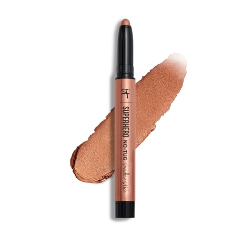
IT Cosmetics Superhero No-Tug Stick in Copper Charisma
Best Waterproof Stick
Want warm copper and waterproof positioning in one swipe? Copper Charisma is the straightforward stick option here.
The shade is a shimmery warm copper. That keeps the color itself aligned with our main ranking axis. We are not asking a wear claim to make a neutral shade more relevant.
The stick is buildable and designed to glide over the lid. In the supplied product record, smooth application, coverage, and crease-free wear show up as positive themes.
One important distinction: waterproof does not mean irritation-proof. Comfort around the eye varies by person and technique. Package directions and your own reaction still matter more than a broad wear promise.
Bottom line: Consider it for easy long-wear copper when you want warm contrast and waterproof positioning together.
- ✅ Shimmery warm copper directly supports strong blue-eye contrast
- ✅ Buildable stick format keeps placement quick and simple
- ✅ Waterproof and crease-proof positioning fits long-wear priorities
- ✅ Smooth application and coverage receive broadly favorable feedback
- ❌ Waterproof positioning cannot promise comfort on every eye area
- ❌ The value case is weaker if long-wear features are not important to you
🧪 Lash Lab Notes — Dr. Sazia (Medicine Specialist & Beauty Enthusiast)
I see the shade as the real reason this works for blue eyes, with the long-wear format as support. Waterproof still does not mean irritation-proof, so I would follow the label and stop if the eye area reacts.
- 💡 Editor’s Note: We would not rank this shade on waterproof positioning alone. Copper Charisma earns the slot because the hue and convenience work together. If your lids are easily irritated, put comfort ahead of the wear claim.
Wondering how people describe the application and comfort? See current buyers discuss IT Superhero Copper Charisma.
Choose it when waterproof positioning matters and you still want an unmistakably warm copper.
Care tip: Follow the current package directions. Remove the waterproof formula gently instead of rubbing the lid.
Next up is less obviously copper. It moves into a more polished, neutral-looking bronze.
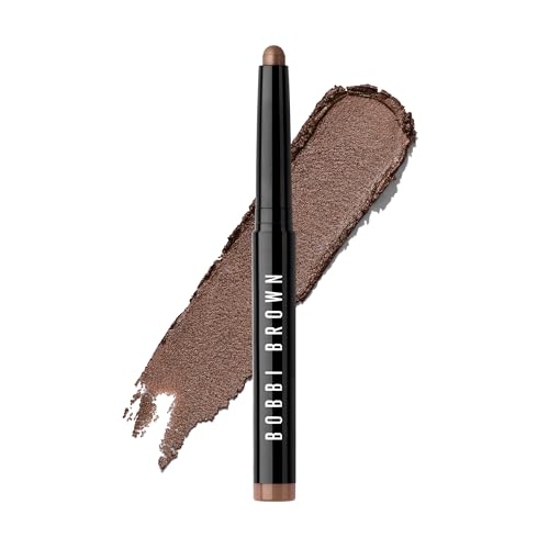
Bobbi Brown Long-Wear Shadow Stick in Golden Bronze
Best Polished Bronze
Want warmth without a strongly copper-looking lid? Golden Bronze gives you a deep bronze shimmer with a more neutral feel.
The creamy stick is buildable. Its product record describes strong pigmentation, smooth application, natural-looking shimmer, and good blendability.
That combination works well for a one-shadow look. You get both warmth and depth without needing several colors.
Timing is the practical issue. Cream sticks can set as they wear. Creasing feedback is mixed, and an independent first-hand review captured during research said the formula sets quickly.
So work one eye at a time. That gives you a better chance to soften the edge before it settles.
Bottom line: Choose it for refined bronze definition when you want blue-eye contrast that still looks polished and fairly neutral.
- ✅ Deep bronze adds warmth without turning strongly orange
- ✅ Strong pigment can carry a simple one-shadow look
- ✅ Creamy texture and blending ease get positive feedback
- ✅ Light shimmer adds dimension without a full metallic finish
- ❌ Creasing reports differ depending on lid type and application
- ❌ A quick set can make slow, leisurely blending less forgiving

🧪 Lash Lab Notes — Mahmuda (Homemaker & Beauty Enthusiast)
I like Golden Bronze for a polished one-shadow effect because the color brings both warmth and depth. I would work one eye at a time so the edge is blended before the formula sets.
- 💡 Editor’s Note: This is our easiest bridge between neutral-looking makeup and a shade that still flatters blue eyes. The warmth is there without demanding a copper-focused look. Keep the application controlled, and the finish can stay understated while the iris gets more separation.
Want to compare current creasing and blending reports? See what buyers say about Bobbi Brown Long-Wear Golden Bronze.
Pick it for a polished, buildable bronze that can stand on its own.
Care tip: Apply to one eyelid at a time. Blend promptly, and follow the current package directions.
Still finding bronze too warm? The next option heads into mauve.
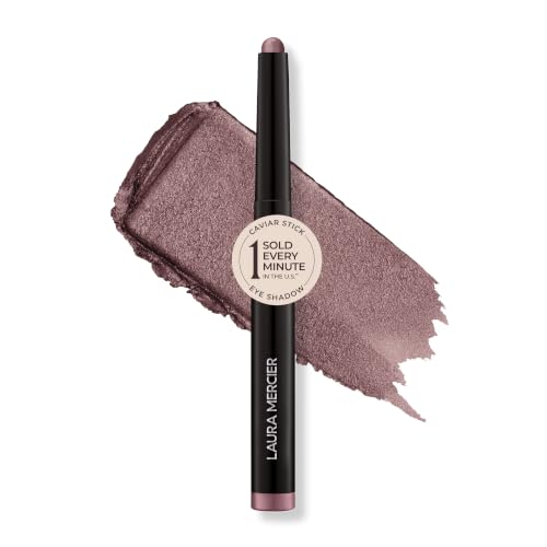
Laura Mercier Caviar Stick in Amethyst
Best Mauve Alternative
Prefer purple-family definition to classic copper? Amethyst gives you a soft mauve with hidden pearl.
That makes it useful when orange-leaning warmth is not your style. The creamy Caviar Stick is richly pigmented and buildable. In the supplied feedback, smooth glide and flexible intensity are recurring positives.
Wear can suit both everyday and more dramatic makeup. The pearl finish adds dimension without turning the lid into a bright metallic.
The main practical concern is the stick itself. Some feedback reports the product breaking off, so careful handling matters.
Bottom line: Pick it for soft mauve definition when you want a purple-family effect in an easy cream-stick format.
- ✅ Soft mauve gives you a clear break from copper and bronze
- ✅ Hidden pearl adds light-catching dimension without heavy glitter
- ✅ Buildable cream texture can go from light to stronger color
- ✅ Smooth glide and all-day wear appear as positive review themes
- ❌ The effect is less warmly complementary than a strong copper
- ❌ Some buyers report breakage, so treat the stick with care
🧪 Lash Lab Notes — Mahmuda (Homemaker & Beauty Enthusiast)
I would reach for Amethyst when copper feels too hot or intense. The mauve stays defined but softer, and the pearl adds dimension without needing a fully metallic lid.
- 💡 Editor’s Note: We would choose Amethyst when the goal is definition with less visual heat. It is not trying to outdo copper at warm contrast. It offers a different effect. That is why it feels useful rather than repetitive.
Want to check payoff and stick durability first? See current buyers weigh in on Laura Mercier Caviar Amethyst.
Choose it when mauve feels easier to wear than copper with your usual makeup.
Care tip: Build the color in light layers. Blend as you like, and avoid putting unnecessary pressure on the stick.
Want more red-purple depth? The next cream moves from mauve into berry.
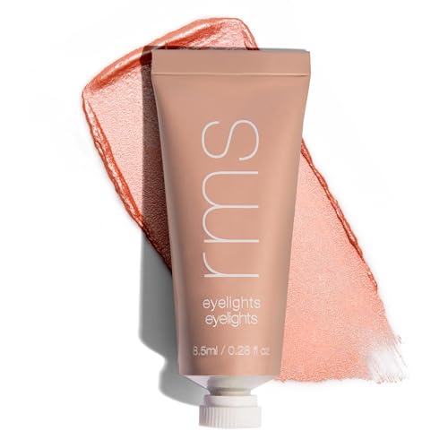
RMS Beauty Eyelights in Cranberry
Best Berry Cream
Looking for a richer frame around blue eyes? Cranberry brings red-purple depth with a luminous cream finish.
The color sits apart from both bronze and soft mauve. Pigmentation is its biggest attraction. Buyers describe the shade as vivid and shiny, while the texture is often called creamy.
A small amount can create plenty of visible color. That helps when you want berry to define the eye instead of spreading too far across the lid.
Application and wear are less predictable. Some users report easy blending and long wear. Others mention creasing, difficult blending, leakage, and a small amount of product for the price tier.
Bottom line: Pick it for rich berry definition if you want a luminous red-purple effect and can accept mixed handling feedback.
- ✅ Berry color gives blue eyes a distinct red-purple outline
- ✅ Strong pigment can create visible impact with a small amount
- ✅ Luminous cream texture adds dimension around the eye
- ✅ Some buyers report long wear without noticeable creasing
- ❌ Blending ease and longevity vary noticeably across feedback
- ❌ Tube leakage may make the cream harder to manage cleanly
- ❌ The product amount can feel small for its price tier
🧪 Lash Lab Notes — Dr. Sazia (Medicine Specialist & Beauty Enthusiast)
I like Cranberry when you want a richer red-purple frame without depending on orange. I would start small, because it is easier to build a pigmented cream than soften too much product after placement.
- 💡 Editor’s Note: Think of Cranberry as an effect choice, not the automatic everyday replacement for bronze. Its red-purple depth can frame a blue iris while keeping the finish luminous. Because handling feedback is mixed, make the first application controlled.
Want the latest texture and wear perspective? See what current buyers report about RMS Beauty Eyelights Cranberry.
Pick it when you want a luminous berry accent with plenty of pigment.
Care tip: Begin with a small amount and build slowly. Remove it gently according to the current package directions.
For softer warmth on a tighter budget, Golden Brown keeps things more casual.
KIKO Milano Long Lasting Eyeshadow Stick
Best Value
Want warmth without a dramatic metallic copper lid? Golden Brown is the low-pressure option in this lineup.
The pencil-style stick has a shimmery finish and medium coverage. That suits everyday warmth better than maximum saturation.
Feedback is positive around smooth texture, color accuracy, blendability, and staying power. The familiar neutral-brown effect also makes it approachable when speed matters.
The weak point is packaging. Some users say the shadow stick can fall out of the tube. So the value story is strongest when the mechanism arrives secure and stays that way.
Bottom line: Choose it for easy everyday warmth when you want golden brown, simple application, and a more budget-friendly pick.

- ✅ Golden-brown warmth flatters blue eyes without a bold copper effect
- ✅ Smooth, silky texture is a recurring positive in feedback
- ✅ The stick format keeps application simple for beginners or busy mornings
- ✅ Blendability and all-day wear are broadly favorable review themes
- ❌ A loose stick mechanism can undermine the packaging experience
- ❌ Medium coverage will look softer than a saturated metallic copper
🧪 Lash Lab Notes — Zayba (A-Level Student & Beauty Enthusiast)
I would call Golden Brown beginner-friendly when you want warmth without a dramatic copper lid. I would still check the packaging feedback, because the value depends on the stick mechanism staying secure.
- 💡 Editor’s Note: This is our “keep it easy” choice. You still get the warmth that helps blue eyes stand out, just with less drama than a deep copper. It makes sense when speed and wearability matter more than maximum impact.
Before you decide, see what current buyers say about packaging and wear for KIKO Long Lasting Golden Brown.
Choose it for simple golden warmth in a convenient, beginner-friendly stick.
Care tip: Apply it straight to the lid and blend to taste. Handle the stick mechanism gently.
The last pick adds more red to bronze. The result is warmer, deeper, and a little richer.
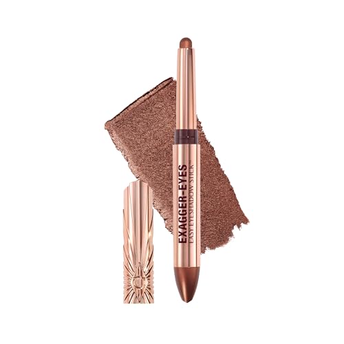
Charlotte Tilbury Exagger-Eyes Stick in Bronzed Garnet
Best Reddish Bronze
Want something between bronze and berry? Bronzed Garnet gives you warmth with a redder undertone than standard gold-brown.
The cream stick has a luminous Satin Glow-style finish. Its easy-sculpt dome tip is designed to follow the eye area.
In the product record, buyers often praise smooth glide and easy blending. The brand positions the formula as waterproof and crease-proof with long wear.
This shade already combines warmth and depth, so one pass can do plenty. If you want a diffused edge, blend before the formula settles. Otherwise, the border can look more strongly saturated.
Bottom line: Pick it for a copper-berry crossover when classic bronze feels too neutral and full berry feels too cool or dramatic.
- ✅ Reddish bronze blends warm contrast with berry-like depth
- ✅ Smooth glide and easy blending are common positive themes
- ✅ The dome-tip stick keeps application quick and direct
- ✅ Luminous finish gives the hybrid shade extra dimension
- ❌ Waterproof and long-wear performance are brand positioning, not the same result for every wearer
- ❌ The richer red shift can feel bolder than neutral golden brown
🧪 Lash Lab Notes — Engr. Nusrat (Engineer & Beauty Enthusiast)
I like Bronzed Garnet as a bridge between copper and berry because one pass gives both warmth and depth. I would blend before it sets when I want the outer edge soft instead of sharply saturated.
- 💡 Editor’s Note: Choose this when you want bronze warmth without staying fully neutral. The reddish shift changes the mood enough to earn a separate slot. Treat wear claims as positioning, then use current buyer feedback to judge how the formula behaves on lids like yours.
Want to hear how current users describe glide and wear? See current buyers describe Charlotte Tilbury Exagger-Eyes Bronzed Garnet.
Choose it for a richer warm look that lands between bronze and berry.
Care tip: Blend shortly after application. Remove it gently according to the current package directions.
At this point, price is not the most useful question. The better question is: which color effect do you actually want?
How to Choose a Shade That Fits Your Look
Feeling stuck between all these warm and purple tones? Start with the effect before you think about finish.
Want the clearest blue-eye contrast? Begin with a visible copper or bronze.
Want warmth that feels quieter? Golden brown, peach, and softer bronze keep things easier to wear. If orange-heavy warmth is not your style, mauve and berry take a red-purple route instead.
Next: choose the finish. Metallic, shimmer, satin, and matte tell you how the color reflects light. They do not change the basic color relationship.
A matte warm brown can still contrast blue. A luminous mauve can still look cooler and softer. Pick the amount of dimension you want, then choose powder, stick, or cream based on how you prefer to apply and blend.
Complexion matters too. The same copper can look brighter, deeper, or more neutral on different skin. A skin-tone guide can help you adjust the same contrast idea for undertone and depth.
Want to match the shade to the rest of your coloring? The guide below is the natural next step.
Brown or purple? Both can work for blue eyes, but they solve different problems. Warm brown gives softer complementary contrast. Purple-family shades move toward mauve, plum, and berry definition.
Need a framework that goes beyond blue eyes alone? Step back from this single-eye-color shortlist and use the broader color-choice guide. It helps combine eye color with your other preferences.
That wider decision is covered here.
If you remember one rule, make it this: effect first, finish second, format third.
From One Shadow to a Full Blue-Eye Look
When does a palette make more sense than one shadow? When you want coordinated transition, crease, and highlight shades around the same idea.
A single shadow keeps the decision focused. A palette gives you supporting shades that are already designed to work as a set.
If that sounds closer to your goal, the palette guide takes over from here.
Once the color is settled, placement becomes the next decision. Layering can change how much copper, bronze, mauve, or berry actually surrounds the iris.
Want to turn the color into a complete eye look? The next guide focuses on that step.
Those deeper guides keep this roundup focused. It does not need to become a palette ranking or a step-by-step tutorial. Here, we are choosing the individual shadow that creates the effect you want.
Questions About Eyeshadow for Blue Eyes
Still deciding between warm contrast and a softer color family? These are the questions that come up most often. The answers stay focused on hue, finish, and the effect around a blue iris.
❓ What color eyeshadow makes blue eyes pop?
Want the strongest complementary separation? Warm copper and bronze usually do the most visible work, especially with clear color payoff. Peach and warm brown soften that same warm-versus-blue contrast.
❓ Should blue eyes wear brown or purple eyeshadow?
Either can work. Warm brown gives you the softer neutral route to complementary contrast. Mauve, plum, and berry add red-purple definition for a different result from classic bronze.
❓ Should people with blue eyes avoid blue eyeshadow?
No. Blue shadow simply creates a more tonal, lower-contrast effect. It makes more sense for a blue-on-blue look than for maximizing separation between the iris and shadow.
❓ What eyeshadow finish is best for blue eyes?
There is not one universal best finish. Hue and finish do different jobs. Metallic and shimmer can add dimension, while matte keeps the same color family softer and less reflective.
❓ Is navy eyeshadow good for blue eyes?
Yes, when you want a deliberate blue-on-blue effect with more depth than pale blue. It usually gives less complementary contrast than copper or bronze. Choose navy for the monochromatic mood, not because it creates the strongest “pop.”
Once the shadow color is set, what changes the frame next? Eyeliner can make the eye look more or less defined without changing the eyeshadow itself.
The guide below helps you choose a framing color that supports the same blue-eye goal.
Mascara can shift that finishing contrast again. It can reinforce the frame or soften it while your shadow stays exactly the same.
Want to compare those finishing colors? This guide covers the next decision.
Final Thoughts: Choose the Contrast You Want
So which direction should you take? Go deep copper or bronze when you want the clearest warm-versus-blue separation.
Move toward golden brown or peach when you want softer warmth. Choose mauve or berry when red-purple definition feels more like your style.
And do not let price or drama decide for you. The better choice is the shade that creates the amount of iris separation you wanted from the start.
Last update on 2026-09-19 / Affiliate links / Images from Amazon Product Advertising API